Another slightly annoying in the morning. But very frustrating in the evening thing…
When working with server actions there’s a couple of validations that help preventing mistakes. I appreciate that they are there, but they could be a tad smarter to not annoy.
One example is:
I create a condition, then figure out I need to do a database query because I don’t have the data I need yet.
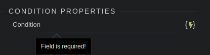
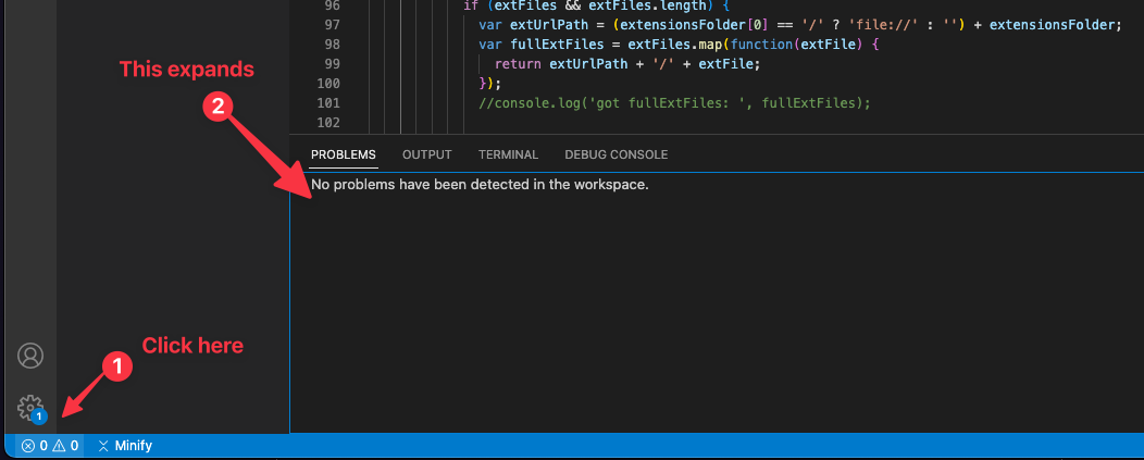
So I right click the step above the condition to create a query. I am met with a ‘field is required’ error:
*This is annoyance one.
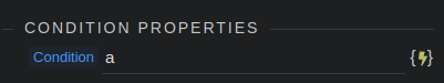
I enter any place holder to continue:
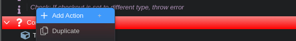
I can now right click and select ‘create action’, and create my query action
I try to go to the query builder. It tells me to ‘enter at least one step’ (in the condition!). Annoyance two.
I try to create a comment step in the condition as placeholder. I right click to add it, but again an error: ‘please enter query builder’. So this time the query builder needs input. Which I can’t do. So I’m effectively stuck right now.
Now the only way to fix it is by deleting one of these steps and putting placeholder info.
This is really taking me out of my flow. I am sure I’m not the only one who works like this. I often try to put steps in the server action as a sort of outline.
So in this case I don’t need to remember what I was going to do with the data from that query: I was making a condition. Which I can see as the very next step.
But now I often have to remove a step purely because of the validation errors preventing me from continuing.
The annoyances noted here are very real, and something that I used to struggle with as well.
Although, I would prefer for them to stay as is.
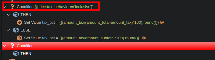
Here’s how I work now: Add a condition step, put a in condition (like you did), and add a comment step inside the condition immediately.
Then, go about creating other steps which I might have forgotten, like query builder.
The comment step would actually help your use case where you are creating an outline of your SA - making it more readable.
Without these validations, there is a good chance my SA will crash when I try to run it.
One thing that can be done to make this smarter, is to not allow adding the query builder step in the first place, without checking the validation that condition should have a step.
Apart from that, any improvement suggestions from your end? Maybe I have missed something.
Thanks for your input, I’m curious why you would prefer it to stay this way? Because otherwise the server cation would crash?
I would prefer it to then crash (in case I forgot to set up some of these steps, thinking I’d do it later), and then told at runtime of the server action that for example I left the condition empty.
That way it doesn’t hinder me while developing, and I’m not as likely to forget filling those things in because I am not creating a huge outline of my server action. Just like your example, usually it’s just 2 steps that I am making ‘at the same time’. Like a condition and a query.
So my personal preference would be to see the error messages when executing the server action OR on saving as @JonL suggests.
Both are good for me as it doesn’t break the flow while editing.
Right now the user experience is similar to filling in a checkout form to purchase something online, and while entering your credit card you see that you made a typo with your name in the field above. But then the site forces you to finish writing your complete CC details.
Thinking of this example… we can also just have notifications instead of forcing the user to finish first.
Yes. I would rather not go through the painful process of reading JSON to identify what is breaking the SA.
I too like Jonas’s idea to just show all errors at once at the time of saving, but I think it would take quite a bit of re-work.
A quicker solution I guess could be smarter validations.
Yes we will be reworking the actions validation in s new way that we already have in place in other panels like database manager.
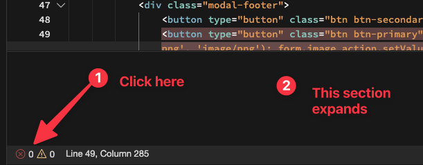
It comes down to just indicating an error in the action steps by just displaying a exclamation mark in its icon. Instead of preventing selection of other steps.
When the error step is selected than detailed validation errors will appear.
And on save, if there are still errors, a message will appear saying that all market errors should be solved first.
If you are able to display with detail where and what that would be nice. I tend to use small SC actions and reuse as much as possible so finding my errors would be easy. But others create 300 step workflows.
It might sound perfect at the beginning, but it won’t be perfect past a few weeks/months when people start complaining that they can’t see the exclamations in the UI. As @nickneustroev has mentioned a few times the SC flow can get hard to read. Imagine adding an icon with an exclamation mark next to the already crowded UI. Now imagine having deep nested conditionals and some collapsed with errors in them.
Don’t reinvent the wheel. Visual studio code already handles errors in a specific place and Wappler’s frontend editor also(as it’s based on Monaco).
If you don’t refactor validation functionality to include a single place where all errors are shown and you can click on them to go to the error you will do triple work.
Add the exclamation icons
Manage forum complaints
Add separate section for all errors to be listed
Better to think this through and get all the specifications right at the beginning as UI is something that affects everyone.
I really cannot stress enough how much I disagree with this proposed UI change. It might sound great at first, but just wait a few weeks or months. People are going to start complaining left and right about how they can’t see the exclamation marks in the crowded interface. As @nickneustroev has mentioned, the SC flow can already be hard to read, and adding an icon with an exclamation mark is only going to make things worse.
Just imagine having deep, nested conditionals, some of which are collapsed, and trying to find errors in all of that mess. It’s going to be a nightmare! Visual Studio Code and Wappler’s frontend editor already handle errors in a specific place, and it works perfectly fine. Why try to reinvent the wheel and make things more complicated than they need to be?
If you don’t refactor the validation functionality to include a single place where all errors are shown and allow users to click on them to go directly to the error, you’re going to end up doing triple the work. You’ll have to add the exclamation icons, manage all the complaints from frustrated users, and then add a separate section for all the errors to be listed. It’s just not worth it.
Please, for the love of all that is good and holy, think this through and get all the specifications right at the beginning. The UI is something that affects everyone, and it’s important to get it right the first time. Don’t make the mistake of rushing into a change that is ultimately going to cause more problems than it solves.
“Reiterate on this point but be very fussy about it so it makes me look like a spoilt child.”
I hadn’t thought of this from the nested and collapsed steps perspective.
The separate section similar to the front-end UX could just list the error messages.
Clicking on an item in the list would scroll to that node in the tree and highlight/select it
First of all, thank you @karh for this detailed request and comments!
I feel exactly the same about this issue, it is very annoying.
I think this 3 points would be good and enough for the 1st iteration:
Don’t initiate blocking if error occurred
Showing message after file save attempt if there are errors
Somehow help the user to find errors (without special “error panel”)
I assume in 99% cases when an error is shown, the user will resolve it right away. For example, as soon as he will create a corresponding db query.
But in some cases the user can be distracted, hide the error node by collapsing the parent and completely forget about it. Until he will try to save the file, see the message and then be frustrated about how to find the error in all the hundred of nested nodes.
So there must be assistance for this.
Here are some ideas:
A. After attempting to save the file, automatically expand the parent nodes of steps with errors. So the error nodes can be easily seen.
B. Or add error style not only to exact nodes that have problems, but for all parent nodes too. So, again, users can easily find all error nodes.
C. Additionally it would be cool to automatically navigate users to the error nodes. Also, it will require the button like “go next error”. Or even little navigation like “<” error 2 of 4 “>”.
In terms of design I think that it is ok to leave the current red background. (except maybe make it a little less bright) Because it is more notable, then a subtle mark at a side. And we indeed don’t want the users to start missing their errors.
Of course an additional panel with an errors list would be very helpful too. Especially if it will allow me to go to the error in the tree by clicking. But I think the error panel isn’t crucial, so it can be left for another iteration.
100% disagree with this. The error panel is crucial and central to providing a single source of truth regarding all the errors that are currently possible today and those to come. Adding more icons, colors, and other nonsense to an already bloated UI or expanding/collapsing nodes automatically for users is recipe for disaster UX.
The sooner non-developers understand that there is no way to nocode yourself through code the better for all. Best that can be done is low-code.
I really do hope all this nocode BS shenanigans bursts as soon as possible as the huge “bubble” that it is.