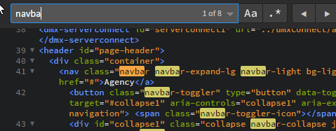
I appreciate some improvements have been made in the display of highlighted text, but the more I use Wappler the less satisfactory it seems, particularly compared to other text editors I use.
Typically text editors highlight all occurrences of a search term; this saves a lot of time, but it’s not critical. Much more important than this, is that most editors make it easy to see the text - you don’t have to hunt for it. In the short extracts below, it may not seem a big issue, but if you’re searching a long page of several hundred lines, it really is a struggle with Wappler. From this point of view, it’s not comfortable to use (I’m obviously just referring to the code view) - and I would have thought it would be easy to improve (but I don’t actually know).
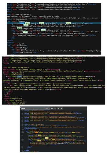
At a glance, I think you can see which is the odd one out:
The third screenshot is Brackets. It shows the number of occurrences which is very useful and it require no effort to find them. It’s really nice to use:

It would make a big difference - to me at least - if this could be improved.
