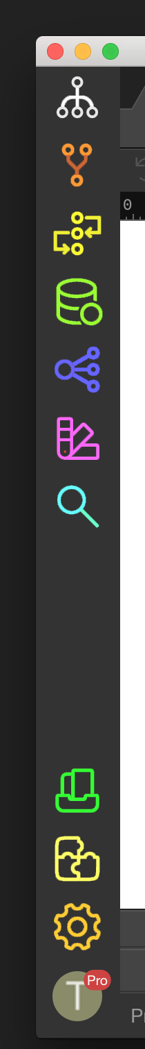
Hi, longtime Drumbeat/UltraDev/DMX user here. Iʻve been using Wappler the last few weeks. The icons on the left in the app are very difficult to discern one from another. Whatever symbology youʻre going for isnʻt working for me. It reminds me of when Steve Jobs passed away and the very next MacOS had all of the color and the text removed from the icons. All of a sudden there were 2-tone icons where full-color icons used to be. Productivity is diminished because of this.
I have everything in my shop marked with colored stickers. The colors are irrelevant, as are the shapes. But the human brain associates those icons with whatever is being labeled as such. On a Mac or an iPhone, everybody sees that big green messages icon and knows itʻs messages. They see the big blue compass and know thatʻs Safari. The grey gear icon is settings. See what I mean here? The black/red icons are very difficult to distinguish from one another.
I have to hover over each one, every single time to see what they mean. One white circle with three red circles means what? Two white circles and one white circle with red lines means what? A red circle with 3 white circles means what? They are so similar in every way.
I like the simplicity of most of the icons in Wappler, but I agree with you about some of those you mention. Having said, I never look at them or spend any time hovering over them.
Wappler is a little too mouse-dependent IMO, but the shortcuts for these critical features are excellent. They’re all conveniently under the left hand (at least in Windows with the thumb on the Alt key - not quite as convenient on the Mac, but they still work well). Not only are they placed ideally, but the letters correspond to the features.
If you prefer using the mouse generally, it might be worth making an exception for these shortcuts.
Please don’t make Wappler a colourised shitshow. More is not better. Right now it is in a sweet spot. Adding colors to the icons will turn Wappler into this.
 )
)