It has taken me ages to work out how to vertically centre a p tag withing a column… and the answer is actually very simple.
Yes, you select vertical align - center for the column in the Properties window.
But that isn’t enough. You have to remember that by default, the Bootstrap 4 p tag has a bottom margin. So you have to remove the margin on the p tag too, then it all works like a dream.
Hi Antony, I have moved this out of official Docs again until it is a little more formatted and explained like an Official Doc.
I think this topic would also help other Wappler users a huge amount, if you could please add some screenshots to it, and a little more detail, it would be very useful.
As an example if i follow your steps to the letter it actually does not work as I would have expected.
Step 1: I made a new document
Step 2: I added the standard Bootstrap framework, App Connect components
Step 3: I added a Container > Row > Column
Step 4: I added a p tag inside the Column
Step 5: I removed bottom margin from the p tag
Step 6: I clicked the Column and in the App Structure > Properties > scrolled to the LAYOUT section and clicked Vertical Align Center.
After these steps my p tag was still not vertically centered, therefore there must be a step missing which i would imagine is possibly something like adding a flex parent container before the p tag, or it would not follow flex bootstrap guidelines
Thanks for your detailed review of my post! I wrote it in a moment of excitement at having appeared to resolve something that had been bugging me, when actually what I had observed was only half the story… so thank you for helping me to see that.
I think my experience shows how complex and confusing all this can be!
So upon further investigation, I have worked with the following example:
A row, background colour pink, min height 200px margins 0, padding 4.
A column within the row, background colour blue.
A paragraph within the column, background colour yellow, margins 0
When you set this up. it looks like this:
So often I have the desire to centre the paragraph within the row… because the row can have other columns within it which are taller than the paragraph I want to centre.
So what we are seeing here is that by default, the column is stretching to fill the available height in the row, so it is defaulting to “vertical-align-stretch” in BS4 speak.
So in order to centre the text in the row, we need to centre the column in the row. We do this by setting vertical-align-center on the column, which stops it stretching to the available height in the row, and makes it now only as high as its content, the paragraph tag, which looks like this:
So this achieves my desired effect.
I think what is confusing in all of this is that the vertical-align property works to align the element you set it on within its container, rather than to align the items that lie within it.
I still have one question, which is how would I most easily centre the paragraph within the column if that was my aim?
No problem Antony, I am happy you do not take offence to it.
So to center a p tag or for that matter almost anything vertically inside a box you can use a special flex container rather than a standard container
All this flex container does is add a div tag with a single class of d-flex now click on your Flex Container in the App Structure and look for the Flex Flow properties, Align Items, and choose center.
From here you can now place a paragraph inside a p tag inside your flex container and you paragraph will always be perfectly centered. As you already mentioned a paragraph tag has it’s own default margin set to the bottom, so for 100% perfect center you would need to remove that too.
Here is kind of what your code should look like when done
<div class="d-flex align-items-center bg-warning" style="height:300px;">
  <p class="mb-0 bg-info">This is a test of some content</p>
</div>
The class on the flex container of bg-warning is just to give a background colour to see it easier.
The inline style is just to set a height to the container so we can test it.
The p tag has class of mb-0 which just sets its bottom margin to 0 as well as a class for a random background colour just to make it easier to see.
That should be it
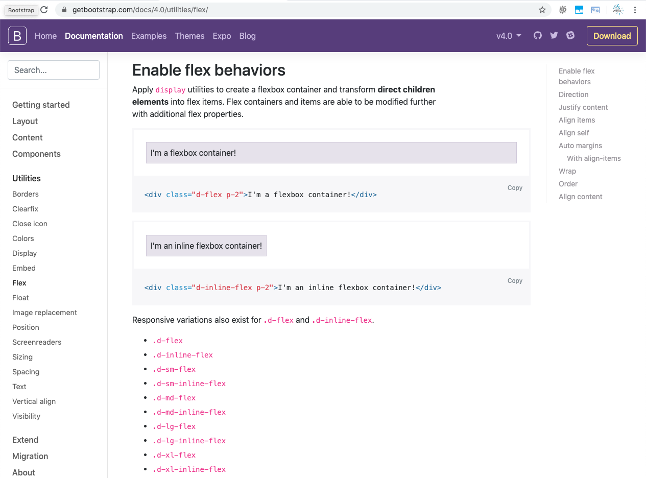
The flex bootstrap docs are a great place to see the usage, just always keep in mind the parent d-flex attribute which then activates flex on direct descendants.