The title says it all. I need to do a DMX-show/hide based on the device.
How can this be done please?
Only need Android vs. iPhone vs. Desktop
Thanks!
You can check browser device width > 768 or <= 768 (768 is px value) to show/hide the elements. This can be used either as a condition or dmx-show/hide.
<div dmx-show="browser1.device.width > 768"></div>
<div id="conditional1" is="dmx-if"
dmx-bind:condition="browser1.device.width > 768" dmx-show="example.data.countProducts > 0"></div>
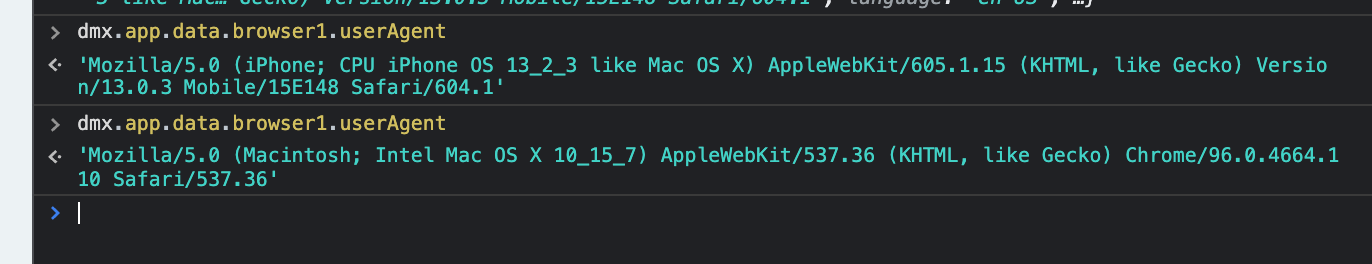
You can get familiar with userAgent which is available property from the browser component.
You can see the difference using dev console and change the device:
I have used
browser1.userAgent.contains('Mobile')
1 Like
THanks for the replies, to reiterate I’m looking for iphone vs android (to show a link to App Store vs Play Store)
@guptast The width is a good idea but some phones now have larger resolutions, which blurs the results if only based on width.
@mebeingken Correct this should be based on userAgent, I’m familiar with that, just asking if people know how to differentiate iPhone vs Android. I’ve seen lists and userAgent families, I should be ok with that.
@UKRiggers Mobile is insufficient for the question 
Thank you all!