ruast
March 12, 2022, 5:04pm
1
I want to have a header with the log out buttons, language selector etc
I am able to have a vertically centred form that is centred in relation to the whole page
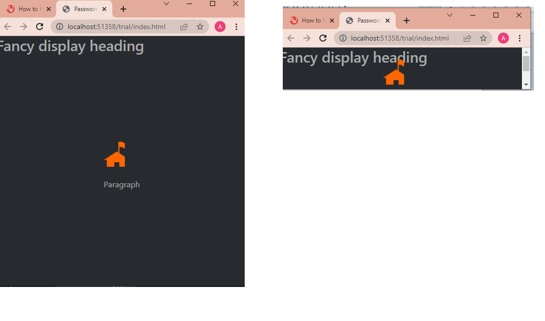
This is the code so far
<header>
        <h1>Fancy display heading</h1>
    </header>

    <div class="container">
        <div class="row">
            <div class=
"col d-flex justify-content-center align-items-center" style="height: 90vh;">


                <form id="formPwdConfirmed">

                    <header class="mb-3">
                        <a href="../index.html">
                       <img src="../assets/images/home.svg"></a>

                    </header>
                    <header>
                        <p>Paragraph </p>

                    </header>
                    <div class="mb-3">

                    </div>


                </form>
            </div>
        </div>
    </div>
    <script src="../bootstrap/5/js/bootstrap.bundle.min.js"></script>
</body>
I’m worried that in pages with bigger forms , the form is going to clash into the header like this ( like the photo on the right) because nothing is stopping the form from clashing with the header
ben
March 12, 2022, 10:29pm
2
Have a look at
<!doctype html>
<html class="h-100">

<head>
    <base href="/">
    <meta charset="UTF-8">
    <meta name="viewport" content="width=device-width, initial-scale=1, shrink-to-fit=no">
    <title>Untitled Document</title>

    <link rel="stylesheet" href="/bootstrap/5/css/bootstrap.min.css" />
    <link rel="stylesheet" href="/css/style.css" />
    <script src="/dmxAppConnect/dmxAppConnect.js"></script>
    <script src="/dmxAppConnect/dmxRouting/dmxRouting.js"></script>
</head>

<body is="dmx-app" id="main" class="h-100 d-flex flex-column">
    <header class="bg-primary" style="min-height: 75px;"></header>
    <main class="flex-grow-1 h-100">
        <div class="container h-100">
            <div class="row h-100">
                <div class="align-self-center col-6 offset-3">
                    <h2>This is centered</h2>
                    <p>Lorem ipsum dolor sit amet consectetur adipisicing elit. Molestias illo facere eum eius qui voluptas mollitia fuga neque, optio provident architecto nostrum atque molestiae ducimus eligendi, accusantium, placeat porro. Eum?</p>
                    <p>Nobis cupiditate aut architecto inventore debitis, repellat laudantium dolor obcaecati reiciendis facere odit cumque veniam saepe voluptates at quidem quod error similique illo tempore unde. Perspiciatis repudiandae magni quae quidem!</p>
                    <p>Aliquid omnis id impedit nulla delectus, culpa saepe labore esse incidunt veritatis! Deserunt perferendis amet perspiciatis minima dolore, obcaecati, odio totam quam mollitia laborum distinctio quia ducimus? Nihil, deleniti tenetur.</p>
                </div>
            </div>
        </div>
    </main>
    <footer class="bg-dark" style="min-height: 50px;"></footer>

    <script src="/bootstrap/5/js/bootstrap.bundle.min.js"></script>
</body>

</html>
1 Like
ruast
March 13, 2022, 9:17am
3
Thank you Ben this worked beautifully and also many thanks for including the footer too.
1 Like
ruast
March 16, 2022, 11:58am
4
I was testing this on mobile (iphone) and it’s not working on mobile , the footer is appearing somewhere in between the content
<!doctype html>
<html class="h-100">

<head>
    <script src="dmxAppConnect/dmxAppConnect.js"></script>
    <meta charset="UTF-8">
    <title>Untitled Document</title>

    <link rel="stylesheet" href="https://use.fontawesome.com/releases/v5.14.0/css/all.css" integrity="sha384-HzLeBuhoNPvSl5KYnjx0BT+WB0QEEqLprO+NBkkk5gbc67FTaL7XIGa2w1L0Xbgc" crossorigin="anonymous" />
    <meta name="viewport" content="width=device-width, initial-scale=1, shrink-to-fit=no">
    <link rel="stylesheet" href="bootstrap/5/css/bootstrap.min.css" />
    <link rel="stylesheet" href="css/style.css" />
    <link rel="stylesheet" href="dmxAppConnect/dmxLightbox/dmxLightbox.css" />
    <script src="dmxAppConnect/dmxLightbox/dmxLightbox.js"></script>
    <script src="dmxAppConnect/dmxTyped/dmxTyped.js"></script>
    <script src="dmxAppConnect/dmxTyped/typed.min.js"></script>
    <script src="dmxAppConnect/dmxBootstrap5Popovers/dmxBootstrap5Popovers.js"></script>
    <script src="dmxAppConnect/dmxBootstrap5Tooltips/dmxBootstrap5Tooltips.js"></script>
</head>

<body is="dmx-app" id="main" class="h-100 d-flex flex-column">
    <header class="bg-primary" style="min-height: 75px;"></header>
    <main class="flex-grow-1 h-100">
        <div class="container h-100">
            <div class="row h-100">
                <div class="align-self-center col-6 offset-3">
                    <h2>This is centered</h2>
                    <p>Lorem ipsum dolor sit amet consectetur adipisicing elit. Molestias illo facere eum eius qui voluptas mollitia fuga neque, optio provident architecto nostrum atque molestiae ducimus eligendi, accusantium, placeat porro. Eum?</p>
                    <p>Nobis cupiditate aut architecto inventore debitis, repellat laudantium dolor obcaecati reiciendis facere odit cumque veniam saepe voluptates at quidem quod error similique illo tempore unde. Perspiciatis repudiandae magni quae quidem!</p>
                    <p>Aliquid omnis id impedit nulla delectus, culpa saepe labore esse incidunt veritatis! Deserunt perferendis amet perspiciatis minima dolore, obcaecati, odio totam quam mollitia laborum distinctio quia ducimus? Nihil, deleniti tenetur.</p>
                </div>
            </div>
        </div>
    </main>


    <footer class="bg-warning " style="min-height: 50px;"></footer>
    <script src="bootstrap/5/js/bootstrap.bundle.min.js"></script>
</body>

</html>
ben
March 16, 2022, 11:39pm
5
Try (no h-100)
<body is="dmx-app" id="main" class="d-flex flex-column">
1 Like