Hi
I try to define different Width for a Container depending on the Device.
For Desktopmode I did set the Width to 75%.
When I’m in Mobiledevice Mode I change the Width of the Container to 100%.
But when I go back to Desktopmode it is set to 100% too.
How can I keep it to 75% and only change to 100% for Mobiledevices?
Kind regards
Alain
In bootstrap this is normally done by setting the number of the 12 preset columns spanned rather than a percentage i.e. col-2 or col-10
This can be done interactively within wappler
Look at the device icons at the top of the design screen
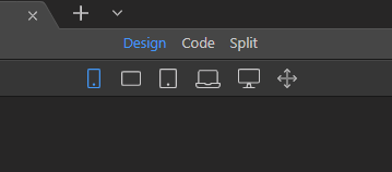
By selecting one of those devices the properties panel will dynamically change can be used to set the specific settings for that particular device.
So 75% becomes col-9 for example
1 Like
Do I really still need Bootstrap?
Guess not but it does make things so much easier as so much or wappler uses it.
I never really understood the need of Bootstrap and similar things. Because to me they seem just like kind of a patch for all those different browser interpretations (especially Internet Explorer) to make sure a website looks the same on almost every browser. But I think those days are gone. Maybe I’m wrong 
Meanwhile it worked to set different Style for different Breakpoints.
But I still do not know what I did wrong before 