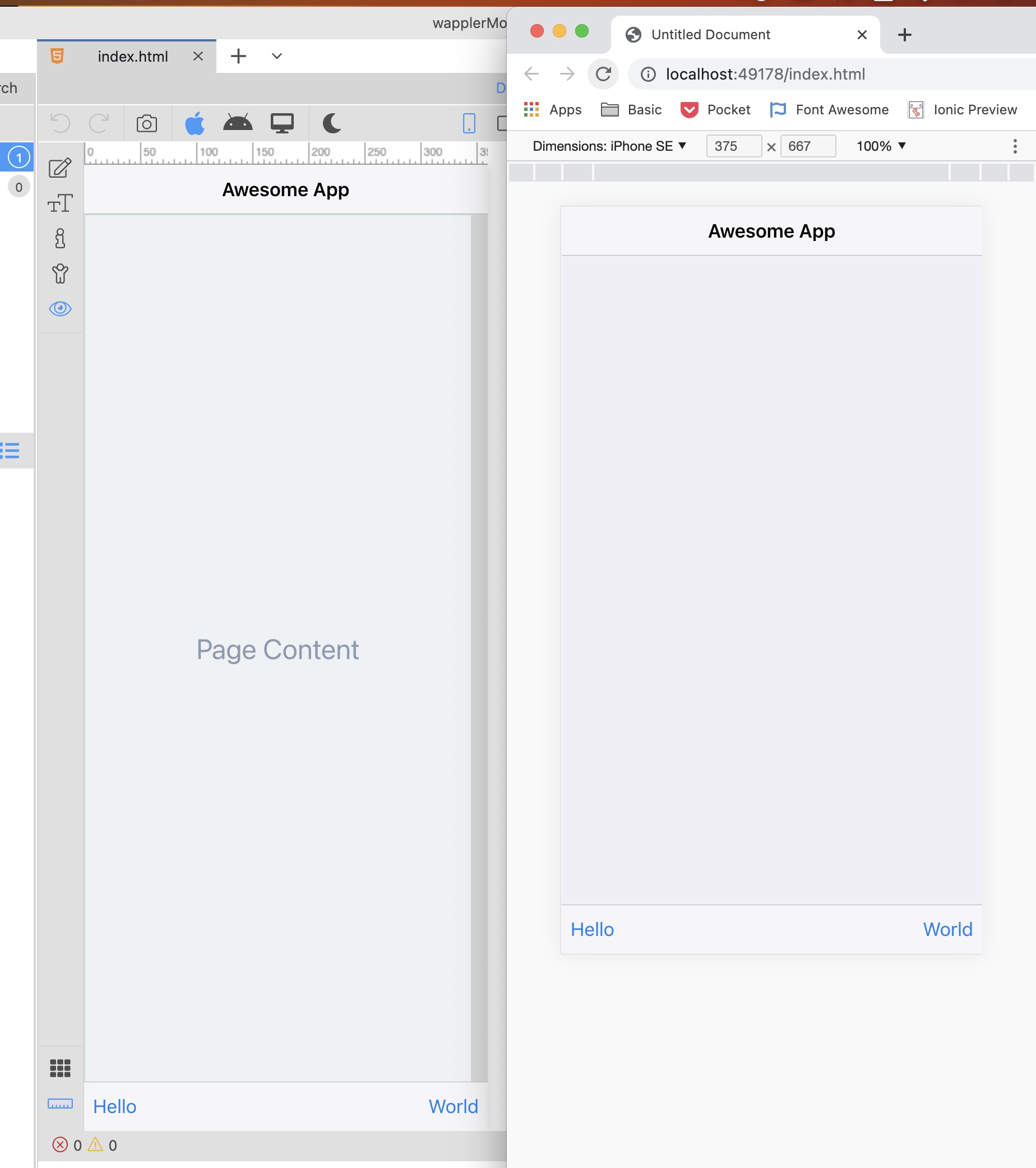
Pretty sure I am missing something simple, but how to I restrict the design view to certain screen sizes of mobile phones?
Currently, it’s always 100% height of the Wappler design view, but how to simulate different heights to adjust the designs, especially for smaller phones?
(Not all screens are designed to be scrollable)
You can’t adjust for screen height on mobile, just width. In your screenshot you have the header and footer. Those will always be at the top and bottom regardless of screen height.