Hi All
Thought i would give a shout out to all you great folks to help me with something i just cant get right
I decided to change my old <datalist> selector for an autocomplete on a site i did some time ago (before Wappler had an autocomplete component). It was the first major Wappler project i did so the technique is not always how I would do things now but then again Wappler is a very different product now compared with 16 months ago.
I have a basic form with an autocomplete.
Functionally it works, i type the list appears filtered on the text
There my happiness ends
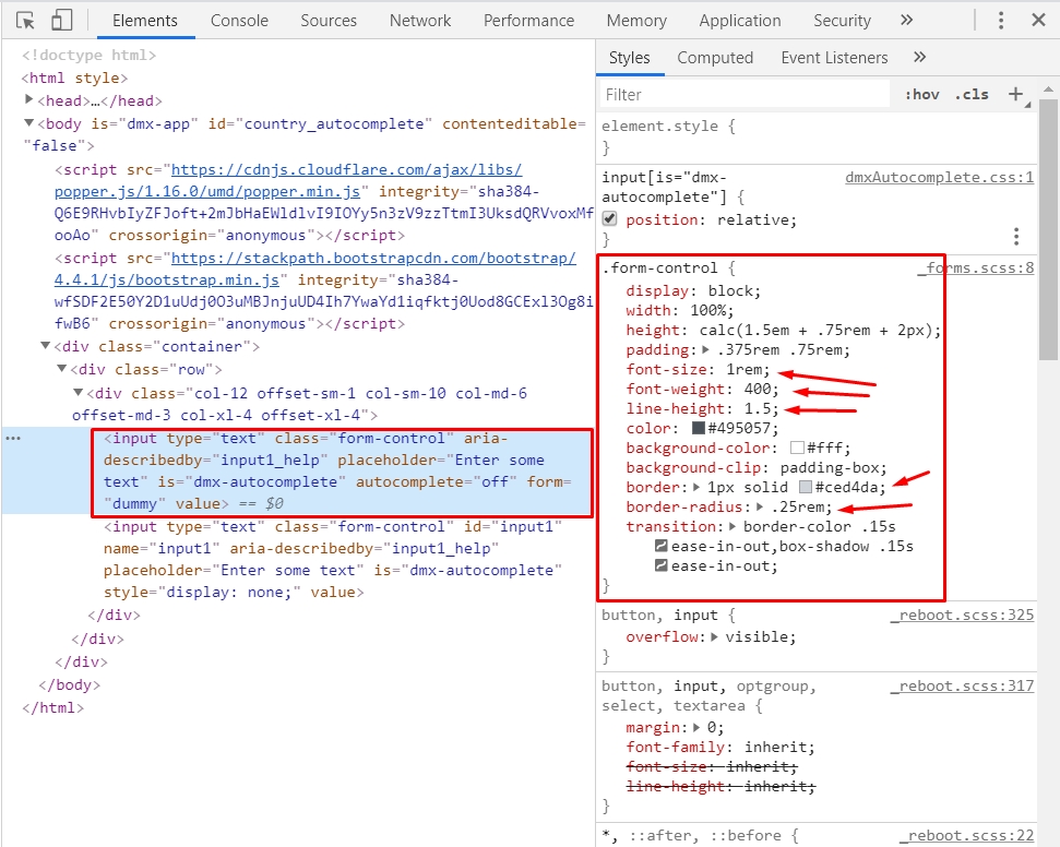
Firstly the options are at the left of the screen, not below the selector

Only the selections which are convert the current container show, this picture above should have a lot more options). Is this normal? Do i need to remaster the site into one container and multiple rows?
Lastly the options are centred, i want them left aligned.
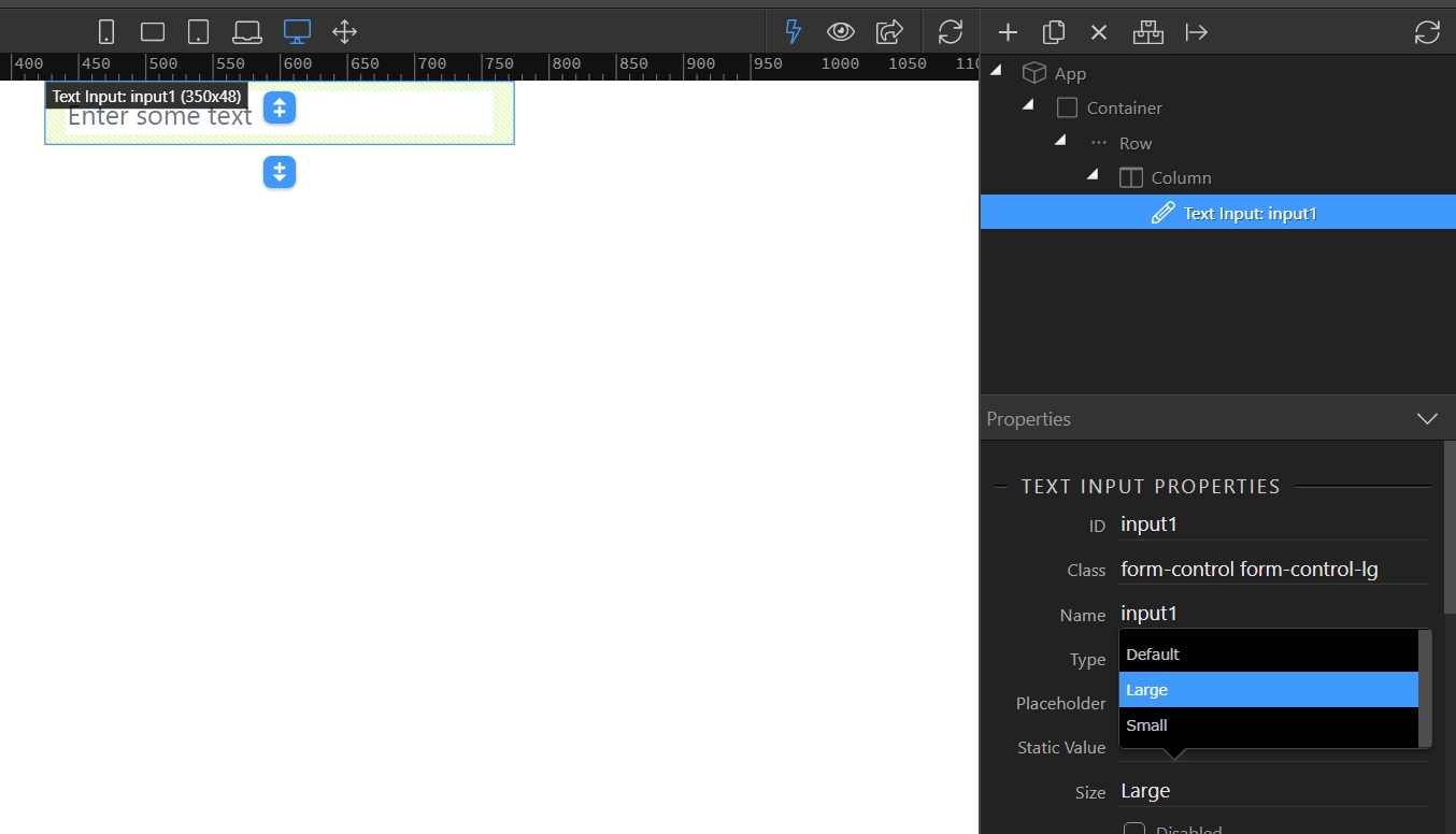
Also I cant work out how to style the box.I want it bigger, bigger text and with a placeholder (the setting in my code seems to be ignored)
Any pointers as to styling with CSS hugely appreciated
I have tried code I found via google based in Bootstrap styling for jQuery UI autocomplete but it doesn’t seem to work (or i cant work out how to make it work)
Here is the container with form contents.
<div class="h-100 container-fluid" style="background-size: cover; background-image: url("img/banner2800_new.jpg"); display: block; overflow: hidden; height: 100%;" id="cbanner">
<div class="row">
<div class="col text-center">
<h3 class="front-page-title-top text-center text-white text-capitalize mt-2" style="text-align: center;" id="t_lgxl">Free Service and £50 Reward if you book Via us</h3>
<form id="form1" action="results.php">
<div class-="form-group">
<input id="autocomplete" name="searchcity" is="dmx-autocomplete" dmx-bind:data="conn_searchlist.data.qry_uni_list_fp" optiontext="City+' : '+UniversityName" optionvalue="City"
dmx-bind:placeholder="Where would you like to stay?"></div>
<button class="btn btn-primary btn-sm pb-1" type="submit" dmx-bs-tooltip="'Search on a City or University'">Search</button>
</form>
<a href="#" class="btn btn-warning btn-sm pb-1" dmx-bind:href="'signup.php'" dmx-bind:popover-title="'Advanced Search'"
dmx-bs-tooltip="'An Advanced Search requires Registration and allows you to enter your requirements for a customised portfolio, see full details of halls and Book direct from our site to quality for your £50 reward.'"
dmx-hide="conn_get_logged_in_user.data.qry_get_user.hasItems()" data-placement="left">Advanced</a>
<h5 class="front-page-title-bottom text-center text-white mt-2 mb-2">100,000 Rooms • 400 Residences • 50 UK Cities • Additional Private Housing Service • Personal Consultant</h5>
</div>
</div>
No errors visible in code view
I am probably missing something simple but I have hit the point where i have gone code blind…