Let me just say upfront that I am not sure if I am going about this in the right way.
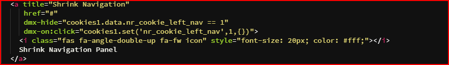
I have a menu which, when you press “Shrink Navigation Panel”,
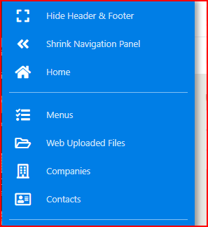
the panel collapses to the left on all screens
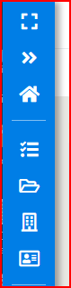
except on mobile where it collapses to the top

OK, that works great using the following code with dmx-hide and dmx-on:click.
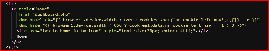
Now for my issue: If you look at the first screenshot I have a Home button, what I want to do is, when you press the home button on a mobile ONLY, then the menu collapses. On other screens the menu stays in full as there is usually the room to keep it expanded. So my problem is using the dmx-hide and dmx-on:click expressions in some sort of “If the viewport is less than (say) 650px then collapse the menu”. I have tried several ways and none work. The following code is where I am at at the moment. Can anyone understand this, and help?
easier way would be to have 2 elements and show hide them based on viewport.
have each of the element define the task separately based on the breakpoint where they are visible.
SOLVED
Thanks @nshkrsh for having a look. The reason for the cookies etc is because of remembering user state which complicates things slightly. You did however just mention something that I had also just found and that was that I was using browser1.device.width instead of browser1.viewport.width.
Here is the code that worked with a bit of playing around...
    <li>
      <a title="Home"
         href="dashboard.php"
         dmx-on:click=" (browser1.viewport.width < 650) ? (cookies1.set('nr_cookie_left_nav',1,{})) : '' "
         dmx-hide=" (browser1.viewport.width < 650) ? (cookies1.data.nr_cookie_left_nav == 1) : '' ">
        <i class="fas fa-home fa-fw icon" style="font-size:20px; color: #fff;"></i>
        Home
      </a>
    </li>