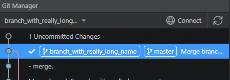
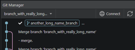
In version 4.0.2, the part where top controls disappear is now fixed. But the other issue about branch detail remains.
There is now an option to increase the width of the left panel a bit more, but that is not a solution.
I still can’t see all the information if I have 3 or more branch badges - which is not uncommon - dev, dev-remote, staging, staging-remote etc. And if the namese are big, then even 2 are enough to hide things.
A better option would be to just add a horizontal scroller in my opinion. Not sure if there are any limitations around that with Electron.
I will investigate what would be a good solution. Could be that we add a horizontal scrollbar or we limit the number of characters in the labels, we can still show the full label or commit text on hover in a popup.