Get width and height of src image

I would like to display the pixel dimensions of an image in my application.

Is there a way when loading an image in a <img dmx-bind:src="image.jpg"> to somehow get the pixel width and height of that image?

I would ideally like to end up with <img dmx-bind:src="image.jpg" dmx-dind:width="000" dmx-bind:height="000"> where 000 changes to be whatever the image currently is.

Well if you get the list of images from a server action there you can also add the dimensions.

We ha methods for that as server action step to get image info and size

Unfortunately i am not getting the images from the server, these image paths are all manually input in each src, so i need to see if there is a way to get this from app connect on image load. I can do it manually in jquery but if there was a built in option then it would be a waste of time.

Can you not get these details via javascript from the DOM properties?, i believe they are available.
Something like:

var img = document.getElementById('imageid'); 
var width = img.clientWidth;
var height = img.clientHeight;

I confess i gave never tried but thought it may be an idea

1 Like

Thanks @Hyperbytes I wrote a small piece of jquery that did exactly what i wanted but to be very honest was not happy with it as I am really really trying to do this entire website using as little custom code as possible and only use built in Wappler functionality.
Obviously with the view in mind of showcasing this as a video set as soon as possible too.

So I have reworked things a little and managed to find a way using only Wappler, i admit, it is not al elegant as the jquery i wrote but for these purposes it works fine.

Thanks anyway, appreciate it.

1 Like

What is actually your purpose to have the image widths included? Can you give an example of why you need this?

99% of the strange things I do are always to, in some way affect SEO, obviously not everyone will agree because SEO is a very subjective field. In this particular case for a single image i need to ensure 1 major thing. Speed, page load speed, page indexing speed, which in turn affects file size, the smaller my file size the more effective my page becomes on mobile devices.

Factors to consider

  1. Image Optimisation - https://gtmetrix.com/optimize-images.html
  2. Image Scaling - https://gtmetrix.com/serve-scaled-images.html
  3. Image Dimensions - https://gtmetrix.com/specify-image-dimensions.html

If you look at lets say this website home page - https://www.africacollection.com
And then analyse it through various tools like
GTmetrix - https://gtmetrix.com/reports/www.africacollection.com/tQ2BhmBp
Pingdom - https://tools.pingdom.com/#!/eA2z2s/https://www.africacollection.com/

And then compare those scores against something like the Africa Collection sister site which I have not begum optimising as yet and which I did not develop - https://www.portfoliocollection.com
GTmetrix - https://gtmetrix.com/reports/www.portfoliocollection.com/HRGOvfrQ
Pingdom - https://tools.pingdom.com/#!/T7tbP/https://www.portfoliocollection.com/

You will note that the only real place my Africa Collection website falls down is on Defer parsing of JavaScript, which I have an entire post on Wappler forum about me trying to fix and caching which I can not control because of the use of certain third party tools that do not allow this.

Almost every website i develop starts out first and foremost with an organic SEO plan in mind and I try to follow a very strict set of rules that “In MY opinion make a large difference” and I think you would possibly agree if i could share site traffic stats with you and show the improvement from where this site began to where it is now, the numbers themselves are not very impressive because i released the updated site in February this year, it had 700 visitors a month on average tested over 6 years, and after my development change this last month they already hit 3000 visitors. No AdWords, No Mailers, No added backlinks, Just a redevelopment, and this number will continue to grow.

1 Like

You are wrong! You should DEFINE script not to get image width… but to get number of Katie from Africacollection :wink:

Just Joking… but you put the staff pics on site :rofl:

Haha lol. I will have to make that an SEO metric. Book a holiday and the first half Katie’s number gets displayed, book a second time and you get the rest. :rofl:

1 Like

Hi Paul,
I see the description for image sizes in one of the tools saying:

Specifying a width and height for all images allows for faster rendering by eliminating the need for unnecessary reflows and repaints.

In responsive web design you do not specify image width and height, as this way your images become not responsive.
I also don't see how would this help SEO :slight_smile:

I know @Teodor, and this is why I say SEO is a very subjective field, the biggest alteration this seems to make is when you do a google test on their mobile friendlyness tool, it seems to eliminate most of their warnings regarding touch zones being too close together, I am not sure why or how but thats where it seems to make the biggest difference.
As you can see from the Africa Collection website, it is still fully responsive with all the images having a width and height attribute.

Responsive images already have the width and height values in the CSS:
max-width: 100%; and height: auto;
Browsers are calculating everything automatically using the CSS values.

I know, and if by adding the width and height attributes it had to break the responsive nature of the site I would have quite an issue, luckily it does not seem to though.

Take a look at the code behind this Wappler forum we are chatting on right now. I realise this is built with Discourse but all images are assigned a width and height attribute and this site remains brilliantly responsive.

The top logo with your W in the round circle

<img src="/uploads/default/original/1X/8c5a8a16dab9f26110e2985a94e07688afec90b1.png" width="33" height="33" alt="Wappler.io" id="site-logo" class="logo-small">

Any post where the user has added an image that is displayed inline in the body

<img src="https://community.wappler.io/uploads/default/optimized/2X/6/655905785f46aa0ba8876e4317635d04a1bb23dd_1_690x363.png" alt="Screenshot_21" width="690" height="363">

User profile images next to each post

<img alt="" width="45" height="45" src="/user_avatar/community.wappler.io/psweb/90/530_1.png" title="Paul Strydom" class="avatar">

I would imagine that as you said

Is what we are trying to somewhat avoid from an SEO perspective anyway, this speeds up the site ever so slightly as the rendering has a rough idea of image size beforehand.

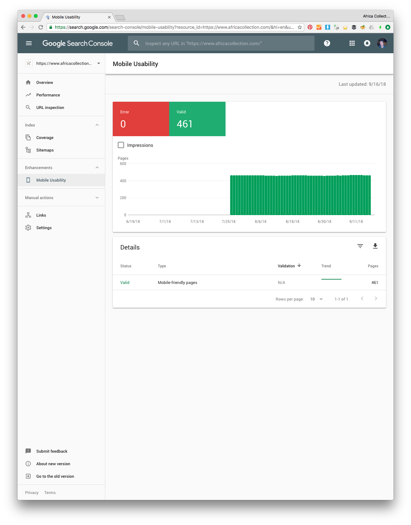
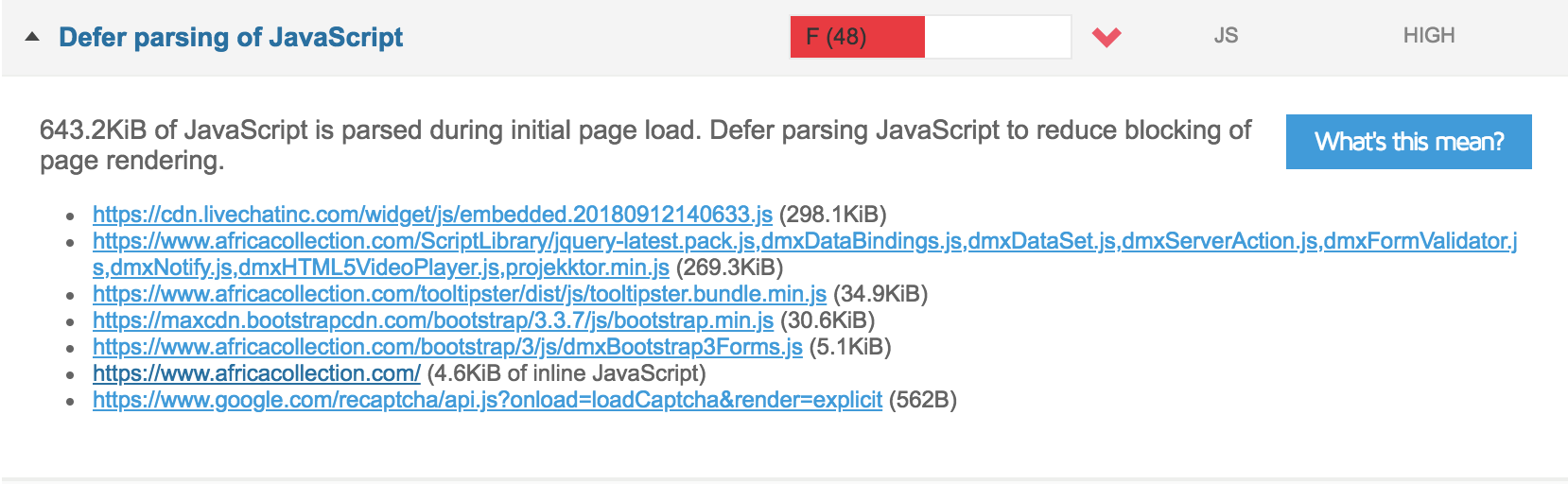
To be honest though I would not even really try and give a highly technical reason, for me it was simple, my Africa Collection website was getting quite a bad list of errors in the Google Mobile-Friendly Test, I researched it, added manual width and height attributes to as many images as possible and suddenly the entire error list about touch zone spacing was error free, the page speed increased in that tool anyway by 15% too. - סקירה כללית  |  Lighthouse  |  Chrome for Developers

I assume Google would use a similar tool to test all websites for mobile friendly code and my sites really need to try and highly rank in mobile search, so regardless of if i agree with it or not, i feel i am stuck having to use it to get my website score higher

The logo and user images here are not responsive - they just have fixed size. I am referring to responsive images which are already styled by the bootstrap framework.

What you are trying to achieve still makes no sense to me:

  1. You load the image in the browser - then it calculates the width and height
  2. Then you load a jquery code which reads what browser returns
  3. You then alter the code and set the width and height inline to the images on the page
  4. Your browser now reads the same values it calculated already …

Of course it’s your choice, but doing the same thing twice really does not make sense to me. I’d rather try to improve the content of a website than worrying about if my images have inline width/height :slight_smile:

Agreed, for ranking, I try to improve website content.
To improve indexing I try to improve google scores on whatever tests i can find, mobile friendly test is the only one that seems to moan about this touch zones too close thing, so if I find another way around the error I will use it, thus far its the only way i have found to not get the error.

I would rather not bother with it either, it is a pain in the butt to add on every image too :slight_smile:

Having image sizes has no relation to SEO what’s so ever and no effect at all. Google does its own sizes calculations after downloading images separately.

The sizes only effect rendering as display areas are then reserved before image is loaded so you get faster display results and no jumping content.

However if you are introducing more scripts to calculate image sizes you will be introducing more delays, as those scripts will block the total rendering. So by doing so you are actually making things much slower.

The only solution is to have the images sizes injected serverside or in the server connect feee as I explained earlier.

I agree George, and if it were up to me I really would not bother doing it at all, but when Google Search Console says that only 30% of my pages are indexed in the mobile index and gives me a mobile usability report to see on my site, and that returns errors found on about 300 pages all to do with touch zone spacing, which I already know has the required space, which i can get around by adding a simple width and height attribute.
Two weeks after adding those silly attributes my Mobile Usability report looked like this

So don’t get me wrong I am by no means saying this is a Wappler issue, nor am I saying that width and height attributes should be set for everyone, but for me, in my circumstances it made a world of difference to my mobile usability report, which made a world of difference to my pages indexed report

As well as made a difference to my page speed report


Which all together amounted in an overall SEO improvement. I mean afterall this is Google, who says they want lean pages but then also wants stuff like schema included which adds loads of code to my pages too. So who knows what they actually want,

According to current page speed reports, I am still by no means happy with my page speed because of this damn page JavaScript render blocking stuff which pulls down my sites page speed significantly, even though I have already managed to get most of the DMXZone js files into a single one file rather than 10. Look at line 2 how they join dynamically.

Anyway this thread could go on forever as every person has their own idea of what does what to SEO and there is conflicting reports all over the place and conflicting data all over the place, my traffic has increased in 8 months after the rebuild of the site by 500% so this seems to work in my situation though.