Basically, FooTable is a bootstrap table on steroids! It offers additional functions like collapsing columns on narrow widths or filtering, and many options more! Right now I’m switching from the standard bootstrap table to this solution which requires a lot of work since there is a mix up with server connect. I’d love to see this officially supported!
you can create same table with wappler… Why do you need ?
Yes that is true. But just look at the performance of the showcase on their website. They use a huge amount of data for the showcase and it still works without any lag! Also, my code is already extremely complex because of all the dmx:onclick and dmx:binds etc. Maybe by integrating all the basic table functions like sorting, paging and filtering as well as responsive properties more tightly with footable, this can be prevented.
You can do exactly the same with the Bootstrap 4 Table & Paging generator - it look identical. Also combined with server connect and paging records set - it will be even faster 
1 Like
But as for the responsive column brakes, I have to go with css media queries right?
Bootstrap 4 has a responsive table option, which can be activated by a checkbox.
It adds an option to scroll table left<>right without breaking the table column-row structure.
Yeah but that’s not what I want. I have so many columns, it does not help. Just look at the following showcase and shrink the page width and you will notice, depending on what is set, one column after the other moves below the record with a data label.
https://fooplugins.github.io/FooTable/docs/examples/component/showcase.html
I don’t say, I can’t do it with bootstrap and media queries. As a matter of fact, partly I already have. But It’s much code and not very efficient.
It could be useful in their specific showcase, but with data laid out in a table aren’t you expecting a table on mobile as well?
If you have huge table with many rows how would you nest them like that/how would it not look messed?
Check the responsive table on your phone/on small screen: https://www.w3schools.com/bootstrap4/tryit.asp?filename=trybs_table_responsive
you can drag table rows left/right…
Right now I have a card layout. So after a specific breakpoint, the table header hides and all cells are being display vertically with a data label. It’s very nice to view on a smartphone and much better than a table that is 3 times the width as the actual screen width.
What I really LOVE about the footable approach is the fact, only certain columns break into the card, and the row is expandable. So the most important info is displayed in a table like layout, and all additional info can be viewed easily by clicking on the row without getting confused where the data belongs to.
Maybe you can just try some simpler solution like:
@media (max-width:768px) {
        .yourtable tr {display: table;  width:100%;}
        .yourtable td {display: table-row;}
    }
1 Like
I’m using this solution right now. Except it has two breakpoints. The first one is for tablets where the cards have a max width and can be display next to each other. The second on is for smartphones where one dataset has a width of 100% to make it look good on the phone.
Plus some additional styles to make it look more neat.
I guess I have to implement the expandable row myself for now. Might learn a thing or two 
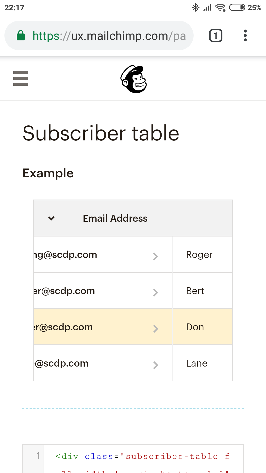
I stole the table idea that mailchimp uses to display all your contacts, might be worth looking at that as a quick and effective alternative.
https://ux.mailchimp.com/patterns/tables
With an apple magic mouse it is really easy to scroll left/right/up/down as well as most laptop trackpads. Or use a conventional mouse with a scroll wheel and hold shift to do horizontal scrolling.
1 Like
But isn’t that the same as bootstrap 4 responsive tables?
At least it looks like that on my phone now.
That is also a nice solution. I just complain on a high comfort level. Right now the only improvement over my card layout would be the hybrid I explained.
Not really, if you look at the first table in the list, it shows all columns in full width and they never get smaller and there is a fixed column to the left so it makes it great for backend systems where there is generally some column that always remains visible and never scrolls left to right.
Not entirely. The trick is, to make the first column sticky if enough width is provided.
Yes that’s right. Like I said, if enough width is provided.
Just checked it on my phone and yes it is not sticky. The implimemtation I made myself is sticky on all devices. Never even realised the mailchimp one was like that. I had to find an example because my version shows sensitive data.
1 Like