In this video i show how to create simple form labels that float over your input fields. This is a new feature that was introduced into Bootstrap 5.

In this video i show how to create simple form labels that float over your input fields. This is a new feature that was introduced into Bootstrap 5.
Great. Thanks @ben, was very pleasant to follow, super professional. Well done !
I did the tutorial and was no issue to follow and reproduce.
Would be maybe nice to get this floating option added natively to Wappler @George
My 2 cents as a new Wappler user :
Edit : will sounds silly question but I have wondered why you used a card for this form. Would have been nice to explain this choice vs other options. When you learn, you want to try to understand.
Thank you for your feedback, especially your 2 bobs worth. I have already requested for the floating labels to be added to Wappler together with input groups.
I have been wanting to keep the videos short and to the point so as not to confuse those that are completely new, although I do realise that Floating Labels is a more advanced topic in relation to creating a form in the first place.
I will take your comments on board and have already started with tutorial on creating a form.
Please keep in mind, that while dealing with Bootstrap 5, server side action will not be included. When I have the time, I will start a series on server side actions.
My use of cards come from the Bootstrap 3 era where there were panels, wells and thumbnails. In later versions of Bootstrap, these components were replaced with the card. A card is the most versatile component in Bootstrap. Please see the videos on cards in Bootstrap 4.
Thanks @ben for your answers.
So you would always advice to use cards for forms in BT5? Or it’s not that important and there is no “best practice”?
No, it's neither required, nor a best practice. It's just a decision for a better design.
Actually there are no any 'best practices' related to designing page - just design the page as you like it 
Maybe check the Bootstrap docs to see what components are available: https://getbootstrap.com/
Well done.
Should the class="form-floating" go to the Form Group only?
What’s the use of moving and/or keeping the label?
Yes, that is all that is needed.
It is a design decision to quote @Teodor.
I’ve got some old forms with no form groups in them so I guess I have to insert a form group for each input field of my old forms so I can use this nice form-floating class. I could not apply successfully the form-floating to the class of the input field.
Very nice…!! Thanks for posting…
Just check the Bootstrap docs to see how to use floating labels. It’s pretty well explained there.
Do you plan to expand the BS5 features in Wappler to include all these?
Go on, say ‘yes’ 
Yes, but after our summer break.
Of course. Certainly wasn’t suggesting sooner. 
Well done video, @ben! Thank you.
Bump. This would be a useful, time-saving addition 
@ben
Floating labels do not render properly when the options of the input form-control are generated by an API source.
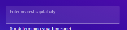
Label position is upward by default:
Is there any trick to fix that?
<div class="col-sm-8" id="city">

    <div class="form-floating mb-3 row">

        <input type="text" class="form-control" id="inp_city" name="city" aria-describedby="inp_city_help" is="dmx-autocomplete" dmx-bind:data="getCities.data.getCities" optiontext="cityIANA" optionvalue="cityIANA" placeholder="Enter nearest capital city">
        <label for="inp_city" class="col col-form-label">Enter nearest capital city</label>

    </div>

</div>Well, please check:
Especially the part explaining:
Other than .form-control, floating labels are only available on .form-selects. They work in the same way, but unlike s, they’ll always show the in its floated state.
Yes saw this indeed for form-select which makes sense since there is a default value thanks to option selected. But in my code - and screenshot - I'm using form-control which is empty by default so label should not be floating.
Upon reviewing the Wappler files:
We have a form-control that runs the dmxAutocomplete JS which puts focus on the input, making the label float by default despite zero value. How can we fix that?
Updates from the Bootstrap community on Stackoverflow:
Perhaps the script is putting focus on the input, try calling
.blur()at the end of the process. Your markup as provided behaves exactly as it should, so the root of the problem must be with either the JS or CSS applied to the element. The input in the image appears as it would when it has focus, or it hasvalue=" "(whitespace).
Do you recommend a fix on our end or do you need to amend the dmx-Autocomplete JS?