ruast
1
Hello
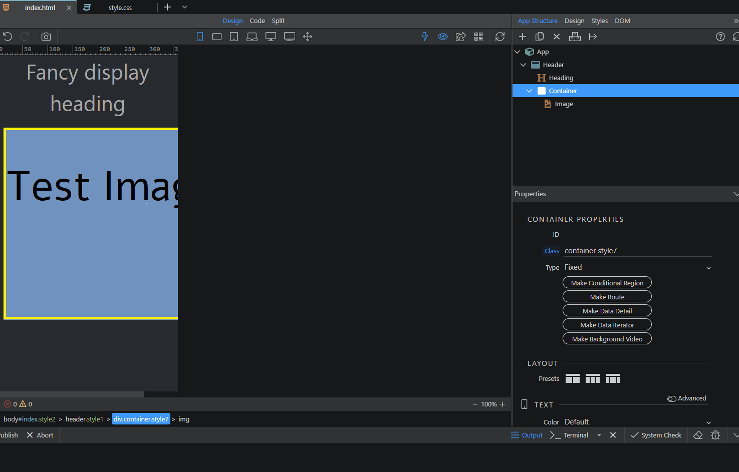
I have a header
Below that i want to have an image
I tried using “Main” , “Container” , “Flex Container”, “Row” so far (below the header) and put an image inside it.
It creates a scrollbar on mobile. I want it to become smaller to fit the mobile screen so that it can be seen entirely, without having to scroll
And i want some padding on left and right so that it looks neat…
How can i do that
Teodor
2
Can you paste your page code here or provide a link to your page where we can check it?
ruast
3
index.html:
<!doctype html>
<head>
    <script src="dmxAppConnect/dmxAppConnect.js"></script>
    <meta charset="UTF-8">
    <title>Untitled Document</title>

    <link rel="stylesheet" href="https://use.fontawesome.com/releases/v5.14.0/css/all.css" integrity="sha384-HzLeBuhoNPvSl5KYnjx0BT+WB0QEEqLprO+NBkkk5gbc67FTaL7XIGa2w1L0Xbgc" crossorigin="anonymous" />
    <meta name="viewport" content="width=device-width, initial-scale=1, shrink-to-fit=no">
    <link rel="stylesheet" href="css/style.css" />
    <link rel="stylesheet" href="bootstrap/5/slate/bootstrap.min.css" />
</head>

<body id="index" is="dmx-app" class="style2">
    <header class="style1">
        <h1 class="style2 text-center display-1 fw-normal lh-base">Fancy display heading</h1>
        <div class="container style7">
            <img src="assets/images/TestImage.png">
        </div>
    </header>


    <script src="bootstrap/5/js/bootstrap.bundle.min.js"></script>
</body>

</html>
CSS :
.style1 {

    height: 20vh

}

.style2 {

    height: 20vh

}

.style3 {}

.style4 {

    text-align: center

}


.style6 {

    text-align: center

}

.style7 {

    text-align: center

}
Teodor
4
Well, you need to enable the responsive option for your image in the properties panel.
1 Like