The Wappler Masonry app component is great for organizing content, especially images with different sizes.
I would love the Wappler team to add a setting to set the number of featured content to show.
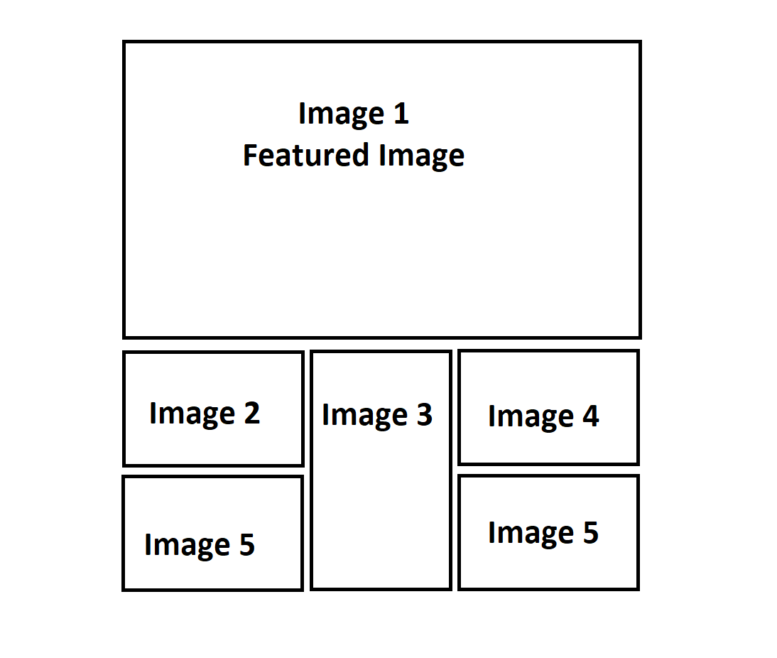
The use case (see the picture attached) is that I want to show the first image in my array of objects as the intro image and the remaining as a masonry grid. This feature is not available by default with the masonry app component. My workaround is I would display the first index of the array [0] to be the intro which is separate from the masonry grid. Then, I filter the array for the masonry grid to exclude the first item in the array as such: arrayData.where(id, arrayData[0].id, ‘!=’)
I think adding this feature will be great, particularly for those who are just getting started with Wappler.