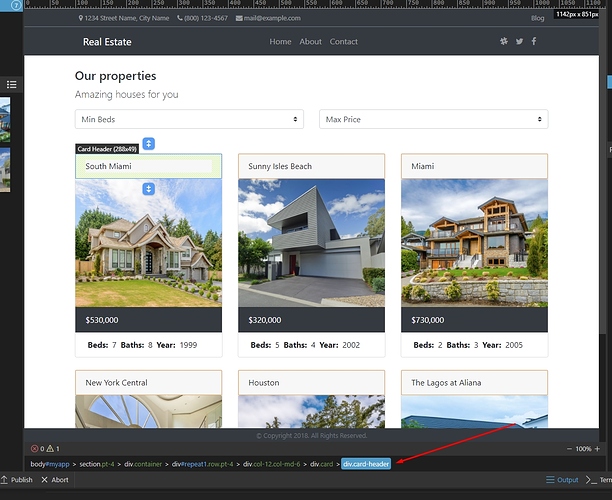
I’ve just installed B13 and found that the view has a seemingly wasteful area beneath the design/code view:
It may have been there for a while but I don’t remember it (unless page console errors were present) - maybe worth collapsing of no errors exist to gain a bit of extra screen space.

