Modal box are definitly not responsive. This is even more true if you also want to access to your app from mobile. From my point of view, the best is to replace Modal box by a rigth side panel. And it’s easy with a few line of Css.
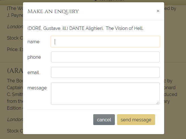
1) Here under the classic modal dialog box before Css styling

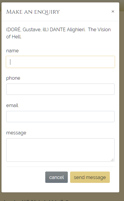
2) Here is the result after Css styling

3) And now how to do it
3.1) First create needed styles in a new css file.
My new style is named “slide-rigth” and must be applied to two classes : modal-dialog and modal-content
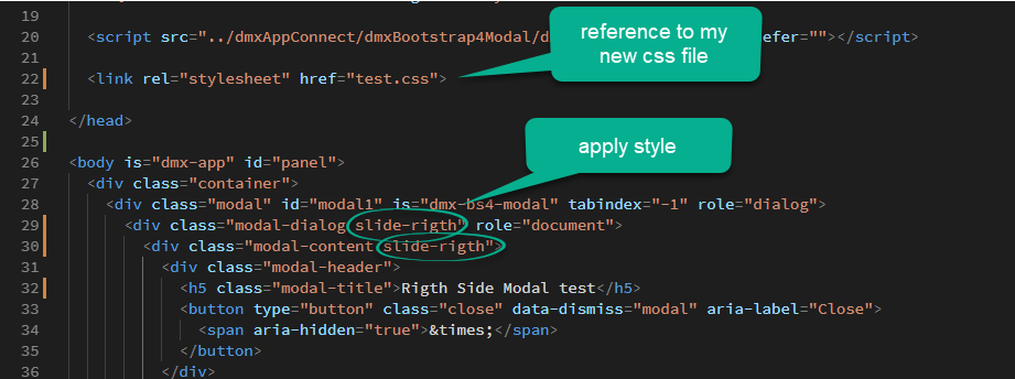
In my example this css filme is named test.css and will be saved in the same dir as my php file.
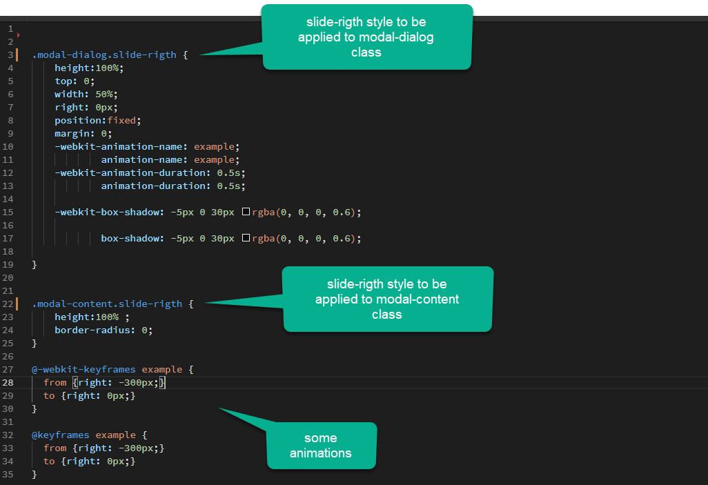
Please note those important styling attribute:
heigth must be set to 100%
top to 0
width about to 50%, the side panel will take 50% of the screen width.
position to fixed.
All other attributes are just design effect.
3.2) Apply style in the code view
Note that we have to apply the style in the code view because styles are not applied to the whole modal but to inside elements of the modal.
And here it is without the fade effect (more professionnal look):

I hope it will help, as i’m not a Css specialist (far from it), i’ll be glad to see some more suggestions to enhance this css styling example !