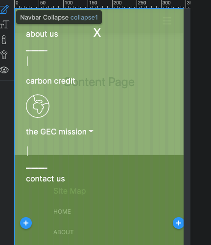
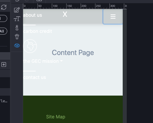
General question about CSS styling of the mobile collapse nav menu. I am having difficulty placing the custom CSS style to the Nav menu that appears on mobile. I have an @ media CSS
@media (max-width 600px) {
.navCMin1 {
    width: 100vw;
    height: 100vh;
    background-color: #83a958c9;
    padding: 2rem 1.5rem
}
}
This is to be applied to the container so that when the buger is touched on mobile the menu appears with the settings. I have tried a few things and it is just not being applied correctly. below is the HTML.
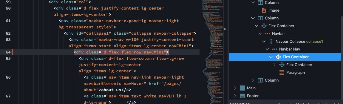
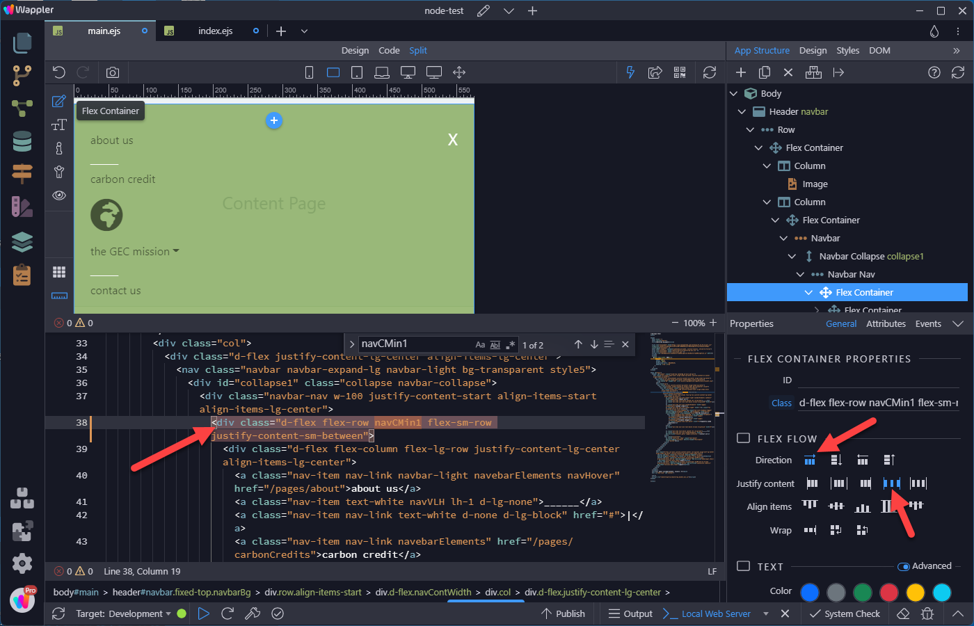
     <header id="navbar" class="fixed-top navbarBg pt-lg-2 pb-lg-2">
    <div class="row align-items-start align-items-lg-center justify-content-xl-center align-items-xl-center">
      <div class="d-flex navContWidth justify-content-lg-center align-items-lg-center">
        <div class="col-auto align-self-center navbarImage d-none d-lg-block">
          <img width="80" height="80" src="/assets/svgLogoFiles/logoFullColorFinalWT.svg">
        </div>
        <div class="col">
          <div class="d-flex justify-content-lg-center align-items-lg-center">
            <nav class="navbar navbar-expand-lg navbar-light bg-transparent style5">
              <div id="collapse1" class="collapse navbar-collapse">
                <div class="navbar-nav w-100 justify-content-start align-items-start align-items-lg-center navCMin1">
                  <div class="d-flex flex-row">
                    <div class="d-flex flex-column flex-lg-row justify-content-lg-center align-items-lg-center">
                      <a class="nav-item nav-link navbar-light navebarElements navHover" href="/pages/about">about us</a>
                      <a class="nav-item text-white navVLH lh-1 d-lg-none">______</a>
                      <a class="nav-item nav-link text-white d-none d-lg-block" href="#">|</a>
                      <a class="nav-item nav-link navebarElements" href="/pages/carbonCredits">carbon credit</a>
                      <a class="nav-item nav-link navbar-light" href="/"><i class="fas fa-thin fa-earth-africa fa-3x"></i></a>
                      <div class="nav-item dropdown"><a class="nav-link dropdown-toggle" data-bs-toggle="dropdown" href="#" id="dropdown1" role="button" aria-haspopup="true" aria-expanded="false">the GEC mission</a>
                        <div class="dropdown-menu navbarBg" aria-labelledby="dropdown1">
                          <a class="dropdown-item text-white" href="/pages/socialBenefits">social benefits</a>
                          <a class="dropdown-item text-white" href="/pages/climateChange">climate change</a>
                          <a class="dropdown-item text-white" href="#">frequently asked questions</a>
                        </div>
                      </div>
                      <a class="nav-item nav-link text-white d-none d-lg-block" href="#">|</a>

                      <a class="nav-item text-white navVLH lh-1 d-lg-none">______</a>
                      <a class="nav-item nav-link navebarElements" href="#" dmx-on:click="browser1.goto('/pages/contactUs')">contact us</a>
                    </div>
                    <div class="d-lg-none">
                      <p style="font-size: 24px" class="text-white" dmx-on:click="">X</p>
                    </div>
                  </div>
                </div>
              </div>
            </nav>
          </div>
        </div>
        <div class="d-flex col-auto justify-content-center col-lg-auto align-self-lg-center align-items-lg-center justify-content-lg-center align-items-start">
          <button id="btn1" class="btn d-lg-none" data-bs-toggle="collapse" data-bs-target="#collapse1"><i class="fas fa-bars fa-lg style1"></i></button>
          <button id="btn2" class="btn btn-primary accountLogin btnPM d-none d-lg-inline-block btn-sm" data-bs-toggle="button" dmx-on:click="modalLogin.show()" dmx-hide="session1.data.token">Login</button>
          <button id="btn3" class="btn btn-primary accountLogin btnPM btn-sm d-none d-lg-inline-block" data-bs-toggle="button" dmx-on:click="endsession.load({})" dmx-show="session1.data.token">Logout</button>
        </div>
      </div>
    </div>
  </header>
Also ***** seeing as when the menu appears it will cover the screen I have an X icon button that will close the menu. I am having trouble finding the route to hide.
Thanks for any help!


 I am working through cleaning up my CSS and simplifying everything. Planning is everything for an efficient design!