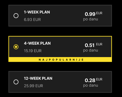
Hi, im making an app for a local gym. I want to make the customer choose a plan via a radio group. The problem is i dont know how i would go about making a radio box like in the attached picture. Any ideas are appreciated.
ps. im new to wappler so maybe i have missed something that would have made my life easier with this problem.
You can customize via css:
First remember having custom CSS file after bootstrap CSS file:
<link rel="stylesheet" href="../bootstrap/5/css/bootstrap.min.css" />
<link rel="stylesheet" href="../css/style.css" />
Then on the code (like this):
<div class="form-group mb-3" id="input1_group" is="dmx-radio-group">
  <legend class="col-sm-2 col-form-label">Some radios</legend>
  <div class="form-check">
    <input class="form-check-input" type="radio" value="" id="input1_1" name="input1">
    <label class="form-check-label" for="input1_1">First radio</label>
  </div>
  <div class="form-check">
    <input class="form-check-input" type="radio" value="" id="input1_2" name="input1">
    <label class="form-check-label" for="input1_2">Second radio</label>
  </div>
  <div class="form-check">
    <input class="form-check-input" type="radio" value="" id="input1_3" name="input1">
    <label class="form-check-label" for="input1_3">Third radio</label>
  </div>
</div>
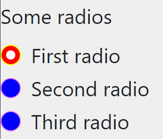
Edit style.css file and add this:
.form-check-input{
    background-color: blue;
    border-color: violet;
}

.form-check-input:checked{
    background-color: red;
    border-color: yellow;
}
You will see this:
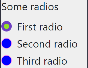
PS: If you want to change the white color (the circule on the middle), just use background: none; and play with borders.
For example:
This:
.form-check-input{
    background-color: blue;
    border-color: violet;

}

.form-check-input:checked{
  background: none;
  background-color: green;
  border: 4px solid white;
  border-color: violet;
}
Will be this:
PS2: Why not?
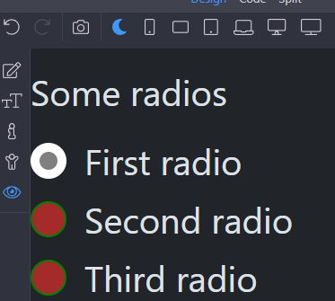
Thanks to @ben explanation, you can also customize the dark mode in case you need it:
Add another rule with [data-bs-theme=dark] before, like:
[data-bs-theme=dark] .form-check-input{
    background-color: brown;
    border-color: green;

}

[data-bs-theme=dark] .form-check-input:checked{
  background: none;
  background-color: grey;
  border: 4px solid white;
  border-color: white;
}
1 Like