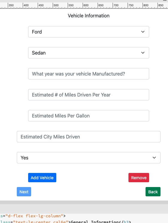
I have a specific question regarding repeat forms and the stylizing of said form. Currently I have set up a repeat form that has several section. For example there is currently a Vehicle section of the form within this section there are 6 questions that are needed to be answered. In addition a user is able to add and additional vehicle. See the below image
I am wondering what the best way to stylize the so that they will be outputted in the following fashion on the return data review page.
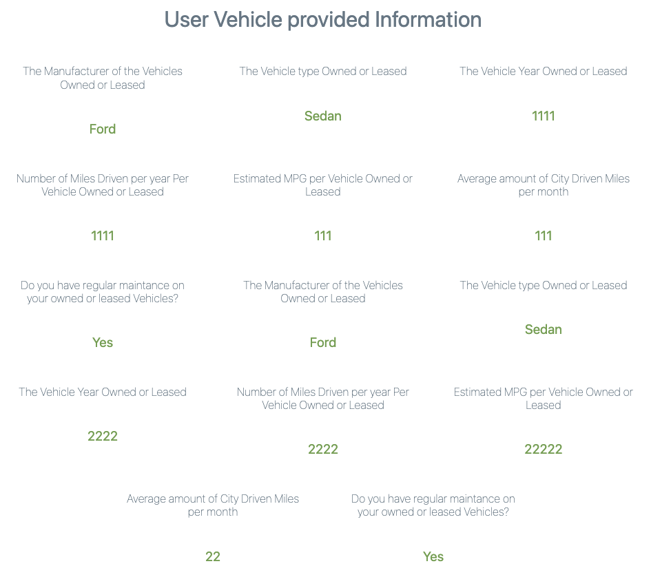
Currently the Vehicle section outputs the review data in the following fashion. The problem is that currently there is no way to differentiate the two vehicles. See the attached image
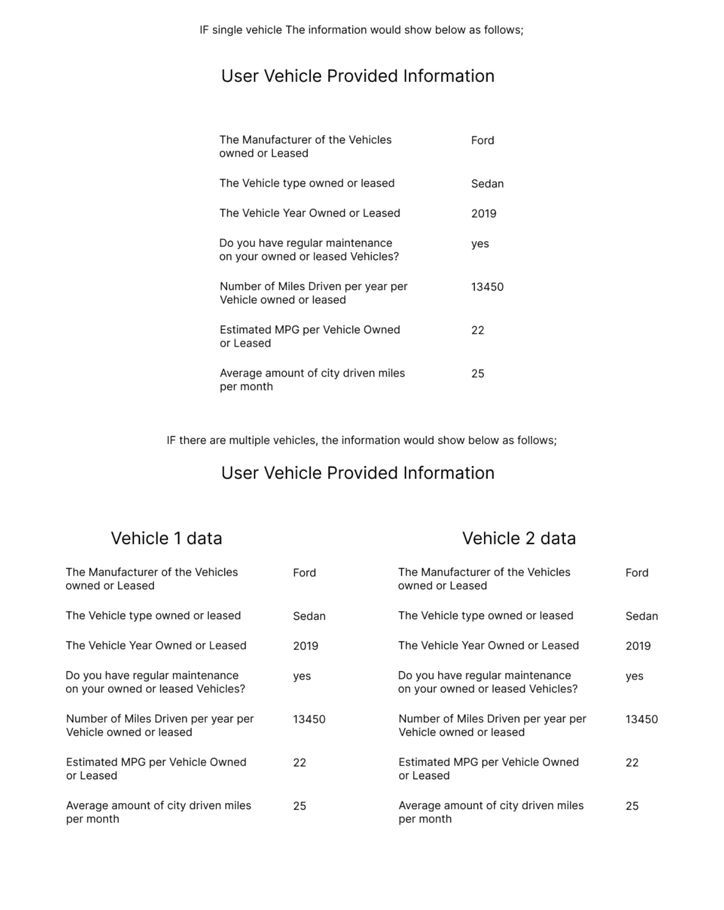
I would like the layout to be shown as the following (I created this layout quickly in figma). If there two or more inputs for review, in the image below there are two layouts.
I did a little research but I have to say I am a little confused as to how to associate the data. I would assume the use of a list element within a div would work. Below is an example that I tried but it did not achieve my desired layout.
Here is an attached zip with the page and its associated CSS. Please note the CSS is not finalized and is only there to semi stylize for testing purposes.
Oh man, i see so many strange things in your page HTML.
From what i understand you want to have one centered column when the repeat returns 1 record and then the column should be 50% wide, if more than 1 record returned.
This can be achieved by using a dynamic class like:
Thats interesting as I worked with Patrick on the code to work out a bug that DMX had when parsing JSON data.
Can you be a little more specific as to what you feel is strange? I would like to simplify this page if I can, and also please note that this page has been updated, changed, and debugged over the last few months to get it to work correctly when working with JSON and an API form sending a list of data.
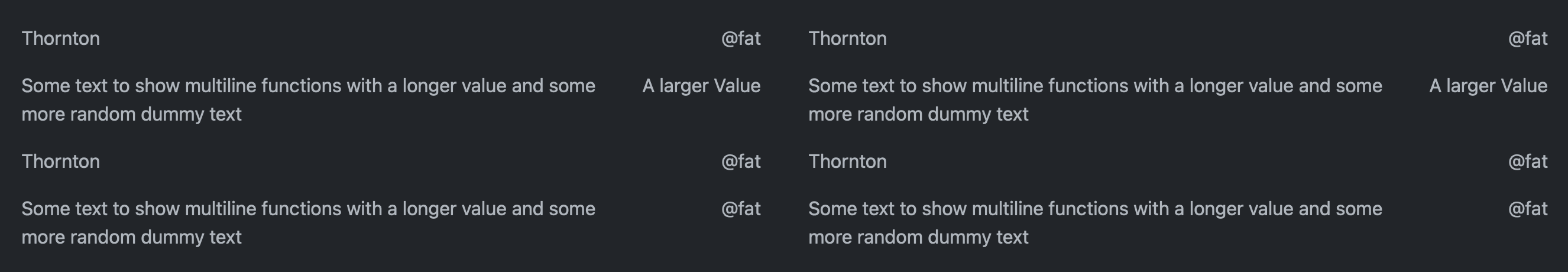
Is this something like what you are trying to achieve? This uses a row and column layout and then inside each column is a table to auto size to the largest value on the right with no wrapping
If the repeat returns one record, it will apply col-12 col-lg-6 offset-lg-3, which means one 50% wide column centered on a large screen size.
If the repeat returns more than 1 record, then it will apply col-12 col-lg-6, which means two 50% wide columns, next to each others on a large screen size.
@Teodor quick question, how can I achieve a title for each column returned record? if one record is returned it will have a H5 called Vehicle 1 data, if more than one record each column would have a header title Vehicle 1 data, Vehicle 2 data, Vehicle 3 data, and so on…?
Your below has the dmx-bind:repeat=“1”. However for me to return the items, I need the bind to stat “carbonCalculator.Vehicles.items” in addtion the id=“VehResponse”. you are stating it should be id=“repeat1”.
How do I account for this as working with Patrick for the data to be stored correctly to make the API call it needs to be shown this way. Unless I am missing something or wrong with would not surprise me.
No your code is totally wrong like that … you can’t put all the HTML i provided in your already bloated HTML. My dmx-bind:repeat="1" was just an example. Just adjust your code per your own design and repeat ID.
I am not sure i am following, sorry.
I provided you a sample code, to achieve what you need, you need the dynamic part of it and adjust it per your code, using your own expressions and IDs.
@Teodor thank you for the help, I was successful in getting the layout to display the data!
One quick question, when applying this as a responsive design for mobile, how would I add to the column segement? As you stated I am trying to avoid bloat.