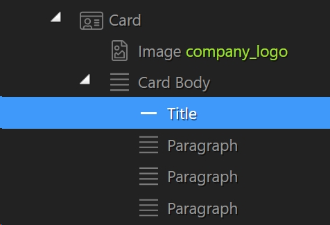
This may not be a Wappler specific question, but I’m having a bear of a time getting my Title and Paragraphs closer to the top of this card body, due to the image causing everything to break to the next line.
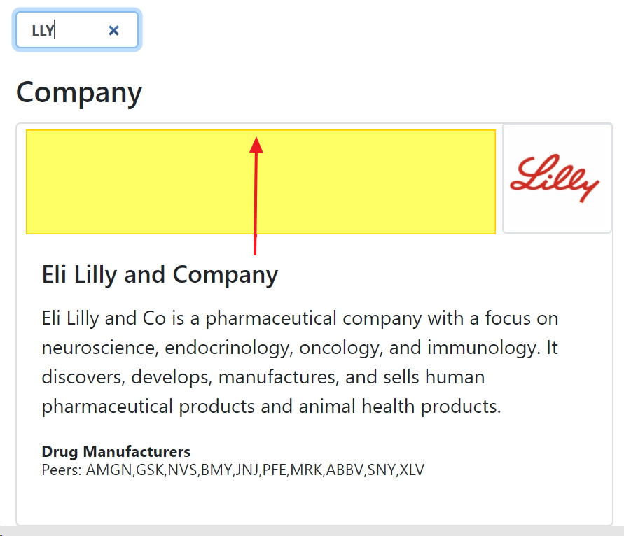
Sorry, I should have been more clear on that. There is no yellow div, that is a highlight box that I added to indicate the region where I want to move the text content. I’ll have a look at using float.
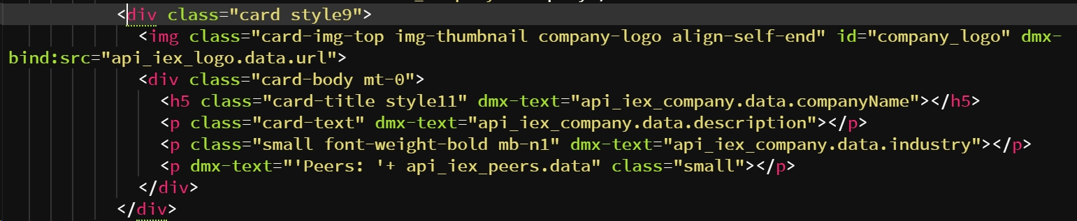
By default the Bootstrap ‘card’ component has a flex direction of column applied so you would need to change that direction to flex-row and also add flex-start:
<div class="card style9 flex-row flex-start" >
You would also need to insert your image into its own container and move the ‘company_logo’ class from the img tag to the picture tag, plus add order-2 so the image appears AFTER the text:
BUT as has been pointed out ‘card’ may not be the most appropriate container.
Your best option would be to use the standard Bootstrap columns structure:
 <div class="container">
 <div class="row">
 <div class="col-md-8 d-flex">

 <div class="col-md-7">
<h4>Your Text</h4>
<p>Your text. Your text. Your text</p>
  <p>Your text. Your text. Your text</p>
</div>

<div class="col-md-5">
 <img class="card-img-top img-thumbnail" id="company_logo" src="">
</div>

 </div>
 </div>
 </div>
If you just apply a float to the image itself I think the text will just flow under the image once/if it exceeds its height ,unless you apply a right- margin to the text or max-length, but Im not sure without testing.