Hi,
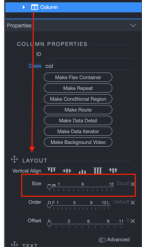
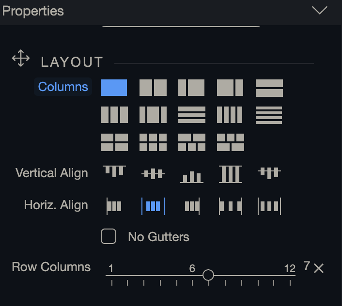
I try to follow this documentation for basic Column Sizing options, but I don’t see it in wappler.
Do you know where I can find it or if it works differently now?
and how you apply to a specific screen size like in the documentation.
It’s super basic but I don’t want to use code for this as I’m pretty sure it’s available in wappler.
https://community.wappler.io/uploads/default/original/2X/f/f99825abe2fe09447e591c35e3eddfdf3d56fa99.jpeg
For screen sizes you start at mobile view set it then advance to your next size where the edit is needed tablet view etc then set it again
1 Like
Switch to the screen size you want to work on and work there:

Note that Bootstrap is a mobile first framework and the styles are being inherited from smaller to larger screens.
Have you had a look at https://youtu.be/zVYweNpRFno
1 Like

