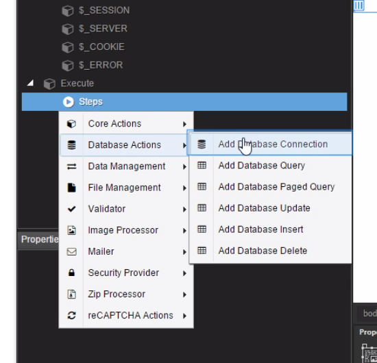
Are the component menus used in Wappler an element of Bootstrap 4 or are they programmed separately and specifically for the app? The reason I’m asking is that I find the classic text menu structuring used in the DMX tutorial videos far more intuitive and less confusing than the relational popup menus (displaying component icons rather than text) used in Wappler.
Soooo… could a future version of Wappler app eventually include a user-select choice of menu style (like Dreamweaver’s Classic, Coder, App Developer, etc.) to accommodate personal preferences?
I agree. I am very happy with wappler so far but the menu really annoys me a bit. It is very counterproductive.
So here are a few suggestions from my side:
Automatic filtering by typing without having to click in the search field
Back button. Not only home as it is now. Navigating through folders would be much faster and easier that way.
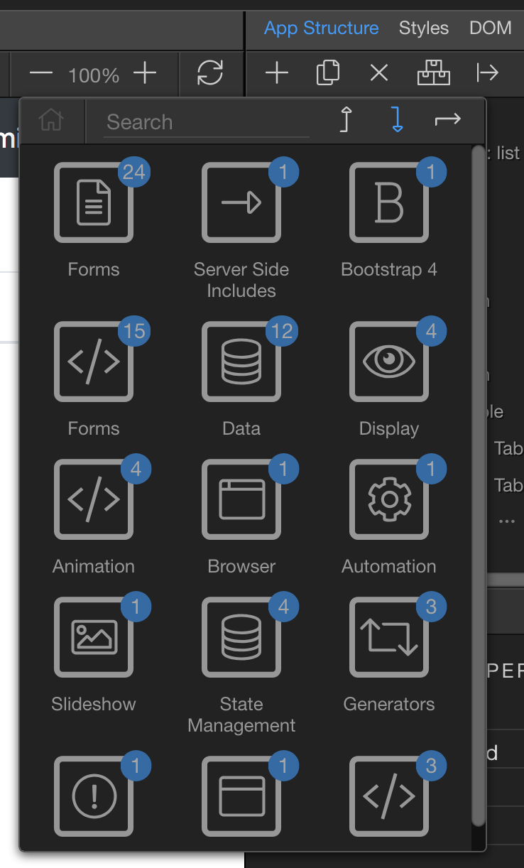
Integrate general commands such as copy, rename or delete. Right now, the item has to be selected in the app structure and then you have to move all the way to the top for the sought action. If you think that one step further: It would be really awesome to be able to select multiple items in the app structure.
In the end it is all about how much clicking and mouse-moving is involved.
Nonetheless a great job has been done so far and I really appreciate it, that there is a possibility for the end user to bring in suggestions.
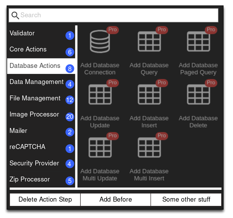
We were already looking on how to improve the insert elements menu so you ideas are very welcome.
I will be posting soon some screenshots of possible layout improvements as well.
The idea is to have like a main category vertical sidebar on the left of the menu and items on the right so it will be more stronger categorized and clear.
This would eliminate the need for a complicated navigation including home or back button. Hovering over the main categories for switching between them is also a possibility.
Only problem would be sub-folders as far as I understand.
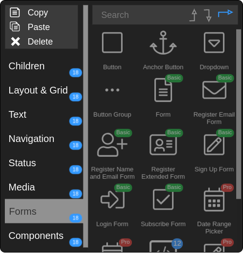
This is what I had in mind when @George said vertical sidebar with items.
Like I already mentioned, it would be great to just hover over the categories to switch. Also automatic search focus as soon as I hit a key.
What makes me a headache is the bottom area with the additional options. I’m not satisfied with that there has to be a better way. But it would be great to implement all options at all time. No matter if I navigate through server actions or in the app structure, all options which are provided in the top bar right now should be accessible through the context menu. Along with the multiple selection option as I also mentioned before.
What came to my mind, is to shrink the search bar to the right. This way different buttons can be positioned on the top left. Like insert after/before and copy, delete etc…
For searching, only up to 5 letters will be used anyway. By then, the right item is already highlighted.
This is my second attempt to integrate general commands in the context menu. This time with the app structure.
I’m still not 100% satisfied with my mockup but I hope my idea has some use to the wappler devs. I don’t know what others exactly would like to see in the new context menu but as far as I’m concerned, it has to reduce the amount of clicks and the distance for the mouse to travel, to achieve commands in a shorter time.
The categories in the left should be 1 line height, maybe prefixed with icons
the actions (copy/paste/delete) has always being in logical to this dialog as they concern the elements selected below in design view and not what you see in the dialog… so maybe we should remove them all together from the insert dialog and provide other means for them directly on the underlinening ui
the insert position (arrows top right) are also a bit weird and people don’t get them at first. So we need to find more logical place for them too
By line height you mean the hight of the actual icons? I like that, it would make the menu a little sleeker. So a maximum of 8 rows could be displayed on the right side.
I get what you mean, app structure has different options than server actions which again have different options than the action steps them self. And then there is the file manager which already has a normal menu integrated. I could think of some sort of keyboard shortcuts as appropriate replacement.
Hm it has to be some kind of toggle since the menu is context sensitive.