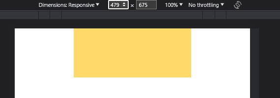
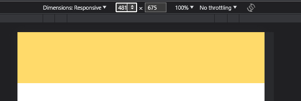
Im using Wappler v5.8.2,
Now I can’t set a specific width of container based on device, when I set 50% width on Mobile it also changed the width in Desktop, how can I solve this problem??
thanks/
Agus
Im using Wappler v5.8.2,
Now I can’t set a specific width of container based on device, when I set 50% width on Mobile it also changed the width in Desktop, how can I solve this problem??
thanks/
Agus
Have a look at
I just don’t get it, I have read and tried this and still have no idea how to implement it.
I just need to accomplish a simple thing, in mobile view, the image width in the container is set to 75%, and in desktop view, the image width is set to 50%. I tried to add a column to the container and try to make it different and it’s just still the same, if change it in a mobile view everything also changes. C’mon, do I have to do this manually using a media query??
The solution is somewhere between your code lines… A forgotten class, a wrong class or a syntax error perhaps.
Please share a screenshot of your structure or even better paste your code here so we can check it.
I’m most interested in the main container that has the width definition AND its parent container
Try
<div class="container-fluid">
    <div class="row">
        <div class="col-9 col-lg-6">
            <img src="https://placekitten.com/640/360" class="img-fluid">
        </div>
    </div>
</div>
Hi @agusramadona,
You can try the bootstrap breakpoints, something like this:
<div class="container">
  <div class="row">
    <div class="col-9 col-sm-6">Set col width @ 50% for screen size >= 576px, otherwise set col width to 75% of the screen size.
       <img>
    </div>
  </div>
Well, there are two ways you can handle that, bootstrap breakpoints like Shalabh says, and custom rule, which is precisely what the browser expects.
.style1 {
    width: 100%;
}
@media (max-width: 480px) {
    .style1 {
       width: 50%;
    }
}

