Can a Modal be excluded from phone screen display

Hi, I was playing around learning to use Modals this AM.

It works great but when testing it via my phone display I feel like it is too much info for a small screen.

Is there a way to keep it from displaying at all on a small phone screen. But still have it surface on all other size screens?

I have it coming up when the user does a mouse over on area of the screen (on touch screens when the user touches an area of the screen).

Not tried this but maybe a conditional based on viewport which you can access via the browser app.

Maybe it’s not a great idea to have the modal open on mouse over/touch area, but activate it using a regular button.
Then just hide the button on small screens.

1 Like

That is a great idea - thanks

Now I just need to figure out how to put a very small question mark “button” in a very precise location on my page :slight_smile:

Have you tried using the experimental Design Panel?

Yes, it is really nice - but not sure how it would help with what I’m trying to do :sos:

Make sure your page has the browser component added already which it probably does.

Click your button you want to hide and go to dynamic attributes. Display. Hide. In the condition choose browser1.viewport.width >= 768px

I get easily confused with less than or greater than so you are trying to say hide button when view port width is less than or equal to 768px wide or any number you choose

1 Like

Yes @psweb, we noticed :wink:

Easier - you can use the display property in app connect panel to hide it on phone size. No need to complicate the task with an additional component :slight_smile:

Thanks to everyone - I'm getting closer - but yet so far to go :slight_smile:
2018-09-25_10-04-55

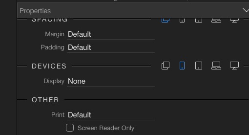
Like @Teodor said. There is actually an easier way. Just select the button. Turn off the dynamic attribute I spoke about earlier. Look in the normal properties for the display section and click the phone icon. Then choose none.

1 Like

Yes, I tried it that way but when I do that it always disappears - so I must be doing something wrong. And when it does go away - it causes elements on my page to move and messes up the alignment.

But I do appreciate all the help :slight_smile:
2018-09-25_11-00-14

You should select display option for each screen size :slight_smile:

1 Like

Ahh I see that makes sense. It is default bootstrap behaviour. Mobile first. So click phone and say none like you have which will make Mobile and all larger none then click tablet and say display block which will make tablet and all up from that block which means tablet laptop and computer. I think, sorry not in front of wappler right now.

Yay - it is working! - BTW, I had to set display ALL to none, phone to none - and everything beyond bigger to block.

You guys are the best - now I can take a break long enough to shower :wink:

3 Likes