Calendar Layout on Mobile Devices

Hi all,

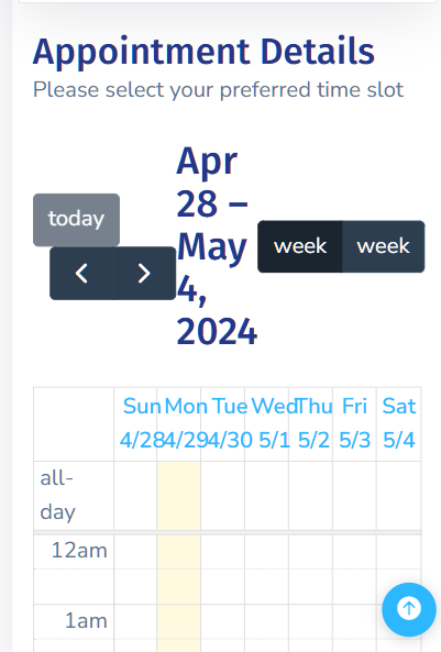
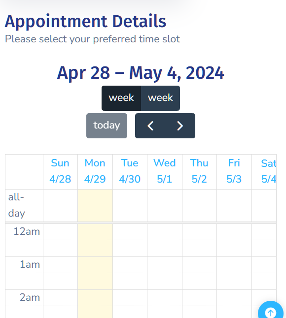
I’m working on a booking system and it’s all flying along, however when testing on mobile I see the header toolbar is breaking the layout and looks awful. Here’s what I’m looking at on a sample screen size of 360x640

I’ve looked all over the place to try and find out how I can get the date range header text resized and on another line above the toolbar buttons instead of the header text being in between them.

Time to get the big guns on it now, does anyone have any ideas…?

You can do something like:

@media (max-width: 767px) {
  .fc-toolbar.fc-header-toolbar {
    display: flex;
    flex-direction: column;
  }

  .fc-toolbar.fc-header-toolbar .fc-toolbar-chunk:nth-child(1) {
    order: 2;
  }

  .fc-toolbar.fc-header-toolbar .fc-toolbar-chunk:nth-child(2) {
    order: 0;
    margin-bottom: 0.25rem;
  }

  .fc-toolbar.fc-header-toolbar .fc-toolbar-chunk:nth-child(3) {
    order: 1;
    margin-bottom: 0.25rem;
  }
}
1 Like

Perfect…!

Thanks for that @Teodor there’s no way Id have gotten that particular one myself, I had no idea about that ‘chunk’ element.

Me neither :slight_smile: i just inspected the calendar in the dev tools.

1 Like