But when page loads, the width returned by browser1.viewport.width is 600+, even thought the actual viewport is just 425.
Checking the viewport on dev console using window.innerWidth and window.outerWidth correctly returns 425.
In this state, if I scroll the page, the value from browser1.viewport.width changes to 425.
Diving into the issue, we could identify the issue to be because of the size of binding text on page.
Here is a simple content page, created on a fresh project in 5.5.1
The problem here is {{browser1.viewport.width+''+browser1.viewport.width}}.
Because this binding’s text is bigger than 425 in width, before AppConnect parses this binding, the viewport width in browser component gets recorded incorrectly.
We have many such large bindings on the page - {{scGetPageInfo.data.qInformation.dataJson.xxx.yyy..}}.
We have numerous images and videos on this app which are dependent on the viewport value to render correct responsive media… and its broken because of this.
We hadn’t noticed this until we had to change a video yesterday, and we did not see the mobile version playing.
Expected solution is to get the correct viewport from the browser component irrespective of the content on page.
Not sure why it is returning the wrong sizes. I was able to reproduce it and it seems that with DOMContentLoaded event the size of window.innerWidth is wrong. I’ve added 2 new update triggers, one directly after DOMContentLoaded event and the load event.
Here the updated browser component: dmxBrowser.zip (1.6 KB)
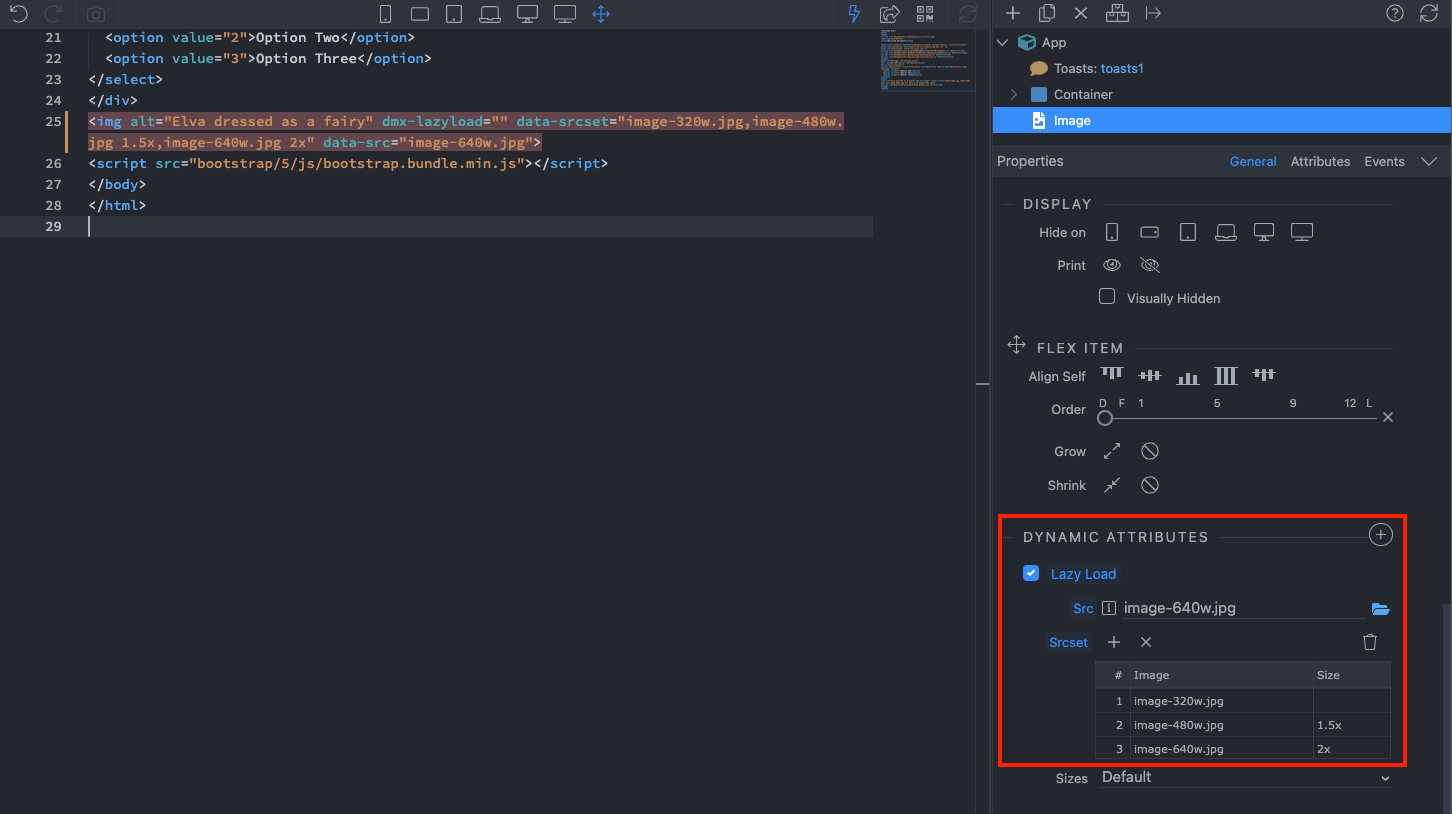
I think I have read about the src-set option somewhere, but have never used it.
In our case, the path of the images contain the breakpoint as a folder - /tour/hero/xl/abc.jpg or /tour/hero/lg/abc.jpg
This has been just the way we configured images early-on. And now there is another layer of Gumlet CDN on top to further optimize the images based on width on screen.
I am not sure if/when can we switch to the src-set method, but that definitely looks like a much efficient way of handling responsive images.
CC: @psweb
srcset is now supported by all major browsers, so the lazyload component won’t be required for it. Maybe we should just move it under the general image properties
A side note on lazy load component: it sort of sucks.
Using Gumlet CDN made me realize how accurate and great the lazy load setup works there. The library used by Wappler loads images that are not in view or are below the fold. Not sure what the logic is - but Gumlet does not load any image unless that section becomes visible.
It could be argued that pre-loading some content before the user scrolls could be better UX, but because this is a CDN service, images loads lightening fast.
If there could be an option to set the loading style on lazy load, it would be cool.
Detects any visibility changes on current and future lazyload elements in any web environment automatically : The script works as an universal, self-initializing, self-configuring and self-destroying component and detects any changes to the visibility of any current and future image/iframe elements automatically no matter whether it becomes visible through a user scroll, a CSS animation triggered through :hover or through any kind of JS behavior (carousel, slider, infinite scroll, masonry, isotope/filtering/sorting, AJAX, SPAs…).
Intelligent prefetch/Intelligent resource prioritization : lazysizes prefetches/preloads near the view assets to improve user experience, but only while the browser network is idling (see also expand , expFactor and loadMode options). This way in view elements are loaded faster and near of view images are preloaded lazily before they come into view.
so it’s kind of smart preloading of images that are near the view


