Browser Component list of available objects?

I know we have this article Browser Component-Can we have detailed documentation? and @TomD’s excellent response to it. Do we have any further information on what is available through the Browser Component?

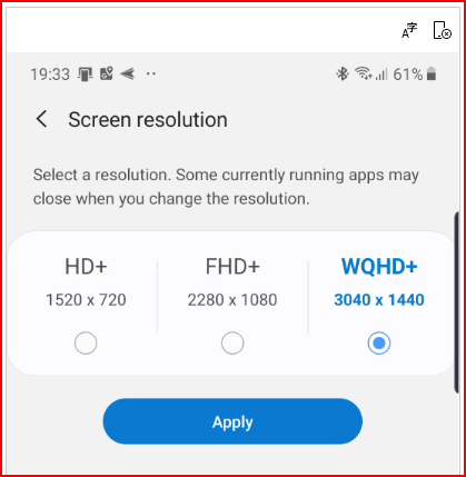
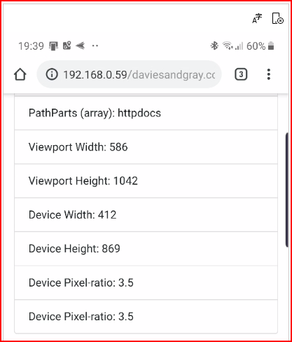
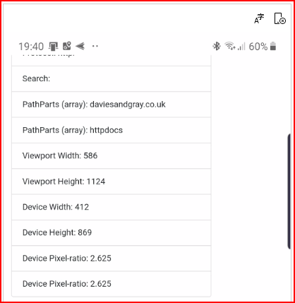
On a web page I want to be able to tell if the device being used is definitely a phone (iPhone or Android), or a tablet, or a desktop machine. Working with viewport.height or device.height is not good enough because my new phone, for instance, can be 3040px x 1440px which is bigger and better resolution than my desktop machine! The only thing I can find is the pixelRatio. A desktop machine always seems to be 1:1 whereas mobile devices are almost always something other than 1:1. Is there anything else that can be used?

To detect the device in most cases the userAgent is being checked, I believe you could detect mobile with {{ browser1.userAgent.contains('Mobile') }}.

S10?

I believe it should report a viewport of 360 x 760 PX rather than the screen resolution? Can’t test, i just have a poor man’s S8+

I still have my Galaxy S8+ but my new one is an Galaxy Note 10+ 5G !!! So happy to have a Note again, it’s been too long :smile:

image

Gives…

image

BUT if I change to 2280 x 1080, I get this…

image

Strange!

Interesting

My believe my S8+ should report 1440 x 2960 px with a pixel ratio of 4

This results in an effective viewport of 360 x 740 (resolution divided by ratio)

Unfortunately the pixel density is not reported by the Browser component, only the pixel ratio which for the S8+ is 2.625

This means you can recalculate the viewport as approx 322 x 156 I think however this is not my area of expertise.

1 Like
2 Likes