Wappler Version : 5.3.1
Operating System : iPadOS (15.5)
Server Model: NodeJS
Was testing an app’s responsiveness on iPad Pro and found that one of dynamic class toggle was not working. The condition is set to browser1.device.width > 991.
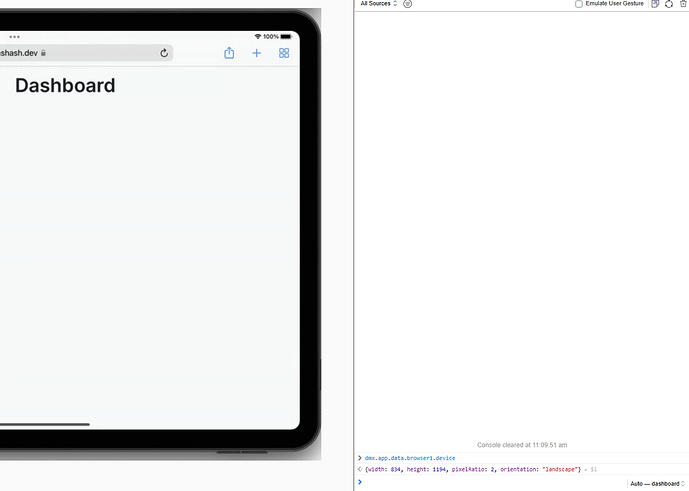
Using dev tools on an iPad simulator, I found that the browser component is showing incorrect height and width.
The orientation is shown correctly as landscape though.
The issue is in both Safari and Chrome on iPad (because of same engine in code probably).

