very simple question. I am using Bootstrap 5 and I am currently exploring how the theming workflow works within wappler.
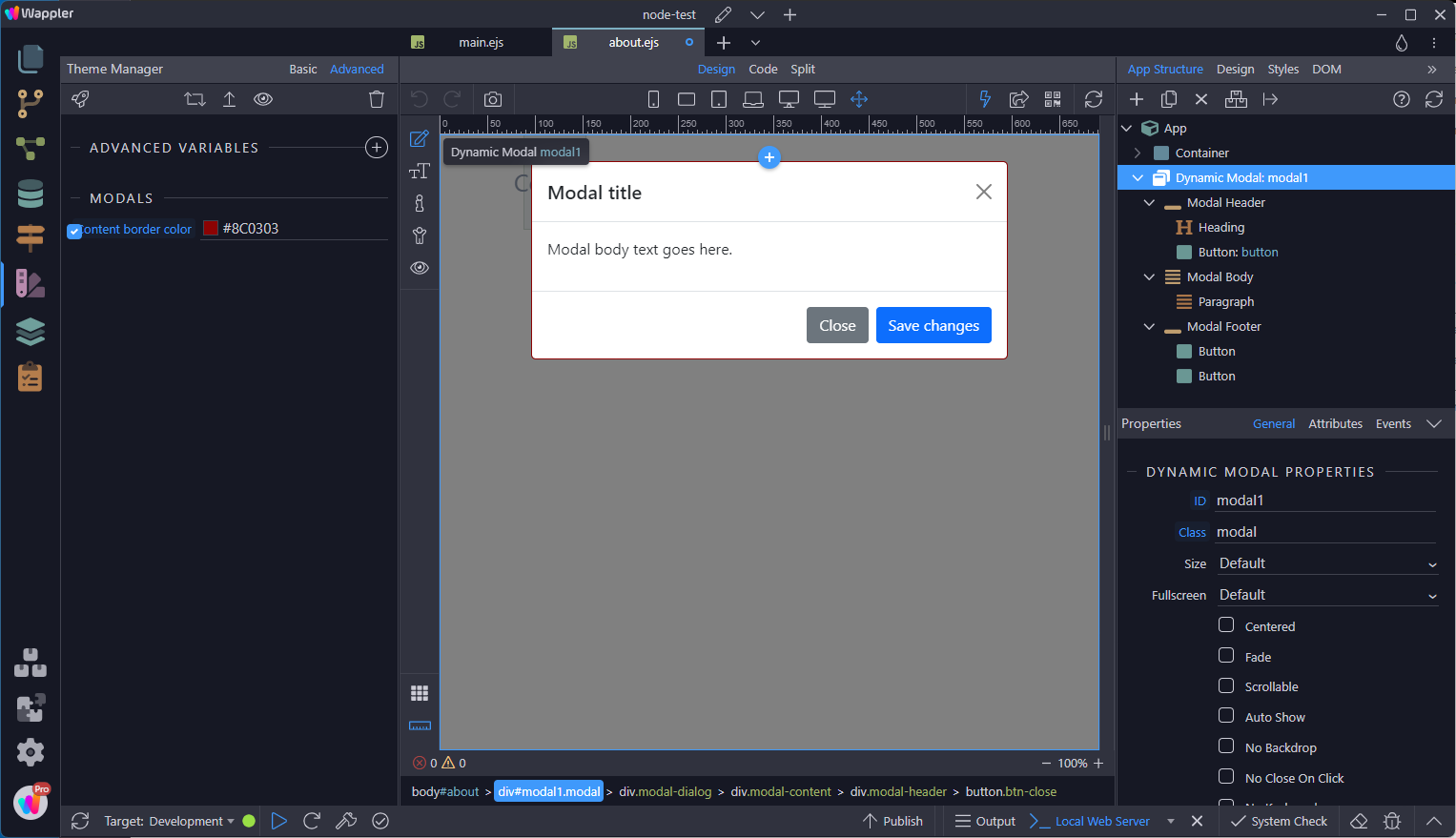
With Theme Manager I can set my basic colors and Advanced Theme Manager will show me very specific colors. Very nice work, by the way. In my case I have implemented e.g. a modal, which has a header (color: $border-color) and footer ($modal-header-border-color) border.
How would I deal with the border color variable, since it will be globally applied?
Where would I change $border-color with my Theme Manager? I have looked at my right window at “Styles” (next to DOM), where I do see a lot of bootstrap variables. I don’t think I want to touch those or edit any of the Bootstrap 5 files. I assume there is a place, where I can edit/override such a variable?
I know I can add my own custom.css file. Would it also be possible to add a custom.scss file, without having to install a converter? Not sure yet, if I will need a custom.css file, since I will make use of your Theme Manager (everything organized).
How would I add extra color with Theme Manager in an organized way, so I can apply those in special cases?:
The close button of my modal for example has the color: #000 (.btn-close > with Bootstrap file). How would I change this color? Do I need to change this within my own custom.css file and use !important or is there a better way?
I do know how to apply my own css. I am asking these questions to get a better understanding about best approach and workflow within Wappler.
Besides changing the colours in the Theme Manager, the only way to override the variables is in an overriding style sheet.
In a style sheets
No go! Only through a style sheet.
Having said that, I suppose you could include a Sass compiler as I did prior to the introduction of the Theme Manager. But this is a pain in the neck.
PS: Looking back over what I have written, it looks like I am very positive of what I call my facts. The opposite is true. These are my findings and they can be open for discussion.
There is a property in Wappler theme manager advanced called “theme colours”.
You can use this to add more colours.
I am on mobile so don’t have the exact syntax to share.
The colours added here, become available in all BS classes automatically.
For eg: if you add green-100 to theme colours, then classes bg-green-100, text-green-100 etc are generated automatically.