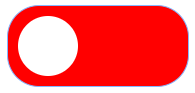
How can I make a bootstrap switch like the image in wappler.
green when on and red when off.

How can I make a bootstrap switch like the image in wappler.
green when on and red when off.
The closest that I have gotten so far is

by adding the following style rules:
.form-check-input {
    background-color: red;
    border-color: red;
    padding-bottom: 5rem;
    padding-left: 11.25rem;
}

.form-check-input:checked {
    background-color: green;
    border-color: green;
}

.form-switch .form-check-input {
    background-image: url("data:image/svg+xml,%3csvg xmlns='http://www.w3.org/2000/svg' viewBox='-4 -4 8 8'%3e%3ccircle r='3' fill='white'/%3e%3c/svg%3e");
}

.form-switch .form-check-input:focus {
    background-image: url("data:image/svg+xml,%3csvg xmlns='http://www.w3.org/2000/svg' viewBox='-4 -4 8 8'%3e%3ccircle r='3' fill='white'/%3e%3c/svg%3e");
    -moz-box-shadow: none !important;
    -webkit-box-shadow: none !important;
    box-shadow: none !important;
}
If you want it to be exactly the same as you have shown, a new background image will have to be created and the corners will need a different radius.
If you want to show the text on and off, use the following style rules:
.form-check-input {
    background-color: red;
    border-color: red;
    padding-bottom: 5rem;
    padding-left: 11.25rem;
    position: relative;
}

.form-check-input:after {
    position: absolute;
    left: 50%;
    top: 5%;
    content: "off";
    color: white;
    font-size: 3rem;
}

.form-check-input:checked {
    background-color: green;
    border-color: green;
}

.form-check-input:checked:after {
    left: 20%;
    content: "on";
}

.form-switch .form-check-input {
    background-image: url("data:image/svg+xml,%3csvg xmlns='http://www.w3.org/2000/svg' viewBox='-4 -4 8 8'%3e%3ccircle r='3' fill='white'/%3e%3c/svg%3e");
}

.form-switch .form-check-input:focus {
    background-image: url("data:image/svg+xml,%3csvg xmlns='http://www.w3.org/2000/svg' viewBox='-4 -4 8 8'%3e%3ccircle r='3' fill='white'/%3e%3c/svg%3e");
    -moz-box-shadow: none !important;
    -webkit-box-shadow: none !important;
    box-shadow: none !important;
}
Hi Ben… Thanks for helping me out…
I have added the styles to my custom.css,mad a form and added a switch, but sadly it dont work…
I must be missing something…
this is the form:
    <div class="row">

        <div class="col">

            <form id="form1">

                <div class="form-group">

                    <legend class="col-sm-2 col-form-label">One switch</legend>

                    <div class="custom-control custom-switch">

                        <input class="custom-control-input" type="checkbox" value="" id="input1" name="input1">

                        <label class="custom-control-label" for="input1">Single switch</label>

                    </div>

                </div>

            </form>

        </div>

    </div>

</div>Change the above to
                <div class="form-check form-switch">
                    <input class="form-check-input" type="checkbox" id="flexSwitchCheckDefault">
                </div>
You can change the ID and add a name for the input.
Hi Ben… Sorry, but it gives me an normal checkbox, that turns blue when selected, and not a red/green switch.
My custom…css is loaded last, so this I think, should be correct.
This is the code for the full document:
<!doctype html>
<html>

<head>
    <meta name="ac:base" content="/test-php">
    <base href="/test-php/">
    <script src="dmxAppConnect/dmxAppConnect.js"></script>
    <meta charset="UTF-8">
    <title>Untitled Document</title>
    <link rel="stylesheet" href="https://stackpath.bootstrapcdn.com/font-awesome/4.7.0/css/font-awesome.min.css" integrity="sha384-wvfXpqpZZVQGK6TAh5PVlGOfQNHSoD2xbE+QkPxCAFlNEevoEH3Sl0sibVcOQVnN" crossorigin="anonymous" />
    <meta name="viewport" content="width=device-width, initial-scale=1, shrink-to-fit=no">
    <link rel="stylesheet" href="https://cdn.jsdelivr.net/npm/bootstrap@5.0.0-beta3/dist/css/bootstrap.min.css" integrity="sha384-eOJMYsd53ii+scO/bJGFsiCZc+5NDVN2yr8+0RDqr0Ql0h+rP48ckxlpbzKgwra6" crossorigin="anonymous" />
    <style>
        .form-check-input {
            background-color: red;
            border-color: red;
            padding-bottom: 5rem;
            padding-left: 11.25rem;
            position: relative;
        }

        .form-check-input:after {
            position: absolute;
            left: 50%;
            top: 5%;
            content: "off";
            color: white;
            font-size: 3rem;
        }

        .form-check-input:checked {
            background-color: green;
            border-color: green;
        }

        .form-check-input:checked:after {
            left: 20%;
            content: "on";
        }

        .form-switch .form-check-input {
            background-image: url("data:image/svg+xml,%3csvg xmlns='http://www.w3.org/2000/svg' viewBox='-4 -4 8 8'%3e%3ccircle r='3' fill='white'/%3e%3c/svg%3e");
        }

        .form-switch .form-check-input:focus {
            background-image: url("data:image/svg+xml,%3csvg xmlns='http://www.w3.org/2000/svg' viewBox='-4 -4 8 8'%3e%3ccircle r='3' fill='white'/%3e%3c/svg%3e");
            -moz-box-shadow: none !important;
            -webkit-box-shadow: none !important;
            box-shadow: none !important;
        }
    </style>
</head>

<body is="dmx-app" id="junk">
    <div class="container">
        <div class="row mt-4">
            <div class="col">
                <div class="form-check form-switch">
                    <input class="form-check-input" type="checkbox" id="flexSwitchCheckDefault">
                </div>
            </div>
        </div>
    </div>
    <script src="https://cdn.jsdelivr.net/npm/bootstrap@5.0.0-beta3/dist/js/bootstrap.bundle.min.js" integrity="sha384-JEW9xMcG8R+pH31jmWH6WWP0WintQrMb4s7ZOdauHnUtxwoG2vI5DkLtS3qm9Ekf" crossorigin="anonymous"></script>
</body>

</html>
And this is it working:
junk
Thanks Ben… got it working now… one last thing… How do I size the switch… its Huge…
Change these values.