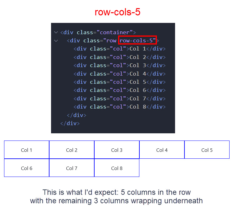
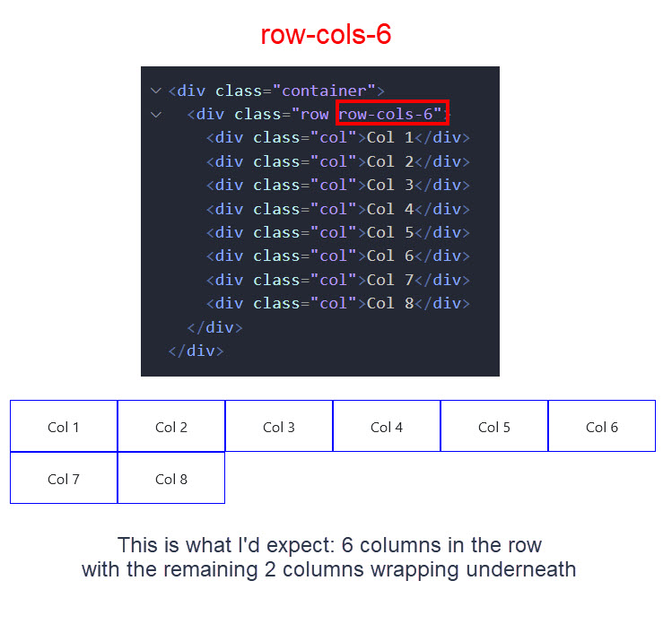
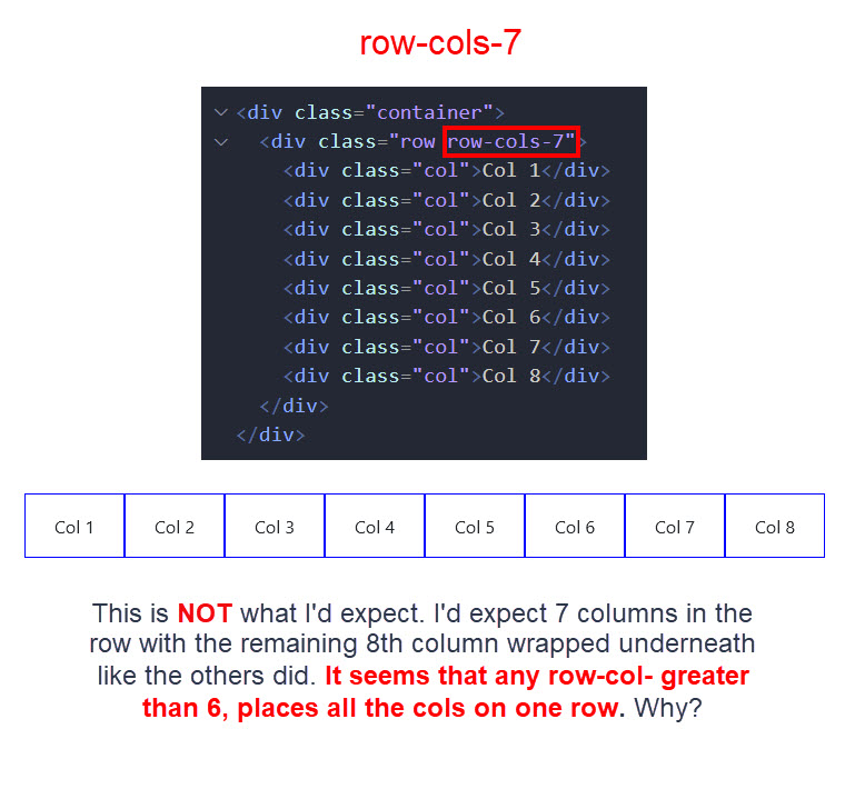
Hi, I’ve checked on the web but can’t find an answer to Bootstrap’s row-column classes, so I’ll try here. Why doesn’t row-col-7 (for instance) create 7 columns and wrap the remaining columns underneath? It seems row-col-(7-12) don’t do anything? Thanks
I just checked Bootstrap 5 code and noticed they only have classes defied for up to 6 columns, see here:
Checking the Bootstrap Docs, they don’t mention anything about limiting the row columns: https://getbootstrap.com/docs/5.1/layout/grid/#row-columns
which makes me wonder why are these classes limited to 6 then?
2 Likes
You can try creating your own classes in your custom CSS file like:
.row-cols-7 > * {
  flex: 0 0 auto;
  width: 14.2857142857%; /* 100/7 */
}
.row-cols-8 > * {
  flex: 0 0 auto;
  width: 12.5%; /* 100/8 */
}
...etc.
which should be working fine for your purposes 
3 Likes
Ahh, good thinking, Teodor. I should have checked the bootstrap css.
I spent hours this morning trying to find info on this including skimming lots of 'how to' videos. They didn't demonstrate anything over 6 columns and nobody mentioned a limit. Because of that and seeing Wappler's Row-Column slider has the option to go up to 12 columns, I assumed there must be something I was missing.
As an aside:
Since Wappler's Row-Column slider goes up to 12 columns, I wonder if it's worth thinking about adding additional bs classes to cover row-column classes from 7-12? e.g.
.row-cols-7 > * {
flex: 0 0 auto;
width: 14.2857142857%;
}
This would have a similar effect as duplicating columns in the App Structure panel but at least it would expand this row-column method across the entire column range and reduce confusion. If the idea isn't rejected here, I might put it forward as a feature request.
(EDIT: just saw your second post, Teodor)