Bootstrap 4 framework layout question

Ok going to really show my ignorance now, but i really just can not figure this one out

I have 5 columns in my footer in a Container > Row > Column layout
If I use this code

<div class="container">
  <div class="row">
    <div class="col">Text 1</div>
    <div class="col">Text 2</div>
    <div class="col">Text 3</div>
    <div class="col">Text 4</div>
    <div class="col">Text 5</div>
  </div>
</div>


This screenshot is how it looks with the above code in place, and is how i would like it to remain. This is the xl version @ 1200px wide


This screenshot is how it looks in the lg version @ 992px wide and I am happy with it.


This screenshot is how it looks in the md version @ 768px wide and I would rather change it’s layout a little


This screenshot is how it looks in the sm version @ 576px wide and i would rather change it’s layout


This screenshot is how it looks in the col- version that used to be knows as xs @ 400px wide and i would rather change it’s layout.

It seems like this should be fairly simple, but because it is 5 columns obviously there is no division that will work with the 12 column layout, I start off with the mobile first approach here, and here is my code

<div class="container">
  <div class="row">
    <div class="col-6 col-md-4 col-lg">Text 1</div>
    <div class="col-6 col-md-4 col-lg">Text 2</div>
    <div class="col-6 col-md-4 col-lg">Text 3</div>
    <div class="col-6 col-md-4 col-lg">Text 4</div>
    <div class="col-6 col-md-4 col-lg">Text 5</div>
  </div>
</div>


I am happy with this @ 400px wide


I am happy with this @ 576px wide


At md it now takes the col-md-4 instruction from 768px wide and up

Now here is where my concern is col-lg NOT col-lg-auto gives me the result i want for lg and xl as per these 2 screenshots, so all from 992px and up look like what i want


992px wide


1200px wide

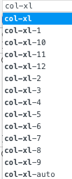
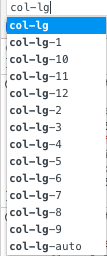
Wonderful, but if I look at the Botstrap 4 docs I can not find mention of col-lg being an allowable class, if i look at google chrome browsers inspect it is available in their list
17 47

Firstly, can i use col-lg as I have, and secondly can anybody direct me to the Bootstrap 4 docs that might talk about this class and its possible differences of col-lg and col-lg-auto so I can understand why one looks great and the other does not.

Hey Paul,
I can’t understand what you really are trying or asking - but please check the bs4 docs related to the grid: http://getbootstrap.com/docs/4.1/layout/grid/

I am trying to ask if col-lg and col-xl are actually real allowed classes, I can see reference to
col-lg-1 col-lg-2 col-lg-3 col-lg-4 col-lg-5 col-lg-6 col-lg-7 col-lg-8 col-lg-9 col-lg-10 col-lg-11 col-lg-12 and col-lg-auto but i can not find just col-lg

So can i use just col-lg all by itself just like that as a real class and what is the difference between col-lg and col-lg-auto because they make my layout look quite different.
I just cant seem to find that usage case in the docs

Yes as you can read in the bootstrap 4 docs col-lg and col-xl are valid values indeed.

This responsive design will get so much easier in the next Wappler update :star_struck:

3 Likes

I am having some similar issues with sizing, particularly in relation to text size. I confess knowing changes were coming i have left that part of the site for the moment and will come back to it after next update.

@psweb, I believe that col-lg is nothing other than col-lg-auto. By saying col-lg, you are really say, at large screen: Column. But what size column? 1 column width? 12 columns width? Well, you didn’t say, so it is auto. Where col-lg-1 is saying on large screens and up: Column at 1 column width. Does that make sense?

I don’t know if I’m answering your final question or not. But I think I am. I might also be drunk and not actually typing on my laptop. I could just be typing on the sink while I am sitting on the toilet. But, better men than I have solved that riddle.

2 Likes

Hit enter and listen for a flushing sound :grinning:

1 Like

Haha, well I have to admit i tried col-lg-auto thinking it was the same as col-lg without reference to any size and it certainly is different.
I was only concerned because i could find no reference to it in the Bootstrap 4 docs, but maybe i just have not looked hard enough.

Okay, now I’m on my real laptop. Surprised you got that message.

I stand corrected. I was thinking of power chords on a guitar and not bootstrap. It happens.

So here is my understanding:

Col-lg will stack anything below large (below laptop) and keep them inline for the most part if large or bigger. So two columns at col-lg will show them half width each. On tablet, it will show them stacked.

col-lg-auto will make the columns adjust based on what is inside the column, how wide it is, etc… So a title inside a column at default, might make the column 4 wide or something and the other will be 1 wide. Add a title to the second column and it too will be 4 columns wide (or so. Estimating width.)

I’m double checking my Bootstrap Dictionary (bathtub) to see if I’m right. Man, I never should have drunk those wine coolers. lmao.

Adding: Stay away from col-lg-auto. It is like a bad mood.

1 Like

I want a system where i never have to play front-end design ever, I really only enjoy the server side stuff to be honest, i like making things function and not making things pretty, look forward to whats to come, very excited.

1 Like

Thanks Chad, I was quite concerned I was just making up my own Bootstrap 4 class names and somehow they were working, I still have not found mention of col-lg all by itself like that, but if George says that is valid then in my head from now on it is valid, so I am happy.

I think people have the opposite problem with me explaining things than most other people, everyone else underexplains and i overexplain everything an make my questions a little confusing.

I will try avoid telling people what I had for breakfast to start off my explanations in future.

Regina: “Chad, I thought you said you met Paul three months ago?”
Chad: “Yeah, I did, so what?”
Regina: “Then why is he still introducing himself?”
Chad: “He hasn’t finished yet.”

3 Likes

@psweb wouldnt grid css exactly do that? You can just arrange and modify your layout without touching again your divs…

This worked out well in the end thankfully. My entire concern was that I was using an invalid class even though it was working. CSS Grid would have worked too as you say however this layout landed up being quite complicated and I kept breaking my App Structure so badly I was getting very confused. Thanks though, I am going to be redoing this layout at some point anyway to showcase it so you will see why I had to do it like this soon.