Introduction
Use Bootstrap’s JavaScript modal plugin to add dialogs to your site for lightboxes, user notifications, forms or completely custom content.
How it works
Before getting started with Bootstrap’s modal component, be sure to read the following.
- Modals are built with HTML, CSS, and JavaScript. They’re positioned over everything else in the document and remove scroll from the so that modal content scrolls instead.
- Clicking on the modal “backdrop” will automatically close the modal.
- Bootstrap only supports one modal window at a time. Nested modals aren’t supported as we believe them to be poor user experiences.
- Modals use position: fixed, which can sometimes be a bit particular about its rendering. Whenever possible, place your modal HTML in a top-level position to avoid potential interference from other elements. You’ll likely run into issues when nesting a modal within another fixed element.
- Once again, due to position: fixed, there are some caveats with using modals on mobile devices.
- Due to how HTML5 defines its semantics, the autofocus HTML attribute has no effect in Bootstrap modals.
Creating the Modal
Positioning the modal is of utmost importance as per point 4 above. An Ideal placement would be after the last top-level element in the App Connect structure. Often this will be after the <footer>.
When using the NodeJS model, the modal can be placed in the page where it needs to be shown. If the modal needs to be shown throughout the site (e.g. login modal), the modal needs to be placed in the NodeJS Layout Page or, in the case of a PHP Single Page App (SPA), this needs to be placed in the index page.
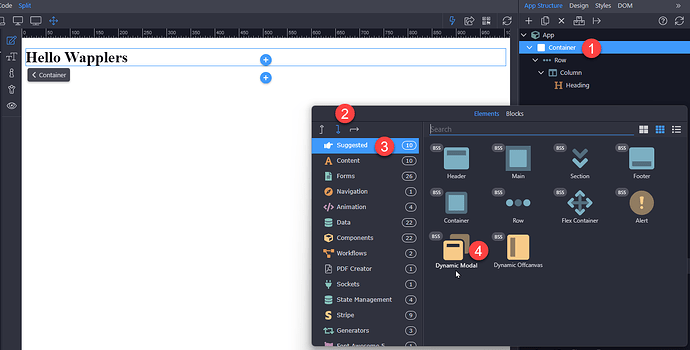
- Right click the last top-level element in the document.
- Make sure to place the modal after the selected last top-level element.
- Choose Suggested
- Select the Dynamic Modal
If you require multiple modals for the same document, add any additional modals following the above procedure.
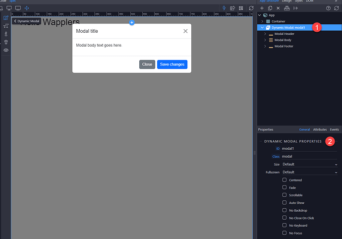
In order to be able to see the modal in Design view and add content in it, just select it in the App Structure (1). You can see the modal properties in the properties inspector (2).
Modal Components
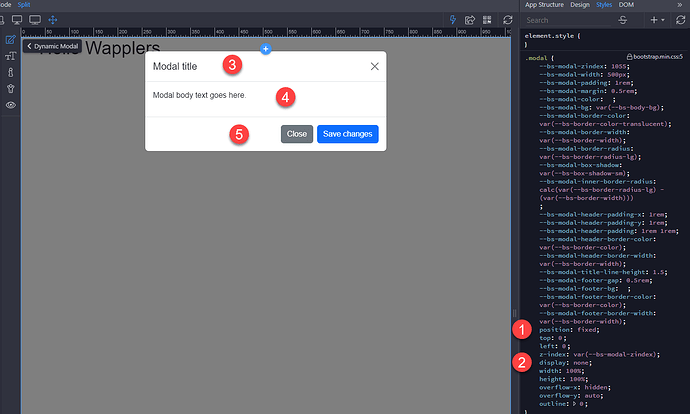
Below is a static modal example (meaning its position (1) and display (2) have been overridden). Included are the modal header (3), modal body (4) (required for padding), and modal footer (5) (optional). We ask that you include modal headers with dismiss actions whenever possible or provide another explicit dismiss action.
Modal Title
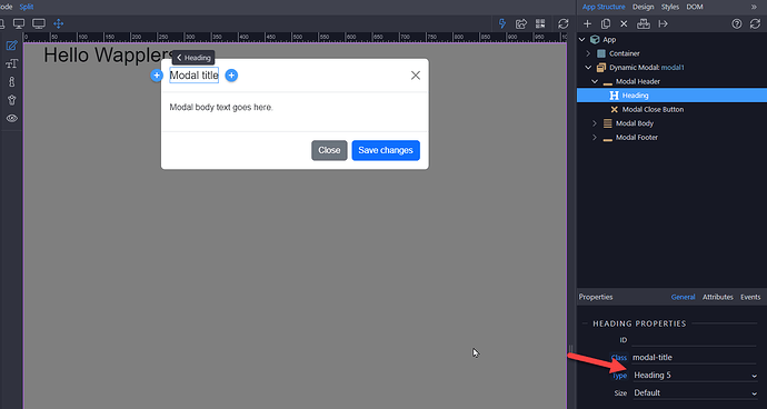
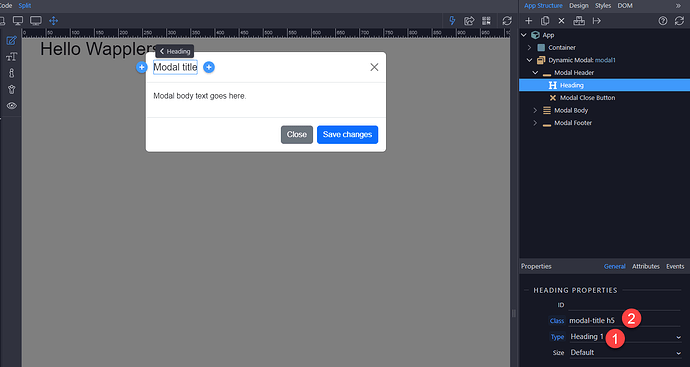
This Wappler example uses a <h5> for the modal title. Structurally, however, a modal dialog represents its own separate document/context, so the .modal-title should be an <h1>.
This is what the correct structure should look like: An <h1> (1) with the font-size-utilities, .h5 (2), to control the heading's appearance.
Modal Body
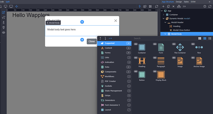
Add elements in the modal body, by right clicking Modal Body in App Structure.
You will see the components you can add inside, any item in the context popup. Just add whatever you need inside the modal.
Modal Footer (optional)
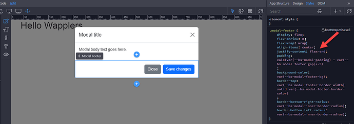
As is the case with the modal header, the modal footer is a flex-container. However, the modal footer has its content justified to .flex-end, meaning that the content (buttons) is justified to the right in a left to right language.
Side note, when the footer has a close button, there is no need for a dismiss button in the modal header.
Launching the Modal
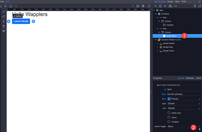
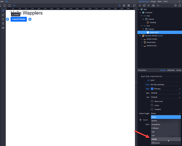
The default, is for a modal to be hidden, meaning, in order to open the modal you need either a link, a button or an anchor button. Select the button (or link) which should trigger the modal (1) and open the action toggle menu (2):
Select Modal:
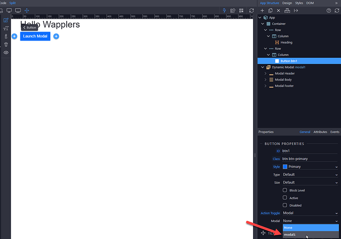
And then select the modal, which you want to open by clicking the button:
Modal Properties
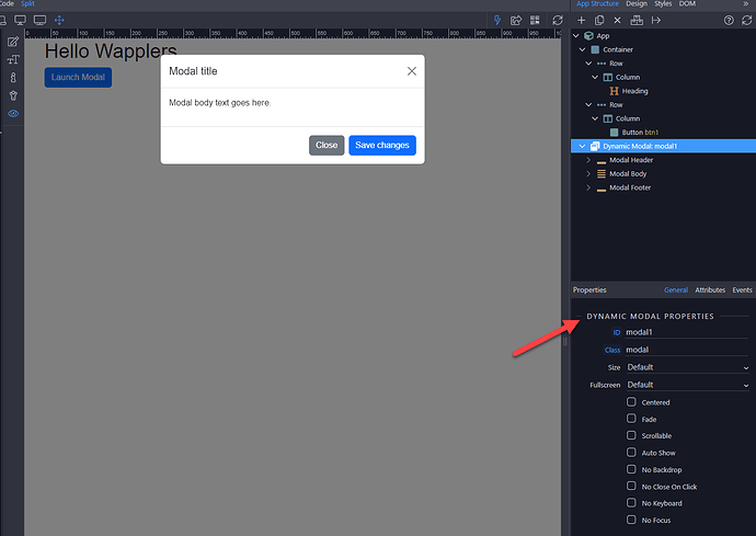
Selecting the modal in App Structure, will show the Modal Properties in the Properties panel.
The following describes the function of each of these properties
ID
It is always a good idea to allocate a recognisable ID to any element, especially when the ID is used to identify a component as is the case with a modal. A common naming convention is modelLogin or mdlEditProduct. No spaces, just camelCase.
Class
Unless you add a bespoke CSS class identifier, Wappler will automatically add the necessary classes here.
Size
Modals have three optional sizes (widths) to be placed on a .modal-dialog. These sizes kick in at certain breakpoints to avoid horizontal scrollbars on narrower viewports.
Fullscreen
This property overrides the size (width and height) so that the modal covers the user viewport for the different client devices. Example full screen below md (below 768px).
Centered
This option allows the modal to be vertically centered.
Fade
Ticking this option, allows the modal to slide down and fade in from the top of the page. The default is for the modal to simply appear,
Scrollable
When modals become too long for the user's viewport or device, they scroll using the page itself. By ticking the Scrollable option, it adds a scrollbar to the modal body, keeping the modal header and modal footer in view at all times.
Auto Show
This option will show the modal when the page is opened in a browser, overriding the default hidden display. This is useful when alerting a user to a new product or similar.
No Backdrop
When the No Backdrop is set, the modal will not close when clicking outside of it.
No Close On Click
This option retains the backdrop while it will not close the modal when clicking outside of it.
No Keyboard
When allowed, it is not possible to close the modal when escape key is pressed.
No Focus
When enabled, the modal won’t be put on focus when initialized.
