The only way to make it a bit workable is by doing this…
Ideally we can do this combined with making the whole ‘options’ window wider, so i don’t need to horizontally scroll.
On top of that, please save the preferences so I don’t need to do it every single time I click on the join window.
This is still a huge frustration in 6.8.0. Could it please be addressed? Just making the pop-up resizeable would massively help (especially if the Wappler UI remembered the last size you set it to):
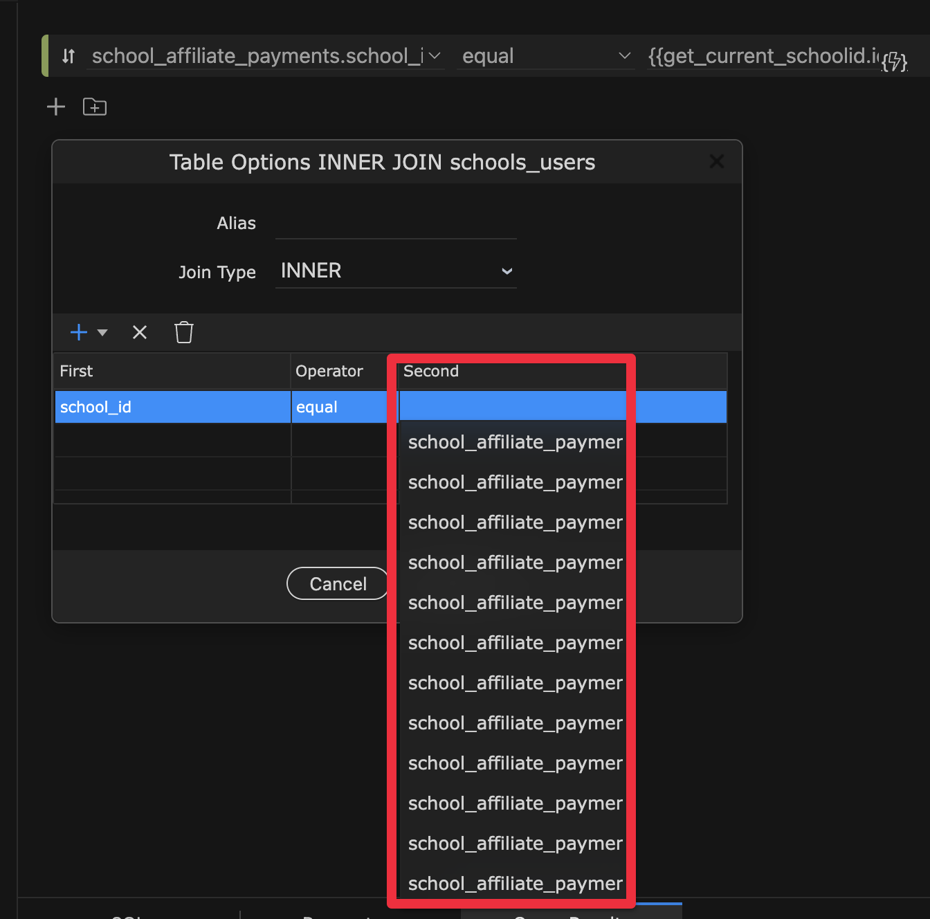
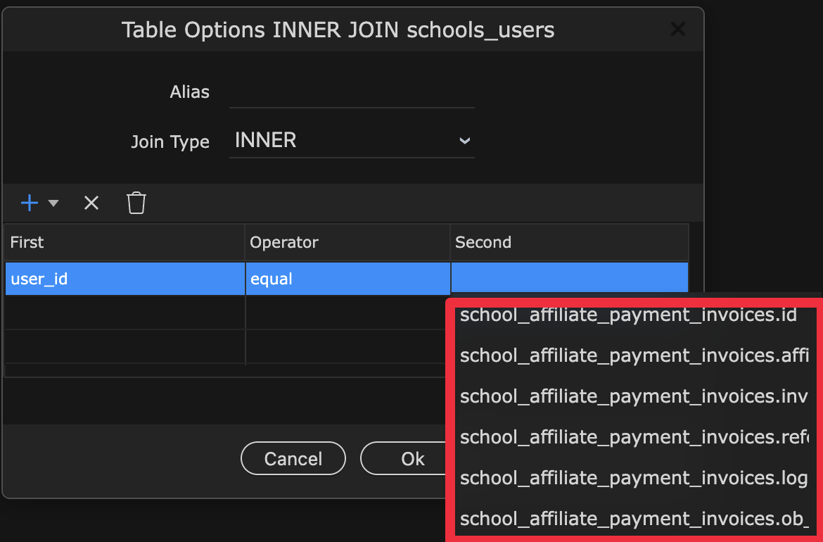
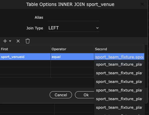
What's worse is when you open the dropdown, the results are inhibited too:
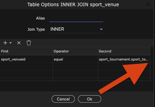
I don't know if you already have this in mind but I make the two left columns small by dragging them to the left and then the fields colums ("Second") Is a lot larger and almost always I know which one to pick from it...
Off course it would be great the whole window to be scaleable or maximized!
Bump - @george much of the UI has been improved but this is still a real problem. Could you please tackle it in one of the forthcoming W7 updates? Pretty please?
Making the join window resizeable would also help...
We should probably do a good update on the UI for this. For now I made the dialog a little wider and made the last column a little wider (available in the next update), hope that helps a bit.
Great. Hopefully you mean improving the many cases where fields are not wide enough, where there is extra space (though I appreciate there are probably issues with different monitor resolutions etc). The topic has cropped up many times over the years, with various feature requests. Most of the issues and links in this thread are probably still relevant.
There have been some improvements, but also some backward steps - eg when 'pills' were introduced. Eg in this example, the expression would fill the available field width, but apart from the pill, most of the space is empty: