You know it can be a real problem to create a layout based on columns when you are using elements with different heights in each row. You can see that the elements are not properly aligned. This is where the app connect masonry is really helpful.
You can use App Connect Masonry with static or dynamic content.
Masonry with Static Content
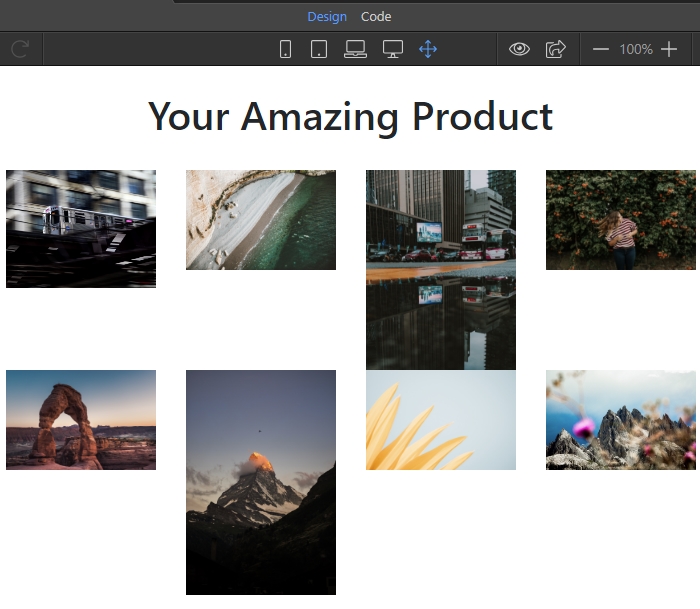
We added App Connect and Bootstrap 4 on our page and built a simple layout with a row and columns with images. As you can see they don't look good because of the different heights:
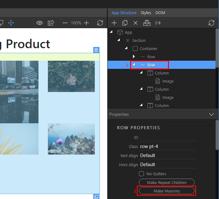
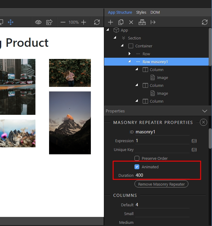
We select the parent element which wraps our columns. In our case, this is the Bootstrap 4 Row(1) and then we click the Make Masonry button(2):
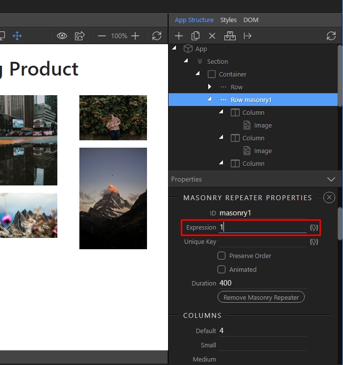
In the expression field we enter '1' - this is because we are using a static layout, and not dynamic images from a database:
We enable the animation options. This way the elements get nicely animated on resize:
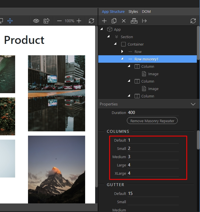
Then we setup the columns of the masonry grid for different screens. Just enter the number of the columns which you need for small, medium, large and extra large screens:
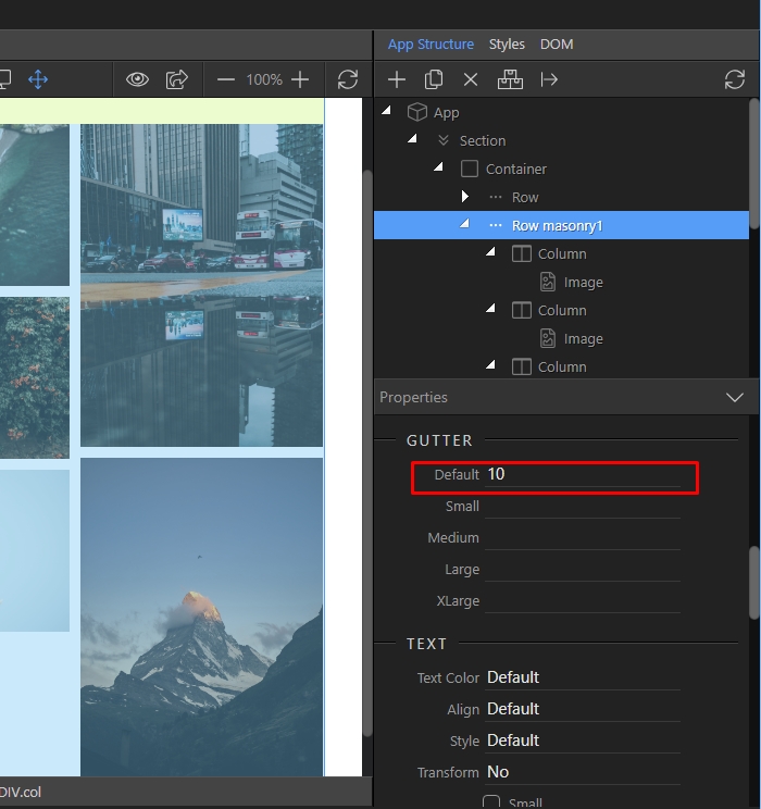
Do the same for gutter options. Here we enter 10 as a default value and leave the rest empty, so that gutter size of 10px will be applied to all of them:
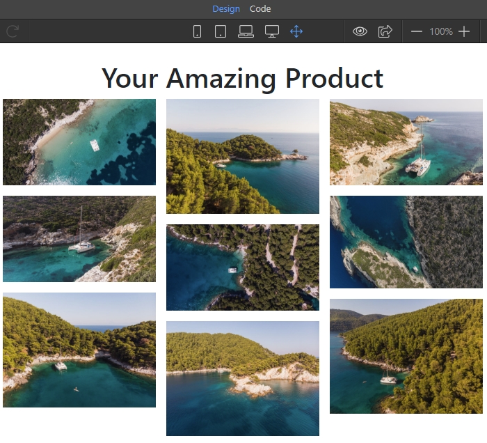
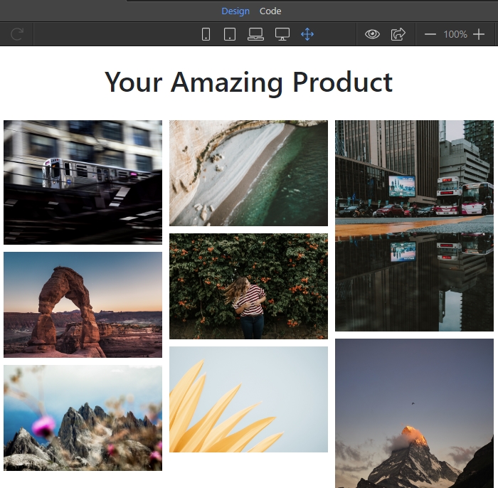
You can see the results in Design View:
Masonry with Dynamic Content
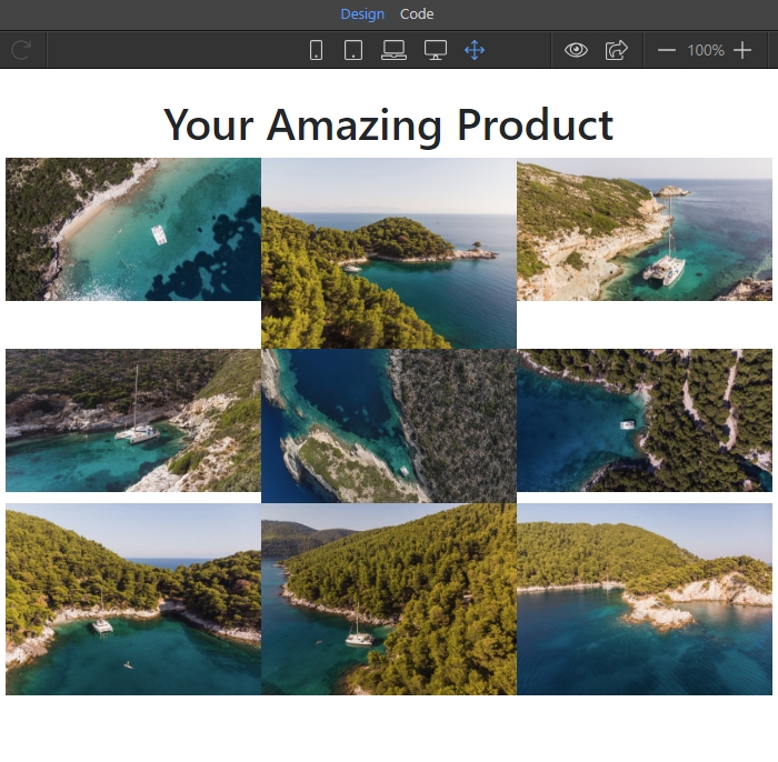
If you are using a dynamic data source to show images on the page - the same problem appears when the images have different heights:
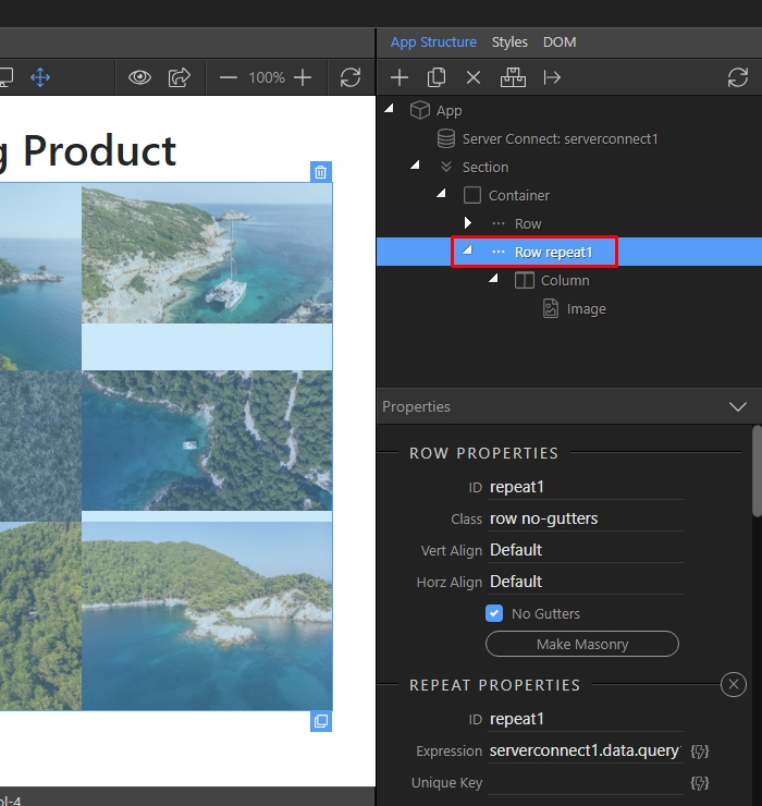
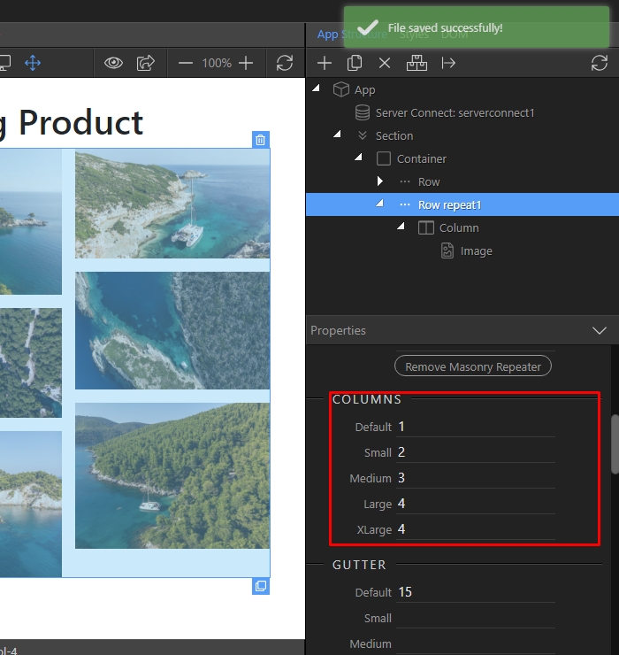
Select the repeat children component in the app structure:
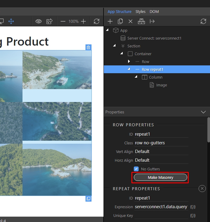
And then click Make Masonry:
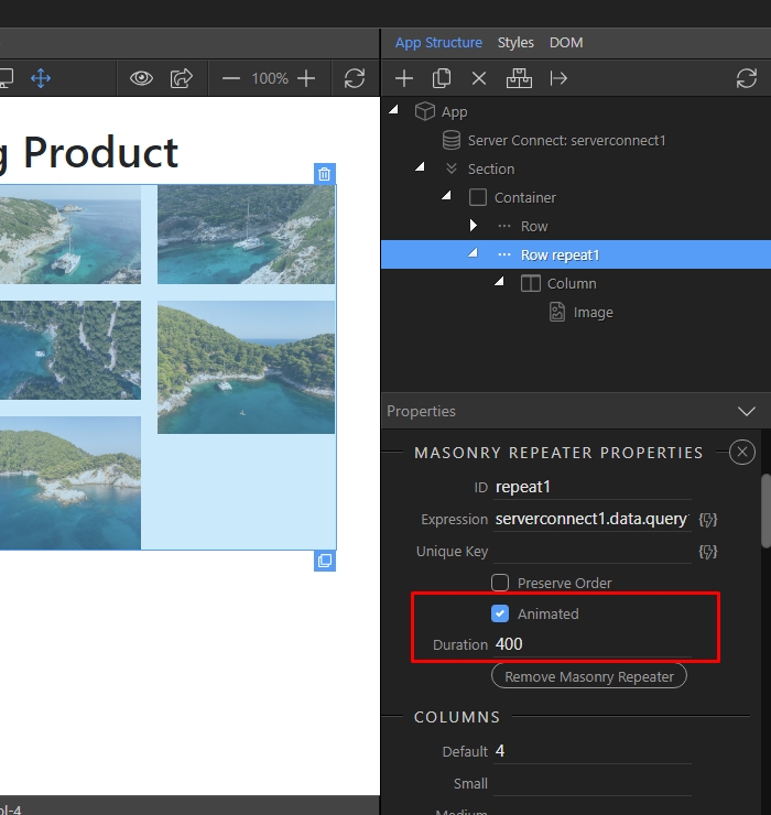
We enable the animation options. This way the elements get nicely animated on resize:
Then we setup the columns of the masonry grid for different screens. Just enter the number of the columns which you need for small, medium, large and extra large screens:
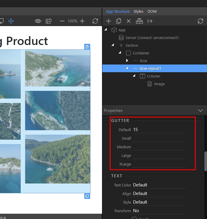
Do the same for gutter options. Here we enter 15 as a default value and leave the rest empty, so that gutter size of 15px will be applied to all of them:
You can see the results in Design View: