Add an 'Average' line to line chart

I have a line chart that works great …

What I want to do is add a second line for the average. I know I must do that in my query but can’t figure out the proper syntax. Here is my Query …

SELECT
	joborders.JODateRec AS Work_Date,
	COUNT( joborders.JODateRec ) AS Job_Orders
FROM
	joborders 
WHERE
	joborders.JODateRec >= NOW() - INTERVAL 28 DAY 
GROUP BY
	joborders.JODateRec 
ORDER BY
	joborders.JODateRec

Not in front of the pc so can’t check but something like this should work by using both the count and avg function -

SELECT
	joborders.JODateRec AS Work_Date,
	COUNT( joborders.JODateRec ), AVG( joborders.JODateRec )

Thanks Max, that was my first thought as well. But that just gives me a date value. I need the average of the COUNT value. Average seems to be missing from the ‘Format Number’ features in Wappler as well. But that’s for another thread.

I can see that now Brad, are you looking for the average per day, per month or something like average days between orders?

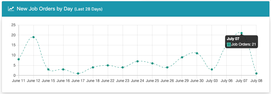
Average number of orders per day. Graph shows total orders per day. I’d like to if possible add a second data set to show the average number of orders per day over that period.

Something like…

COUNT(*) / count(distinct date(joborders.JODateRec)) AS Avg_Orders

Should give you average orders per day. Check a working fiddle here.

Getting closer. That gives me a daily average which is always the same as the daily count.

I think I somehow have to sum up the Job_Orders data and sum up the number of days and get an average. Maybe I’m over thinking it.

I thought the request was strange as the daily average orders is the same calculation as count daily orders.

The only average that I think may be worth showing perhaps is the average daily net change.

Interesting idea. That seems like a complicated query.

Aren’t you after a Moving Average? There are a bunch of mysql examples in SO about that.

Yes, an average of job orders per day. It should be easy but I just can’t get my head around it.

That makes no sense. The avg per day are the totals of that day :joy:

Check specifically “Moving Averages”

Maybe I am not explaining myself properly …

For example I have 17 days with Job orders … I have 100 job orders in total. I just want to show a straight line with the average.

100/17

So I need to count how many days in my query and count how many job orders over all and find the average

Haven’t you just answered your own question?
17 days divided by 100 orders equals 5.88 (ish) orders per day.

Yes, that is what I am trying to achieve but can’t figure out the SQL for it. It’s the grouping that is screwing me up.
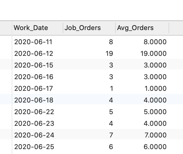
SELECT
	joborders.JODateRec AS Work_Date,
	COUNT( joborders.JODateRec ) AS Job_Orders 
FROM
	joborders 
WHERE
	joborders.JODateRec >= NOW() - INTERVAL 28 Day 
GROUP BY
	joborders.JODateRec 
ORDER BY
  joborders.JODateRec 

Gets me the line I need for number of job orders each day.

SELECT
	COUNT( joborders.JODateRec ) AS Job_Orders,
	COUNT(*)/ COUNT(
	DISTINCT DATE( joborders.JODateRec )) AS Average 
FROM
	joborders 
WHERE
	joborders.JODateRec >= NOW() - INTERVAL 28 DAY 
ORDER BY
	joborders.JODateRec

Gets me the right average but I can’t combine the two queries. I may just admit to boss it can’t be done.

Why don’t you use two separate queries and return to the chart the division?

Tried that but the chart tool only picks one query at a time. Even tried combining both queries in a single action.

That’s a shame. I haven’t yet delved into the chart component so I don’t know what parameters it takes.

Hi Brad,
You can do it in a bit “hacky” way, not hard to do though.

If your server action component in App Connect is called serverconnect1 and your query query1 then you just add another data set in the charts and use this as its value:

serverconnect1.data.query1.avg(`Job_Orders`)

So your chart code becomes something like:

<dmx-chart id="chart1" dmx-bind:data="serverconnect1.data.query1" dataset-1:value="Job_Orders" labels="coordinate" dataset-2:value="serverconnect1.data.query1.avg(`Job_Orders`)"></dmx-chart>

You are just using the same query as for your other data set.
And here’s the result:

5 Likes

This is very good information to know, for those of us who have hit some limitations with the built in charts.js.

This will come in handy I think. Thanks @Teodor

1 Like