You can customize the Swiper component to show different number of slides on different screen sizes. Also you can customize the spacing between slides.
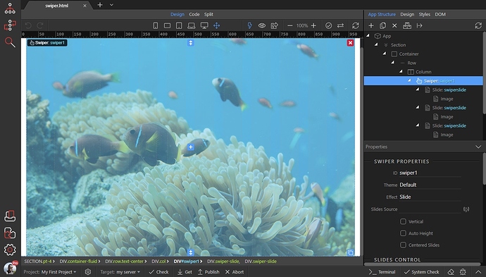
We added a Swiper with slides containing images and set the effect to "Slide":
Scroll down the properties panel and you will see the Slides View options. There are 5 icons available for different screen sizes: (default, phone, tablet, laptop and desktop).
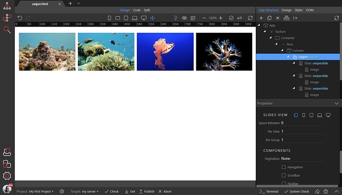
The default option is applied to all, until you override any of the options for bigger screen sizes. So we leave the default to show 1 slide at time, without any spacing between slides:
We want the same option applied for phones, so we jump directly to tablet size. We set spacing of 5px between the slides and show 2 slides:
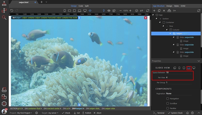
For laptop size the spacing is 10px and we show 4 slides:
Then for big desktop screens - spacing 15 and show 5 slides:
And you are done. You can see the results:


