Styling Radio Groups in Form Questions?

This is Ugly

This was better – a form I did with just a few bootstrap css , jquery, popper files.

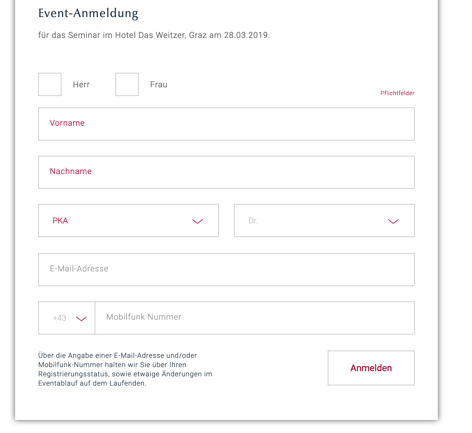
Code was barebones —

How are people using Wappler controls to make my ugly Wappler Radio buttons something crisp & refined?

Such as the FRAU or HERR radio buttons at the top?

Or anything that lines up HORIZONTALLY with nice spacing and larger than the default radio box size.

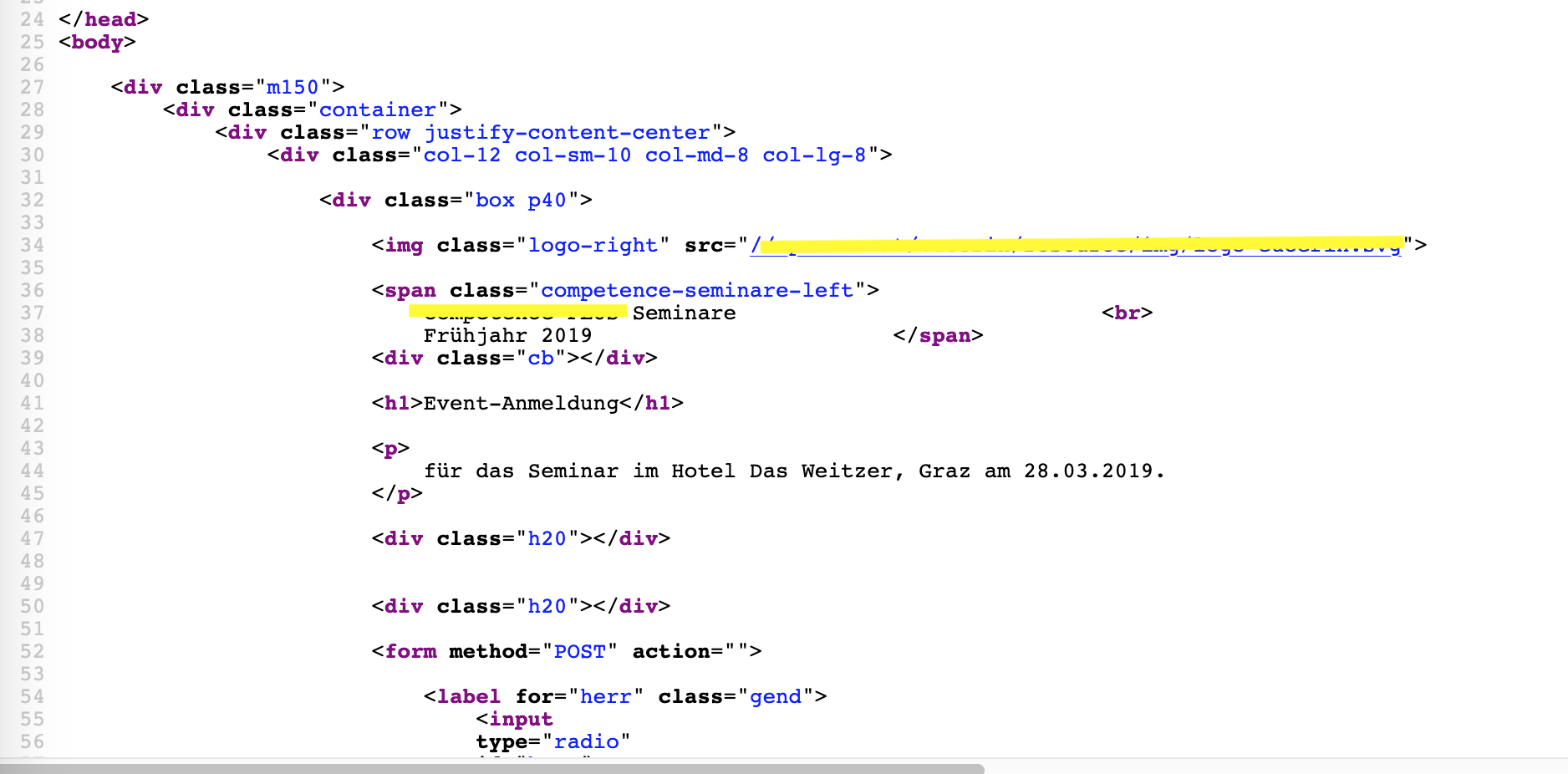
How do I Apply improved styling using Wappler ?

It looks like I have to go physically modify all of the applied Wappler style sheets.

Well you do not want to go and edit the Wappler predefined styles.

To be honest Wappler does not create any predefined styles at all, it just brings in all the styles that Bootstrap as a framework gives, which is what anyone that uses Bootstrap would get with or without Wappler.

if you could send a screenshot of your code so i can see how you built it, then i could advise you on how to style it.

As any other thing in web development, if you want to style an element you can use CSS to do so. That’s not Wappler related question, but a general web design/development question.

As for the form layout it’s up to you how you will set it up. Stacking radio buttons vertically and centering them in the form is indeed not the most beautiful form layout I’ve seen. But as I explained it’s up to you to create your forms layout.