POLL: Best way to do responsive design in Wappler

So as we are optimizing our UI in Wappler, I would like to know what will suit you best to do a responsive design.

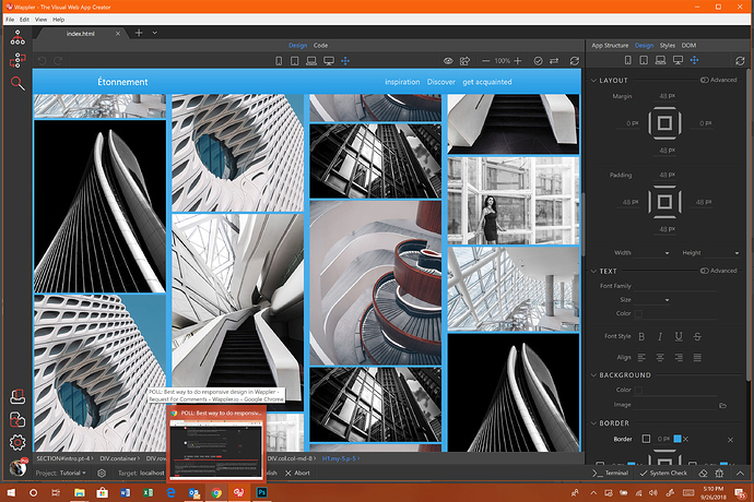
Currently we have the device selectors on top of design view:

image

Those indicate the various devices and their size. Yes @psweb we added even the missing one landscape mobile (second) :slight_smile:

So currently those devices only change the design view size, to show you how everything is rendered on that device.

The ideas is actually not to do that only but also switch for edits in that device and up so that every specific changes in the CSS of Bootstrap components are done specifically for the media queries for that device and higher.

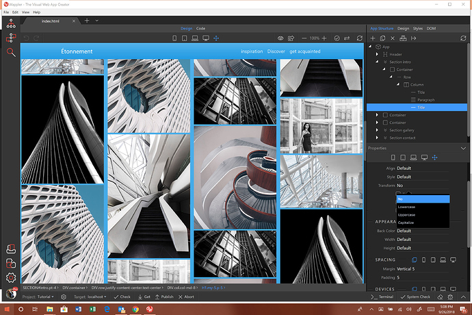
Currently we have within the Bootstrap properties also a devices selector:

image

But actually we want to remove it and just use the divice selected above in the design view device selector.

Is that ok to you? Or should we just keep both?

Or maybe you have a better idea? Maybe our @wappler_ambassadors will share their view!

  • Yes, provide a single clear global device selector in the design view toolbar
  • No, keep both device selectors
  • I have other idea, will post in comment

0 voters

I voted for keeping both but could be convinced that one global one will work if I knew more about it. Right now the biggest issue with using only the globals is that they are only accurate on large screens.

Even on my MAcBook Pro I cannot use any of the desktop views or laptop views. So I see that causing issues if that is the only way to do it.

Awesome, haha @George, you know me too well, I saw that right away and was so so happy, thank you.
I voted for keep both, although the three options are a little unclear.

So for me I would love both options, either I can choose in the properties and change certain things according to device, or if I prefer i can choose the fluid view to the very right and make alterations that affect all sizes, or i can choose just a single size and alterations i make only impact that particular size.

Love Love Love, that idea.

I could probably ask another 100 questions about it too, but i will keep this short and sweet.

Having to switch to design panel to select it then back to property panel to get back to my work mean two more clicks to me. :slightly_smiling_face:
The most thing i use is change the device type then play with the margin and padding. And thats 90% of the work i change in the desgin actually

Since the devices are so important to responsive design, I wonder if it would be better to have one, however put it in-between the App Connect Panel and the Properties Panel? And then maybe at the top of the Styles Panel and the Design Panel?

Just thinking that @mrbdrm makes a good point about going back and forth to change styles. Having it close to all the areas you can change styles might be good. But instead of scrolling to it, have it as a panel that is always showing.

But the big question is aren’t you following mobile first design?

So if you do, you actually go from the smallest device in design view, make sure it all looks fine and then go up to other devices to make changes. But all visual by selecting the right device your are designing for.

So why would you need so many other device selections?

Yes to mobile first design.

However, when you are making those changes on bigger designs, then you’ll be using one of these panels. I’m not saying it is a great idea. I’m just saying it puts the sizing next to the panels that change what an element does at a certain size. :slight_smile:

In addition, sometimes I click back and forth between sizes. Yes the smaller size is already done, but I want to make sure the “feeling” or the “presentation” is consistent between sizes as I’m editing larger sizes.

But, this is not a suggestion I’m strong about. I think putting one version at the top of the browser is fine. I was just thinking that if I’m in “perfectionist” mode, I can get click happy between sizes to make sure my work is consistent in presentation.

Aha maybe I wasn’t very clear but the panels will “see” what you have selected as current device in design view and just make changes to that device.

So everything you edit is for the selected device.

Except if you select full size/all then it is device unrestricted.

Do note that it works from the selected device and UP

1 Like

Ahh, I didn’t catch that part. Yep, sounds good. :). Been a long day!

My answer will be in comparison of the tool I am the most used for visual responsive design: FlexiLayout from Extend studio.
This tool have no dynamic capabilities but have a very good UI for designers.
One cool thing is it provide a simple way to adjust the styling of elements, You have the main devices size at center top like Wappler but when you apply a change to a specific element, example element X have a top padding or margin of 20 pixels for mobile devices, then when you switch to desktop view if you make it 40 pixels the change will be kept separately for each device. I might be missing something but I don’t see in Wappler, when I change padding for mobile it is applied to all other devices sizes.
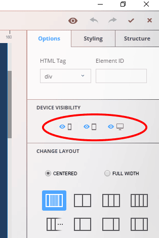
show-hide

Also they have some option panel where you decide "show/hide element for each devices view separately.
Again this is a very useful feature, it is very important as a visual designer to be able to easily switch between sizes and change values accordingly, just as drymetal mentioned.

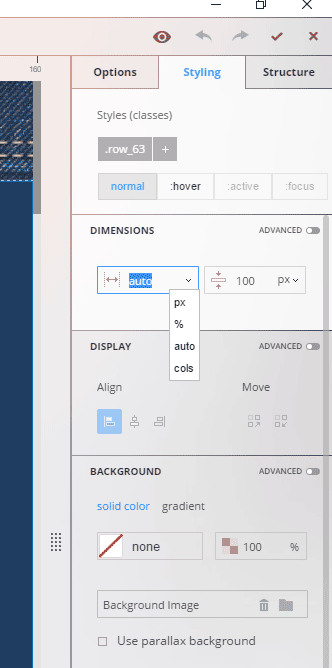
Also, one feature I like is the dimension options for the containers, you can choose between Pixels, %, auto or colones (1 to 12).

And yes we do now design for mobile first but in many cases we have to design for tablet and desktop too so what I think is important for designer is the be able to easily switch between devices view and apply the changes for each when needed.

Greetings :slight_smile:

1 Like

@Webjack357 brings a very good point here.

That is that sometimes elements are indeed hidden on a specific device. So using just one selector for the device in design view won’t cut it because you will never know what is hidden.

You will have to switch to that device and inspect the elements properties (probably first have to find it in the App Structure tree - because it is invisible remember) and then see in its properties that is set to invisible.

So a lot of unnecessary steps indeed.

And by having visibility selectors per device in the property panel - you will see directly for which devices the element is invisible.

I wish it was that easy with all the responsive grid sizes… like one column for mobile, two columns for tables, 3 and more for above. That will be difficult to visualize in a single property inspector view, without having to switch to all the different devices to see what is going on …

2 Likes

I like your idea of working:
“So everything you edit is for the selected device.
Except if you select full size/all then it is device unrestricted.”

So for me i would like the 5 sizes in the Properties Panel as in Design View and one ‘All’ for adjustements in all devices.

2 Likes

A post was split to a new topic: Bring back the responsive device setting in the properties