Intro
The Notifications component allows you to show different types of notification messages based on different events - success, info, warning or error.
Notifications Component
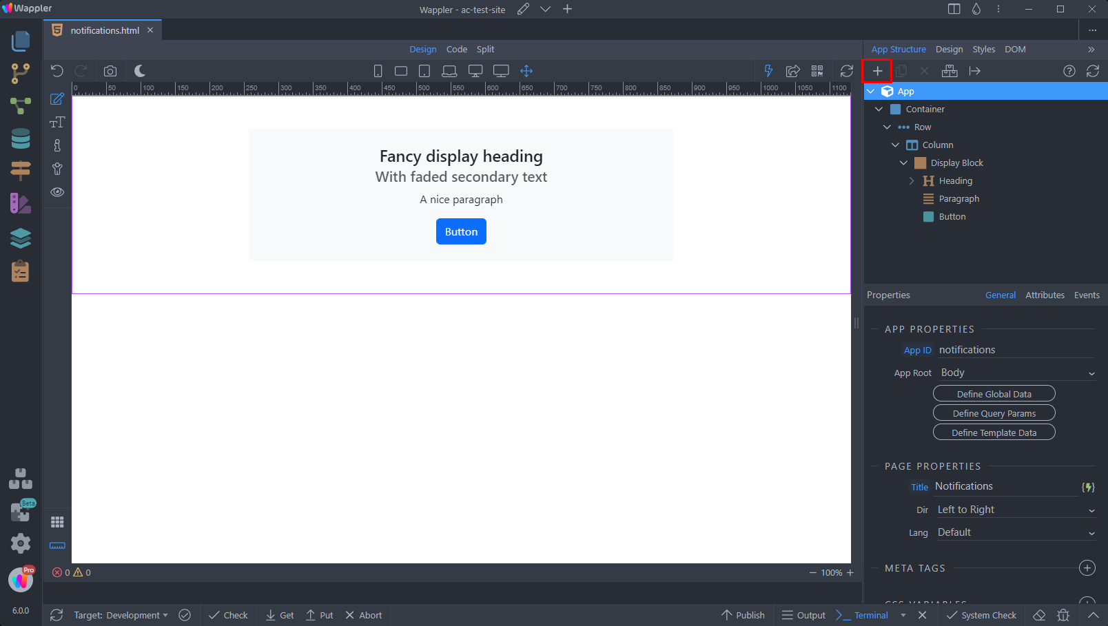
First we need to add the Notifications Component on our page. Select App and add a new component:
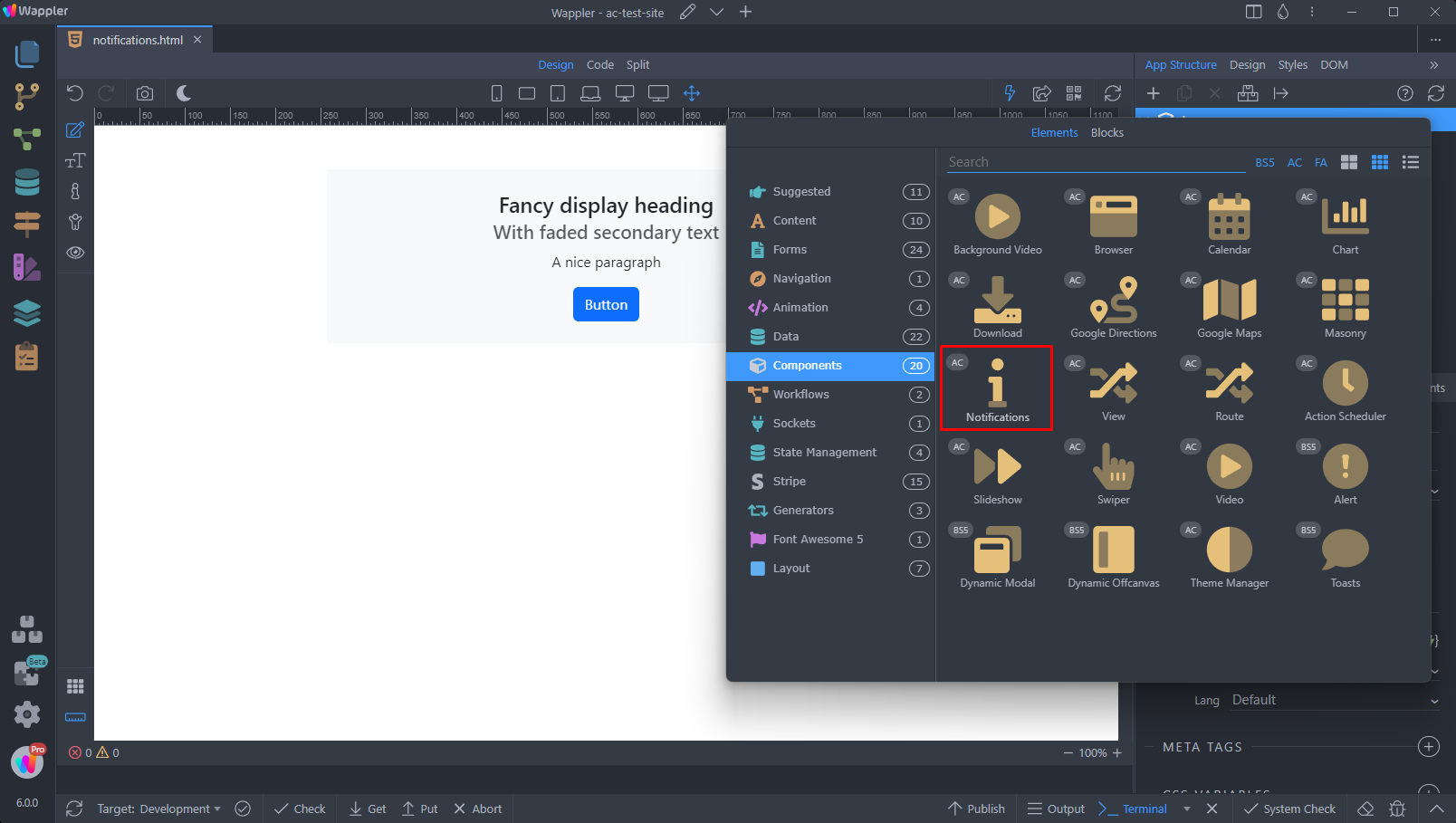
Open the Components menu and select Notifications:
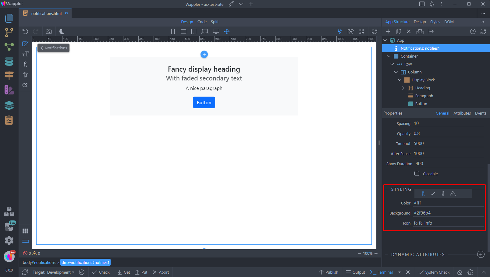
Properties and Styling
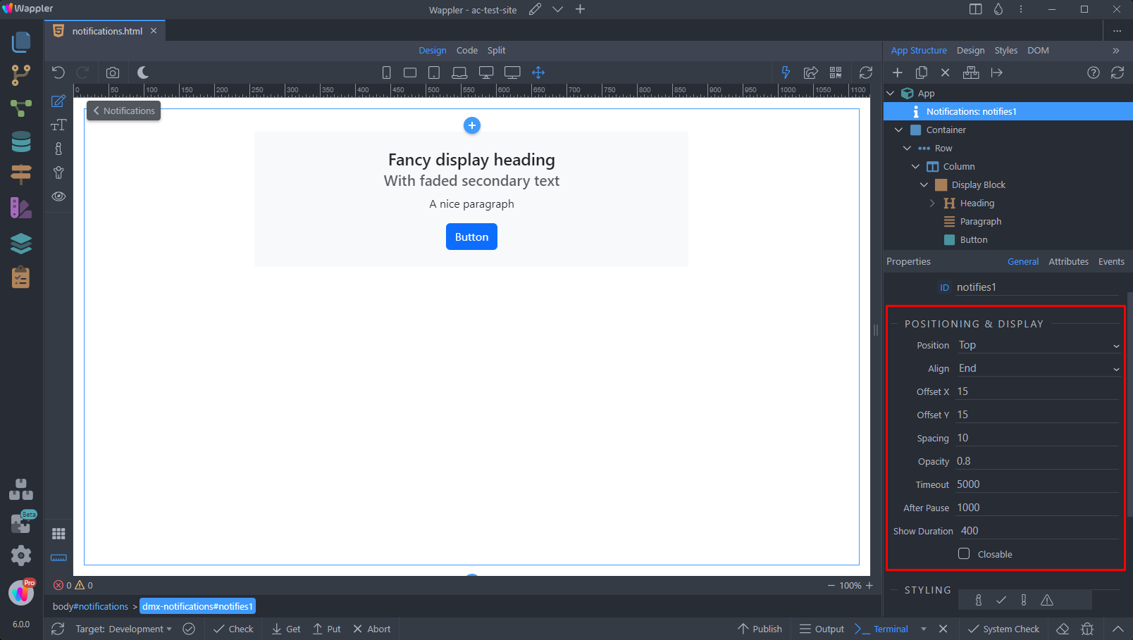
In the properties panel you will find the Position and Display options for the Notifications component. Here you can setup the position, alignment, horizontal and vertical offsets, spacing and opacity options as well as the timeout for the notification. Enable the closable option if you need to show a close button inside the notification:
You can edit the default styling for the chosen notification type - success, info, warning and danger. Select one of the notification styles and setup the text color, background color or the icon. Note that the icons used here are standard font-awesome icons, which can therefore be swapped out for more suitable icons according to your needs:
Controlling Notifications
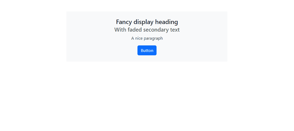
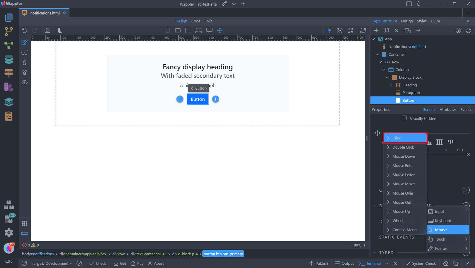
You can display notifications for various dynamic events, including successful or failed logins, successful or unsuccessful attempts to retrieve data from the server, simple click events, and more. In this example, we’ll demonstrate how to show an info notification upon button click.
Select the button and add new dynamic event:

Select Mouse > Click:
And click the dynamic action picker button:
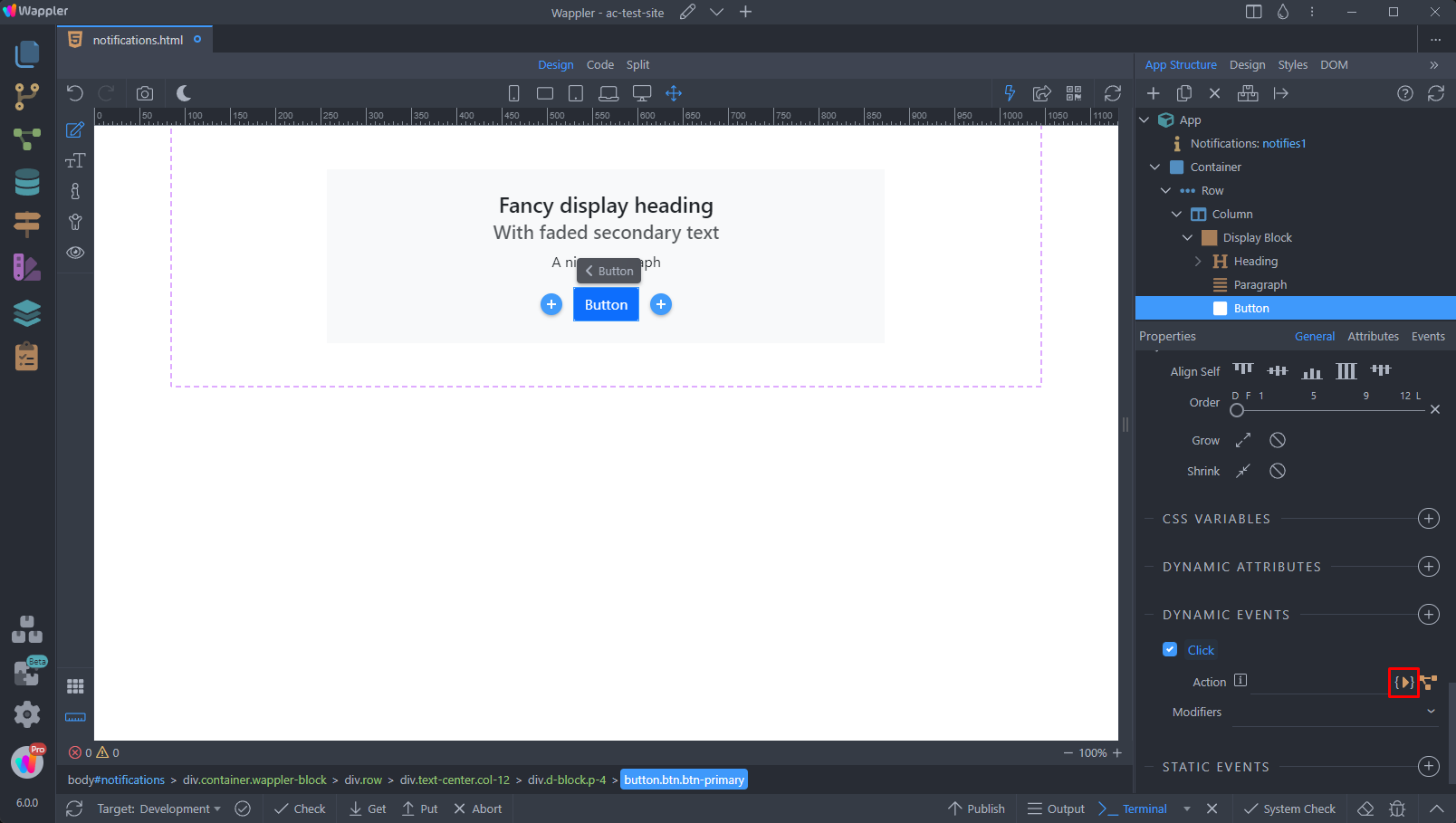
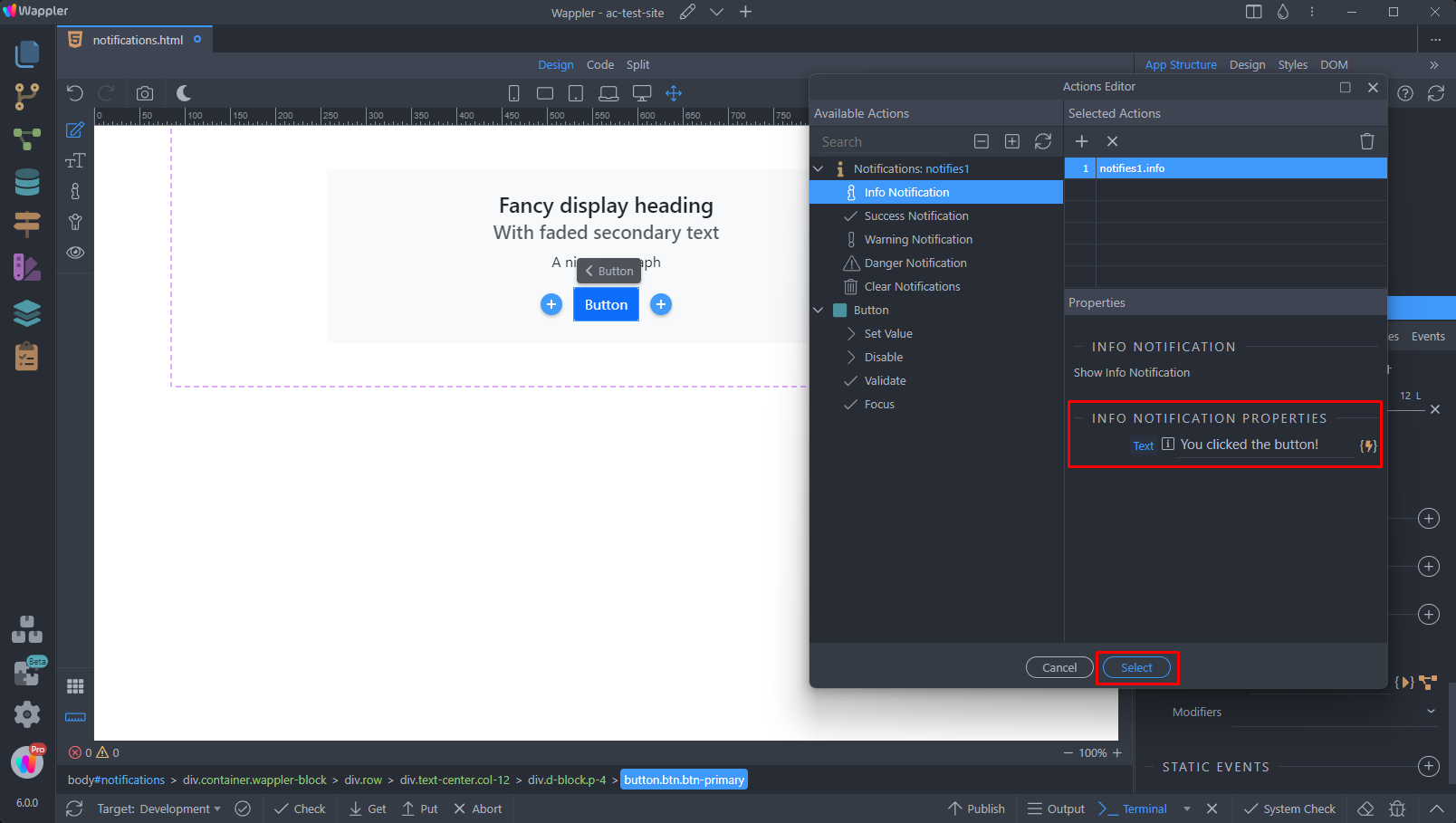
Select the Notification type that you want to show on click and add it:
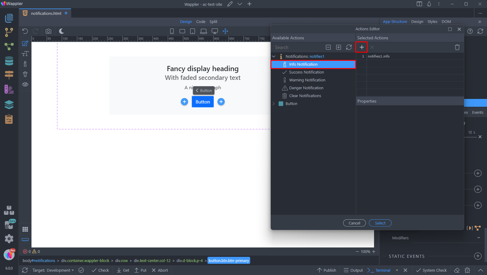
In the text you can either select a dynamic value, using the dynamic data picker, or enter a static text message. Click Select when you are done:
When we click the button a notification will be displayed: