How to fix current Workflow’s UI/UX

Hi everyone!

Since the new SC Flow Designer was presented recently, I want to talk again about the current Workflow designer.

I criticized it for a long time. But on fundamental level I like this concept. I like that nodes are compact and they go from top to bottom like a regular code.
I feel that this approach is the strong side of Wappler.

But current Workflow designer have critical issues with UI/UX

Here is an example of some workflow.

It is impossible to understand what’s going on here. I instantly get a headache when I open such a workflow.

But it is not a fundamental problem of this type of workflow designer.
This is just specific problems and mistakes in current UI/UX. And I believe it could be solved.

Core problem is that nodes are not distinguished enough visually. That’s why it is hard to visually read the hierarchy levels of it. Which is important.

I see 3 different options that can be applied here. They can be used separately or combined together for better effect.
.

Option 1. Get rid of the chevrons (by the left side of the nodes)
Chevrons prevent the easy reading for the left border of the node. So it interferes with the whole visual reading for the node’s hierarchy.

But if we delete them, then how are we gonna understand, that node can be expanded?
I suggest making subheading nodes (EXEC, THEN, ELSE, etc.) always visible. And they also keep chevrons, but they will be on the right side.

Here the result.

It’s not much, but I believe it will improve the quality of UX/UI here.
.

Option 2. Make subheading nodes (EXEC, THEN, ELSE, etc.) less attractive

Currently those nodes have problems:

  1. They add additional level to node’s hierarchy
  2. Their style is the same as regular nodes: icon and white font color.

So we have to delete the icons, make the font gray and bring the node to the same level as child nodes placed.

Result: (combined with the option 1)

So Workflow’s look became concise.

Another style:

I think those 2 options significantly improve Workflows.
.

But the problem with chevrons is that they exist not only in Workflows, but in other places in Wappler too.
Particularly the problem also persists in App Structure. And proposed solutions are not suitable here.

So I want to suggest another option, that is more universal, therefore it can be used in any place in Wapper.
.

Option 3. Make different background colors for different node levels.

That means the background color’s alterations:
1 level - dark gray,
2 level - light gray,
3 level - dark gray again,
etc.

Take a look. It is still a bit complicated, but better than the original.

Also, the same, but with little different composition.

So every node group gets an easily distinguished vertical border on the left. It is seen despite the presence or absence of chevrons.

And here how the same approach is gonna look at the App Structure.

In Workflows this option could be enhanced by combining with options I talked about at the beginning.

Here is the look, when you reduce the accents on subheading nodes. (EXEC, THEN etc.)

And here the result, when combining all the proposed options together. That includes to get rid of chevrons on the left.
I think it looks quite clean and easy to read and edit.

.

By the way, one of the things that I always wanted in Workflows - is to make titles/descriptions for every node. I just read that this option is planned, so here is how the same layout will be with this addition.

.

I’m very curious to hear what you guys think about all my thoughts and suggestions.
.

What UI/UX of Workflow designer do you like the most?

  • One of the proposed above (“chevronless” and/or “striped”)
  • Current Workflows (Wappler 5)
  • New Connect Flow Designer (Wappler 6 Beta)
  • I don’t like any of it.

0 voters

2 Likes

Love it, @nickneustroev! Small improvements with a BIG impact. I feel it’s too early to decide between this and the new Flow Designer, but these would be a great improvement to the UI in workflows and app structure.

2 Likes

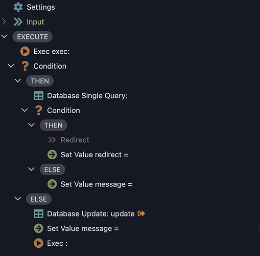
just improved the default styling of the tree THEN/ELSE nodes in Wappler 6 beta 5, so maybe this will make a difference

4 Likes

I think the new style in Wappler 6 beta 5 is too distracting, the badge pill, especially the “Execute” in the beginning. At least the background needs to be darker, grab the colors from Nick’s design…

Screenshot of Wappler 6 beta 5 for those who haven’t seen:

If I were to choose any improvement, I’d probably choose option 2, but there’s a pending feature request that needs to be fixed first:

But to be honest, as far as UI changes are concerned, I’m fine as it’s on Wappler 5 with the FR above done. Can’t we have these as selectable options?
1 Like

I really like this. It is really clear as to where nesting starts and finishes.

FWIW I see the benefit of the new flow canvas and tree structures for different users or even the same user but different complexity APIs. If both can be maintained, that would be my preference

1 Like

+1
@George Badges are bad. Also, why are you working on tree design if your plan is to REPLACE it with the flow thing?

My suggestion would be just increase the indentation. In above design concepts, removing the icons/chevron has similar effect.
Removing chevron is not something I would recommend… instead, move all chevrons to the left edge, like in code view.

Thank you, George!

I think it indeed improves readability of Workflows.

Though maybe @apple is right about background color of badge pill. On the first glance it looks alright in the Dark Theme I use. But in Default Theme maybe it is too bright therefore distracting a bit.

@kfawcett, @bpj Thank you guys for the positive feedback and support!

@sid Thank you for the feedback!

Maybe increasing the indentation will help a little, but I think it won’t be enough.
This is not the same as deleting chevrons.

Chevrons prevent easy visual reading of the left border of the node groups. Hence, easy reading tree levels. Because of chevrons all workflows become messy.

I think the only options here are removing chevrons or adding visual borders to nodes (by adding background with different colors: 3rd option in my post).

@nickneustroev, thank you for your hard work on this! :pray:

I love option 3… this one:

But very important for me that chevrons stay on the left.

When I want to collapse a series of groups or if/else statements in a big server action, it makes a massive difference if the chevrons are all aligned to the left.

Click-down-click-down-click-down-done.

If the chevrons are now in a zig-zag because they are on the right it will be much more effort…

… and we need to decrease the clicking effort as well as the visual effort!

1 Like

Noticed the change and it makes a difference! Thank you for that.

I am personally not a huge fan of this alternating of indention color, it’s not guiding, it’s losing focus. What does it mean? Coniditions and branches are dark, while actions steps are dark? Perhaps can be fixed with a better color scheme, but this needs to apply to all color themes, taht’s why this sort of highlights do not tend to work in reality.

It can work if you rethink the whole editor, but that’s not in scope, I guess :wink:

See the example below from Construct3, Each line is a single event in the order “Object”, “Event” (What happened), that’s the trigger, and then another Object to act on, and the steps to execute. So it’s like a table. Always tidy and clean, even with larger “scripts”.

He’re a single step

It reads "if a AlienGreen object touches a Bug object, then check if the AlienGreen is not on the ground and move the alien up, destroy the Bug object and call a sub function named "ClearIntro" with parameter "bug", else call a function "PlayerLifeLost".

Just a quick suggestion: why not introducing guiding lines for indention, like code editors do? We had this suggestion already, if I remember correctly:
CleanShot 2023-09-02 at 11.15.51

Another one: when I launched beta 5 the first time, the screen was presented like this (this is now a mockup), and I liked it. Sadly, it was only one, a bug I guess, but that would be a beneficial feature to the known node editor:

I can simply drag the step I want into a place on the node…

2 Likes

Just expose the CSS in the settings so that people can build their own style for that part of the app. You will have to deal with bug reports with pink and yellow stuff…but everyone will be pleased. Except your eyes.

5 Likes

I can simply drag the step I want into a place on the node…
:+1: :+1:

thank you for your hard work on this!

Thank you! I appreciate it.

I love option 3… this one:

This indeed may be the best option to keep chevrons but also minimize the negative effect they bring on readability of workflow.

When I want to collapse a series of groups or if/else statements in a big server action, it makes a massive difference if the chevrons are all aligned to the left.

Good point, I agree that the process of collapsing and expanding the nodes must be quick and simple.

If the chevrons are now in a zig-zag because they are on the right it will be much more effort…

This moment I realized that I didn’t explain one important detail about this layout. :sweat_smile:

I meant here that all the “EXEC”, “THEN” etc badges in fact will be buttons. So to collapse or expand you can click on it. It must be easier than clicking on the chevron on the right.
So in this case chevrons on the right are basically only for indication.

My brave assumption is that using these badges instead of chevrons (on the left) wouldn’t significantly reduce the speed or comfort of collapsing/expanding the nodes.
But this question is important and must be well-thought and tested in practice before any possible redesign, I agree with that.

In any case this definitely requires a little change of habits. But I personally think that reducing chevrons from the left side completely will bring so much clarity to workflows UI/UX, that it is worth it anyway.

1 Like

I see nothing wrong with that, what could possibly go wrong?
Screenshot 2023-09-03 at 15.52.00

7 Likes

That looks sooo good @Teodor! Please add in next release. :grin:

1 Like

Chef kiss

1 Like