
No worries Max. Thanks a lot for your response.
So there is an opc ua extension where you can use to bring in your data from an opc ua devices. the extension is made by sw11, and this link shows how you install it https://watch.screencastify.com/v/DNaA62ZIJco7KGFP8qTJ
so that’s my plan on how to bring the data in. but I’m not sure if it’s the best way compare to other ways like MySQL database. Please check it out and let me know your thoughts. It’s interesting extension
Best regards.
So did u set the aliases x and y so the script can read the data for the correct axis and display it?
like i did here:
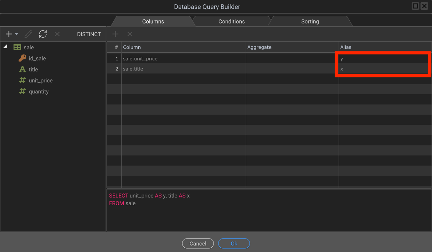
Of corse u gonna have to do it inside your code extension.
so this extension goes straight to the data. there is no query type connection. it connects Like this,
So I can connect to to it using {{SC.data.cpuload.value}} through dynamic attribute, but when I put that in data: dmx.parse(‘SC.data.cpuload.value’) it doesn’t work because how can I say that y or x! like in your query image, that’s one issue . The other thing Max. let’s say I use database query like you way, when I have 3 Ys and one X how do you do that in the query?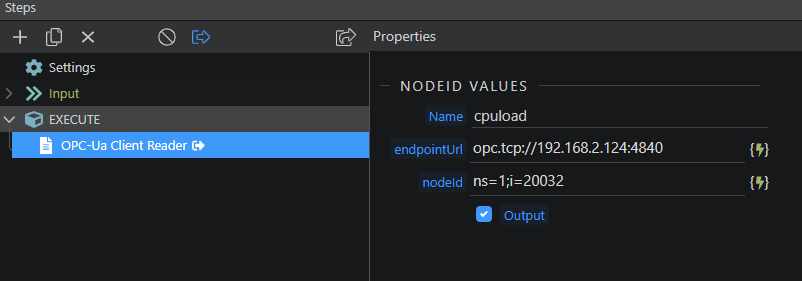
Since I don’t know how your extension displays the information that you receive, I guess the easiest way to do it would be to pass it to a database and from there create a server action that you can then display with apex.charts.
Regarding the “3 Y” I guess you could use three different graphs instead of just one or make a join between the three fields into one and then display the information in a single Y.
1 Like
Thanks Max, but those graphs have to be in one chart.
I evidently chose the right place to put this request!
Thanks, @Max_Saravia !
I’ve pulled together several of your replies to charts topics in the Forum and they should really help me!
YOU dah MAN!
1 Like
thanks Max.
Please forgive my knowledge, but
in series: [{
name: “Session Duration”,
data: [what is the syntax here to get my_API values?]
},
{
name: “Page Views”,
data: [what is the syntax here to get my_API values?]
},
{
name: ‘Total Visits’,
data: [what is the syntax here to get my_API values?]
}
],
I tried [{{sc.data.my_API.value}}] and it didn’t work.
May be im wrong cause i dont know your schema, but i think it should be [{{sc.data.my_API}}]
Did anyone work out how to change the legend and x/y axis label colors?
dmx-bind:colors="[’#28a745’, ‘#ffc107’]" works for the chart lines, but cannot even work out how to amend the dmxCharts.js for the legend color
You can do that by editing the file by hand.
1 Like
Thanks I was looking in the dmxCharts.js
1 Like
Thanks for anyone who contributed to this.
Implemented a new Apex Chart in v5 in about 7 mins total.
Works a champ!
2 Likes
I’ve just created a stunning Apex chart, its a line area series chart with four data sets represented in it.
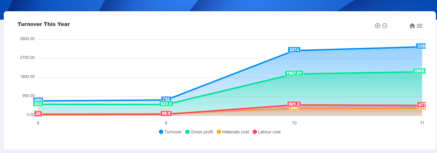
I was bumbling around until I found @Max_Saravia info on how to trigger the data response from the SC.
I’ve been having a bit of an issue though adding another seperate chart to the same page. I tried a lot of variations on the updateChart() function - i.e. giving it another name etc but whenever I try and add another seperate chart to the page, both of them stop working. I cant see any errors generated so am finding it difficult to debug this.
This works perfectly and results int that nifty looking graph above:
<script>
    var options = {
  chart: {
	 locales: [{
      "name": "en",
      "options": {
        "toolbar": {
            "exportToSVG": "Export SVG",
            "exportToPNG": "Export PNG",
			"exportToCSV": "Export CSV",
            "menu": "Menu",
            "selection": "Selection",
            "selectionZoom": "Selection Zoom",
            "zoomIn": "Zoom In",
            "zoomOut": "Zoom Out",
            "pan": "Pan",
            "reset": "Reset zoom"
        }
      }
    }],
    defaultLocale: "en",
    height: 320,
    type: 'area',
    },

stroke: {
curve: 'straight',
},
    dataLabels: {
    enabled: true
    },
  series: [],
  title: {
      text: 'Turnover This Year',
  },
  noData: {
    text: 'Loading...'
  }
}

var chart = new ApexCharts(
  document.querySelector("#charttest"),
  options
);

chart.render();

function chartUpdate() {
    chart.updateSeries(
        [
            {
            name: 'Turnover',
            data: dmx.parse("content.scTurnover.data.custom")
        },
        {
        name: 'Gross profit',
        data: dmx.parse("content.scTurnover.data.customCurrentYrGrossProfit")
        },

        {
        name: 'Materials cost',
        data: dmx.parse("content.scTurnover.data.customCurrentYrMatls")
        },
        {
        name: 'Labour cost',
        data: dmx.parse("content.scTurnover.data.customCurrentYrLabour")
        }


        ]
    )
};

</script>
But whenever I try and duplicate the above, but use different data, both charts show but contain no data.
I’m sure its something simple, can anyone see where I’m going wrong…?