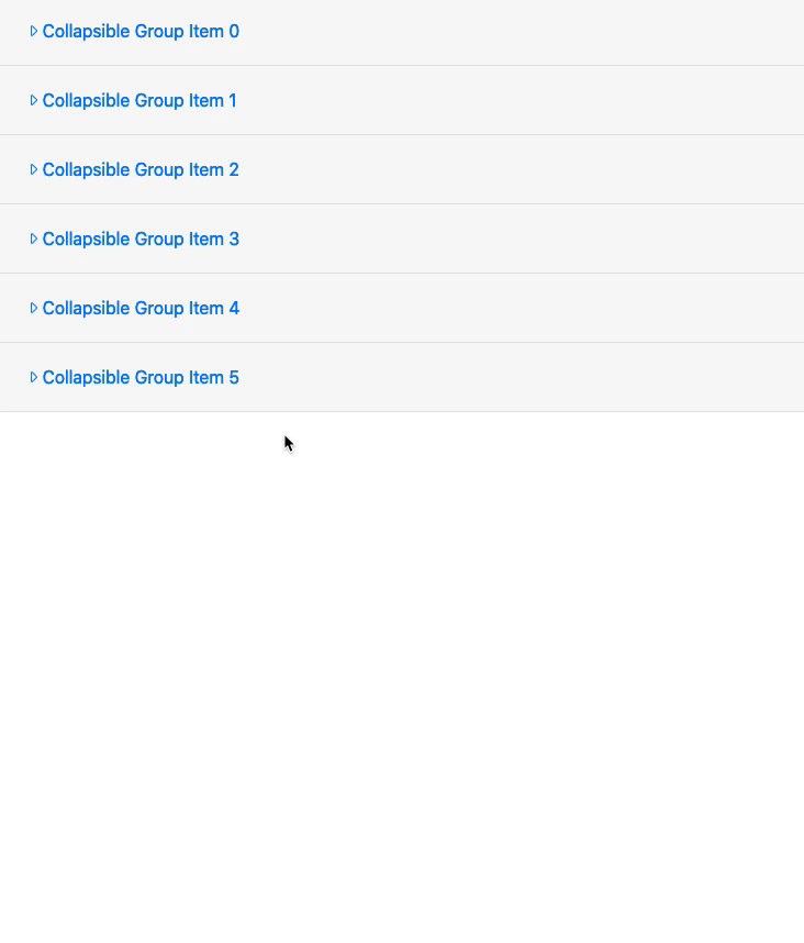
Dynamic Accordion Usage

Try
dmx-bind:id="“accordion1_headingOne’ +$index”>

Thanks Brian, but that did not make any difference to this particular issue.

Here is a recap of the 2 issues I have found.

  1. Create a new php page, save it, add a container > row > column > accordion cards, the head .js is not added of <script src="/dmxAppConnect/dmxBootstrap4Collapse/dmxBootstrap4Collapse.js" defer=""></script>

  2. If you alter your code to try make dynamic accordions like this code

<div class="accordion" id="accordion1" is="dmx-repeat" dmx-bind:repeat="3">
    <div class="card">
        <div class="card-header" dmx-bind:id="'accordion1_headingOne'+$index">
            <h5 class="mb-0">
                <button class="btn btn-link" type="button" data-toggle="collapse" dmx-bind:data-target="'#accordion1_collapseOne'+$index" dmx-bind:aria-expanded="$index == 1 ? true : false" dmx-bind:aria-controls="'accordion1_collapseOne'+$index" dmx-class:collapsed="$index != 1">
                    Collapsible Group Item {{$index}}
                </button>
            </h5>
        </div>
        <div dmx-bind:id="'accordion1_collapseOne'+$index" class="collapse" is="dmx-bs4-collapse" dmx-bind:aria-labelledby="'accordion1_headingOne'+$index" data-parent="#accordion1" dmx-bind:show="$index == 1">
            <div class="card-body">
                Anim pariatur ... wolf
                moon ... excepteur
                butcher vice ...  haven't heard of them accusamus labore sustainable VHS.
            </div>
        </div>
    </div>
</div>

And open your developer tools to watch the classes change as different accordions are opened and closed, you will notice that the button classes do not change as they are meant to.

Here is a gif on what it should be doing before making things dynamic, gif credits @Teodor, haha, thanks

@JonL I know you are online, do you feel like taking a crack at this issue I am having to see if you can find a way around it, 3 days later and i am spinning wheels.

What are you trying to change dynamically when expanding and collapsing?

All I want to do is add a little caret icon next to each heading that when that particular accordion is open then the caret icon is down aand when the accordion is closed the caret icon is left.
It’s for this site https://www.africacollection.com/south-africa-and-mauritius-travel-itinerary-packages/south-africa-safari-and-mauritius-beach-holiday-travel-itinerary/ which uses accordions dynamically everywhere for all the itinerary days.
If the accordion classes were changing like I know they should by bootstrap design then i could target the open vs closed caret icons with css.

Hope that makes sense.

1 Like

Here you are:

<div class="accordion" id="accordion1" is="dmx-repeat" dmx-bind:repeat="2">
 <div class="card">
  <div class="card-header" id="accordion_headingOne">
   <h5 class="mb-0">
   <button id="accordion1_collapseOne_Btn" class="btn btn-link" type="button" data-toggle="collapse" dmx-bind:data-target="#accordion1_collapseOne{{$index}}" aria-expanded="true" aria-controls="collapseOne">
   <i class="fal" dmx-class:fa-caret-right="accordion1.items[$index].this.collapsed" dmx-class:fa-caret-down="!accordion1.items[$index].this.collapsed"></i> Collapsible Group Item {{$index}}
    </button>
   </h5>
 </div>
<div dmx-bind:id="accordion1_collapseOne{{$index}}" class="collapse" is="dmx-bs4-collapse" aria-labelledby="accordion1_headingOne" data-parent="#accordion1" dmx-bind:show="($index == 0)" id="this">
  <div class="card-body">
 Anim pariatur cliche reprehenderit, enim eiusmod high life accusamus terry richardson ad squid. 3 wolf moon officia aute, non cupidatat skateboard dolor brunch. Food truck quinoa nesciunt laborum eiusmod. Brunch 3 wolf moon tempor, sunt aliqua put a bird on it squid single-origin coffee nulla assumenda shoreditch et. Nihil anim keffiyeh helvetica, craft beer labore wes anderson cred nesciunt sapiente ea proident. Ad vegan excepteur butcher vice lomo. Leggings occaecat craft beer farm-to-table, raw denim aesthetic synth nesciunt you probably haven't heard of them accusamus labore sustainable VHS.
   </div>
  </div>
 </div>
</div>

The important part is knowing that in a single accordion the collapsed boolean is stored in it’s own element:

accordion1_collapseOne.collapsed

While in repeating accordions you need to query the array element that belongs to the accordion.

accordion1.items[$index].this.collapsed

Then I just needed to switch classes depending on the state of the collapsable area.

<i class="fal" dmx-class:fa-caret-right="accordion1.items[$index].this.collapsed" dmx-class:fa-caret-down="!accordion1.items[$index].this.collapsed"></i>

No need to use CSS unless you want to do a fancy animation or other stuff.

Wappler Team It would be great to access the properties of a repeating collapse from UI.
So these bad guys -> dmx.app.data.accordion1.items

11 Likes

Absolutely brilliant, thanks so much Jon, that will perfectly get me around this issue without needing to concern myself with the classes not toggling.
I would have never imagined going about it with your solution, no wonder I wasnt getting it working, haha. Thanks again, really appreciate the time taken.

I am going to make 2 new different bug reports for the actual bugs that still exist so the Team know there is an issue for future fix but at least this gets me around the problem for now, and opens up some new possibilities for me, so this has really been useful, as I had no clue I could target one element from the class change of another element like that, brilliant.

1 Like

Anytime.

BTW, one thing I forgot. That use of a double dmx-class attribute is not supported by Wappler’s UI. If you dare to open the element in the DOM inspector it will kindly delete the second dmx-class for you :slight_smile:

Also you can’t code them manually with the DOM inspector open as the UI checks won’t stop deleting it.

I assume also that if were an AC element you would also have to avoid selecting the element in the AC panel too.

1 Like

Good to know, although to be honest I rarely use the dom inspector for everyday elements as I find the DOM often does not support some of the stranger things I tend to do, so most of the time I just fill in the missing parts I want in code view.

Out of interest, if you are using a mac, did your test page auto add the <script src="/dmxAppConnect/dmxBootstrap4Collapse/dmxBootstrap4Collapse.js" defer=""></script> to the head at all.

It didn’t. I had to add it manually.

1 Like

Ok cool, at least I can confidently add that as a bug report.

1 Like

I already noticed you implemented the work around.

You should check font size on small screens or change the height of the header to accommodate the text. I would probably go for the second option as I like the font chosen and the size :slight_smile: But maybe it doesn’t look so good.

Anyway just wanted to mention it to you. Although you probably are aware.

That is not entirely true. You can have as many dmx-class attributes as long as they toggle different class names.

So you just can’t have exactly the same ones as those are then really duplicated then

I know the framework can but the UI doesn’t like it. I will send a GIF.

1 Like

@George

Here you are. As you can see the UI doesn’t show both elements correctly and also corrects the html code by removing one class. This only happens in DOM panel.

All in all, you can’t add two class changes from the UI. Once you add one, you can’t add a second one.

This happens with other attributes also where you can add only a single item and not multiple that will trigger depending on different conditions.

Maybe it’s worth doing a pass to all the elements and checking if they are allowed to be set dynamically multiple times.

1 Like

Not sure what exactly are you trying on your page, but i use multiple classes quite a lot in my tests and have no issues with applying them:

I correct myself then.
It doesn’t happen in the AC panel. Just in the DOM panel.
I never paid too much attention as I would just add them in the code.

Just upload plain mp4 - no need for gifs

1 Like

Aha yes it’s in the app structure panel where you are applying dynamic attributes.

In the dom panel is just plain attributes

So then the only way to add multiple dynamic attributes to a non App Connect element is via code. This is actually probably very niche so that’s why I didn’t even bother to report it months ago when I discovered it :slight_smile:

Anyway, back to i18next :wink: