There are two ways of setting up a Bootstrap Navbar on your page.
- Using the predefined Navbar templates
- Create a Navbar from scratch
Using the predefined Navbar templates.
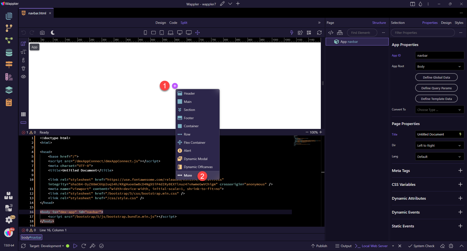
Click the add button in Design View (1) and choose More (2):
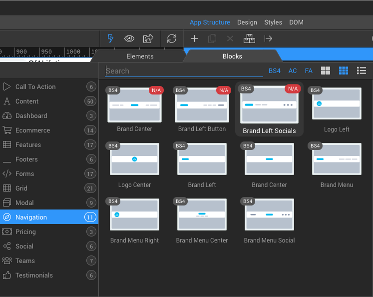
In the modal, choose Blocks (1) and Navigation (2). You will find the different navbar templates here. Just select any of them and it will be added on the page.
From here, the Navbar and its children can be styled as shown after Create a Navbar from scratch.

Create a Navbar from scratch.
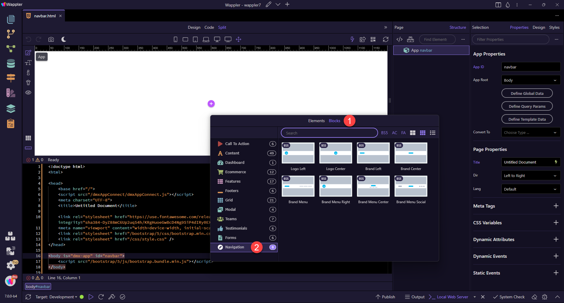
Click the add button (1) and select More (2):

In the modal, select Elements (1), Navigation (2) and Navbar (3)

Inside the Navbar, click the add button (1) and select Container (2)

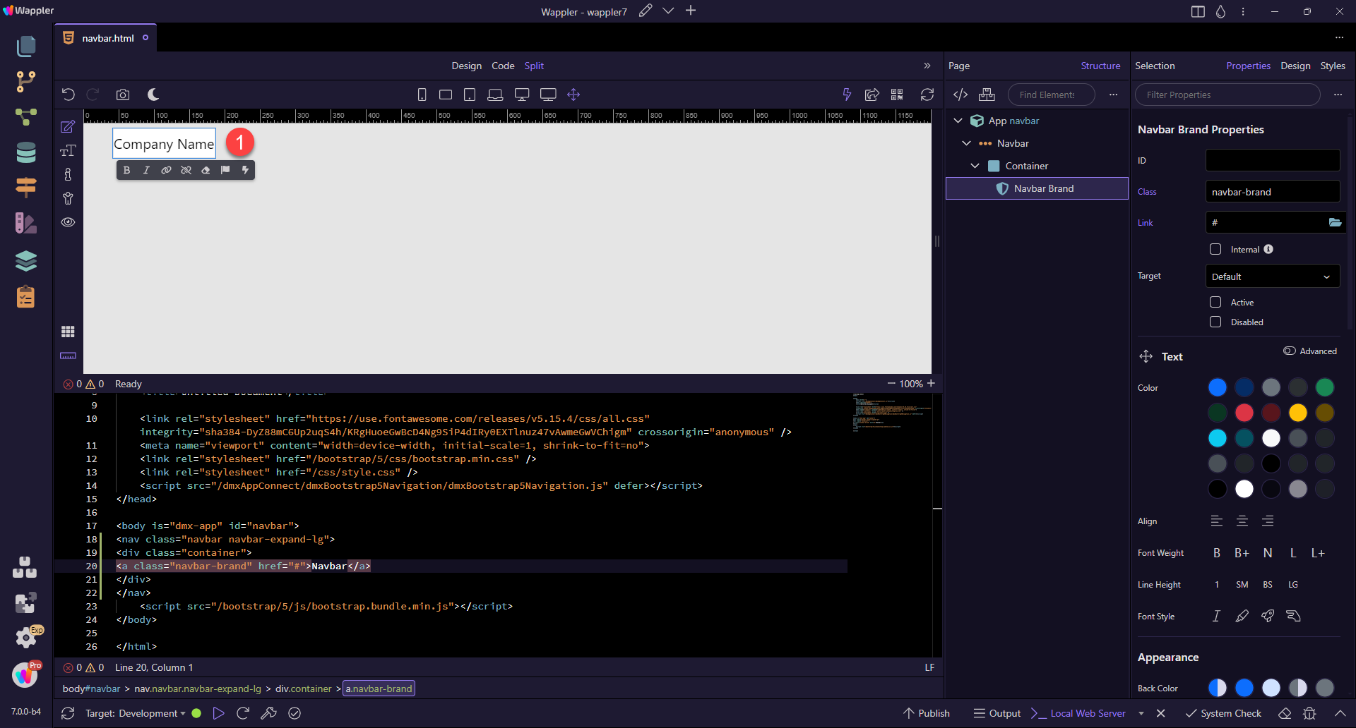
And add Navbar Brand by clicking the add button (1) in the container and selecting Navbar Brand (2)

Double click the resulting text (1) to select it

Then enter the name of the project (1) or similar.
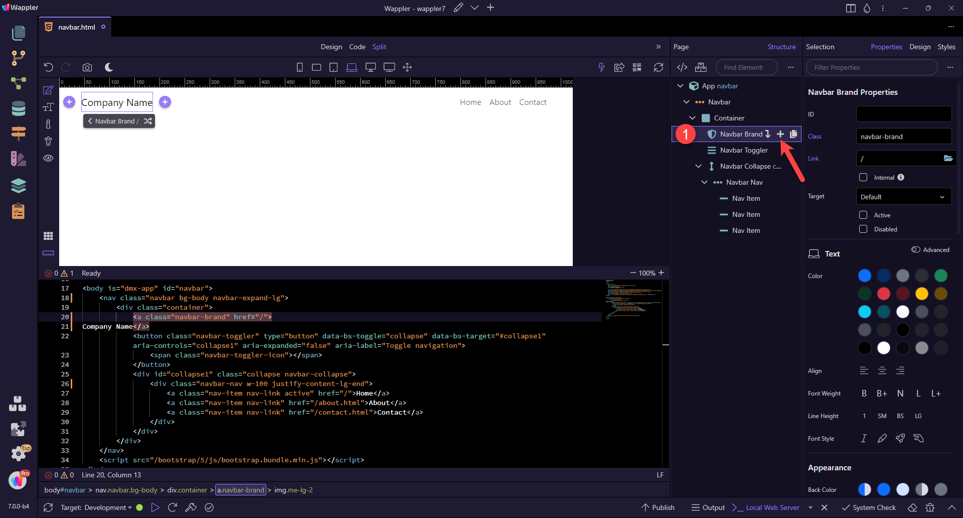
After the brand we need to add the Navbar Toggler element and the collapse region which it toggles. While the brand element is selected, click the Add After button (1) and select Navbar Toggler

The toggler element also adds the collapse, which holds our navigation links. Click the add inside collapse element button (1) and select Navbar Nav (2)

And then inside the Navbar Nav you can nest your links. You can do this by clicking the add inside button (1) and choosing Nav Item (2)

You can add more links in the Page Structure tree as well. Just hover over the element (1) and select the add after button (A) or the duplicate button (B).

Linking
Here we have added three navigation items (1), changed the text (2) and added the link (3). The link is chosen by selecting the folder icon (4) and choosing the page from the dropdown. The Home page has been set to Active (5) with the assumption that this will be the first page that is opened when visiting the site.

Styling
Style your Navbar by setting up the BS Theme (1). By default, this is set to Auto. The result is a dark text for the Light theme.

This changes to a light text in Dark theme (1).

This works fine when we choose one of the subtle (transparent) colours for the background. Similarly, this also works fine when one of the three body colour variants are used.

But when we choose a solid colour, this does not work wel.

For a Navbar with a solid dark background, the Theme need to be changed to Dark (1)

Similarly, a solid light background requires the theme to be changed to Light (1)

Positioning
Normally, when the page is scrolled up, the Navbar disappears out of sight. To have it always visible, we can use the Position property (1).

- Fixed Top - ensures that the Navbar stays at the top of the screen. However, this property takes the Navbar out of the natural flow of the document, causing the rest of the document to also start at the top. To overcome this, padding (e,g,
pt-5) needs to be added to the top of the container that holds the main content. This container is usually a<main>element. - Fixed Bottom - ensures that the Navbar stays ate the bottom of the screen. This value is the same as in 1. with the exception that the padding needs to be added to the last container in the document, quite often the
<footer>element. - Sticky top - If there is content (e.g. a
<header>) above the Navbar, on scroll, the Navbar will stick to the top of the screen, making it always visible. Because Sticky top follows the flow of the document, there is no need for extra padding.
Be advised that mobile devices do not recognised Sticky Top; the Nabar will scroll up as per Default.
Sticky Top can be used instead of Fixed Top.
Expanding
By default, the Navbar has been set to expand on large size (Laptop). If you want to change this, first select the large device icon (1) and de-select Expand (2). Then choose on which device size the navbar should be expanded. Just click on the device icon, and check the expand checkbox.
If you want to have the menu collapsed on all screens i.e. to see the "hamburger" icon on all screens, just remove the expanded option for all the screen sizes.

Aligning
You can align the links in the Navbar, by selecting the Navbar Nav element (1) and then adjusting the Justify property (2), so this allows you to align them left, right or center:

By choosing the Container (1), we can change the container from fixed to fluid or a number of in-betweens.

Adding an image
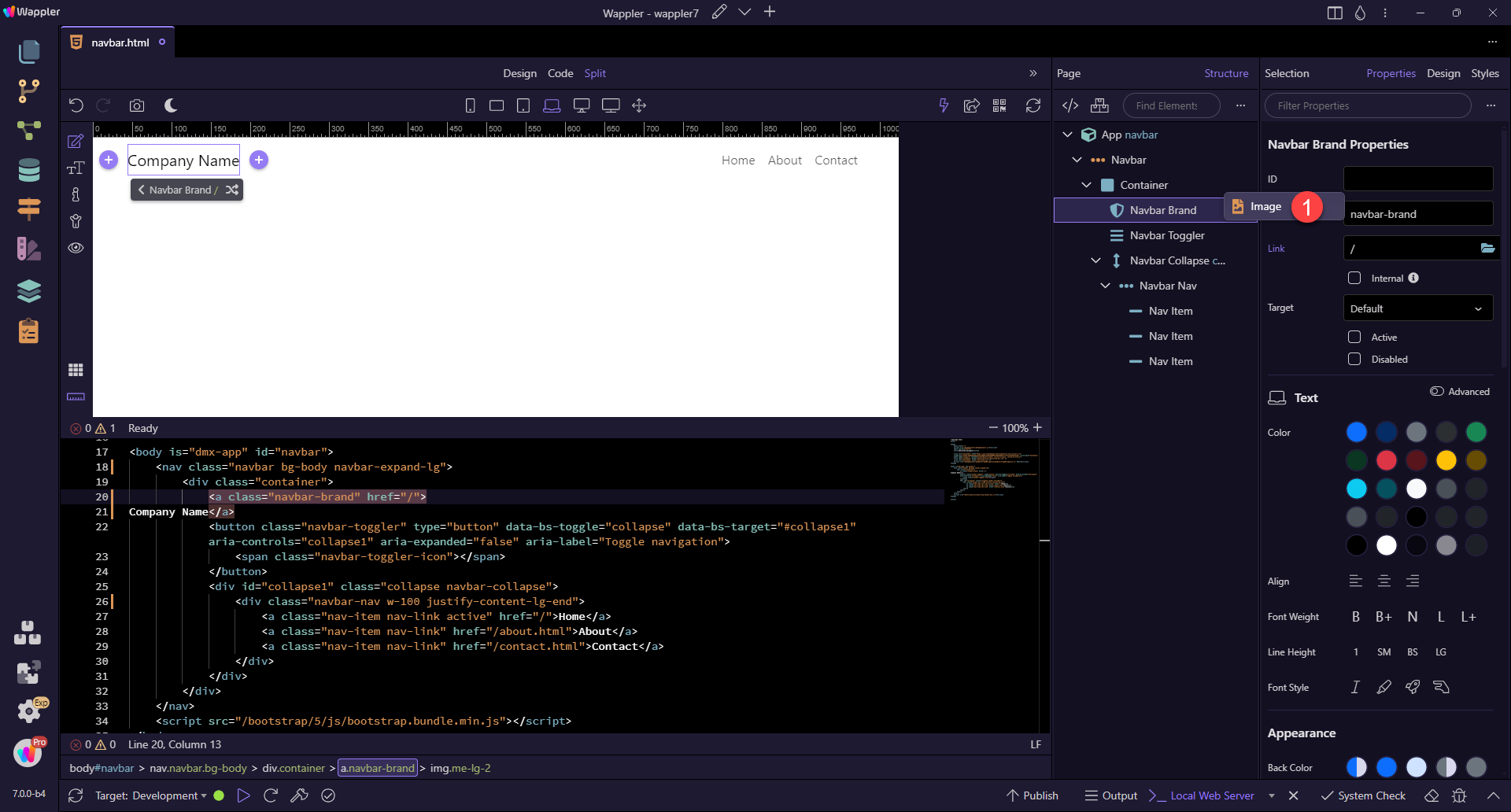
To add a logo or similar, hover over Navbar Brand and click on the add inside button (1).
Click on Image (1)
Select the Src of the image (1), set the Width (2) and Height (3) and do not forget the Alt text (4). If the logo and the text are too close together, the image may need a right margin (.me-2).

Accessiblity
Indicate the current item by using
aria-current="page"for the current page oraria-current="true"for the current item in a set.
This is currently only possible by hand coding in Code view.
___