First off, I might be doing this the wrong way… yet here is the scenario.
I have finished creating the desktop layout via the design panel and only to find out that it was not copied for the laptop layout.
Is there a way for me to copy all the settings on my desktop layout under the design panel to the laptop layout instead of doing the whole changes again?
Hi @BrodNeil, great to see you are advancing with Wappler and its features.
As you see, we are using the Bootstrap 4 Framework for building site layouts in Wappler and Bootstrap 4 Framework is a mobile-first framework. The idea behind mobile-first approach is that you first design for the smallest devices (mobile phones). All the adjustments you make there are passed on to all the bigger screens - tablets, laptops and desktops.
So for example, if you create a 12 columns wide bootstrap column on mobile - it will be 12 columns wide on all the devices. If you want to make it 6 columns wide on tablet, you switch to the tablet view and change it there, then it will be 6 columns wide for tablets and bigger devices, while still 12 columns wide for smaller screens. You can learn more about mobile first design by visiting the following links:
or by just googling the subject
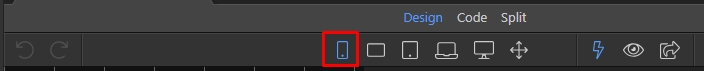
In our design panel, we are using the same approach (mobile firs) so the changes you make depend on the selected device size and apply for it and bigger screens only.
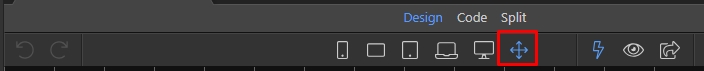
There are two ways to apply the styles to all devices:
and all the styles you apply will affect all the devices. Then if you need changes on any of the bigger screens, just select it and apply the adjustments for it and bigger screens.