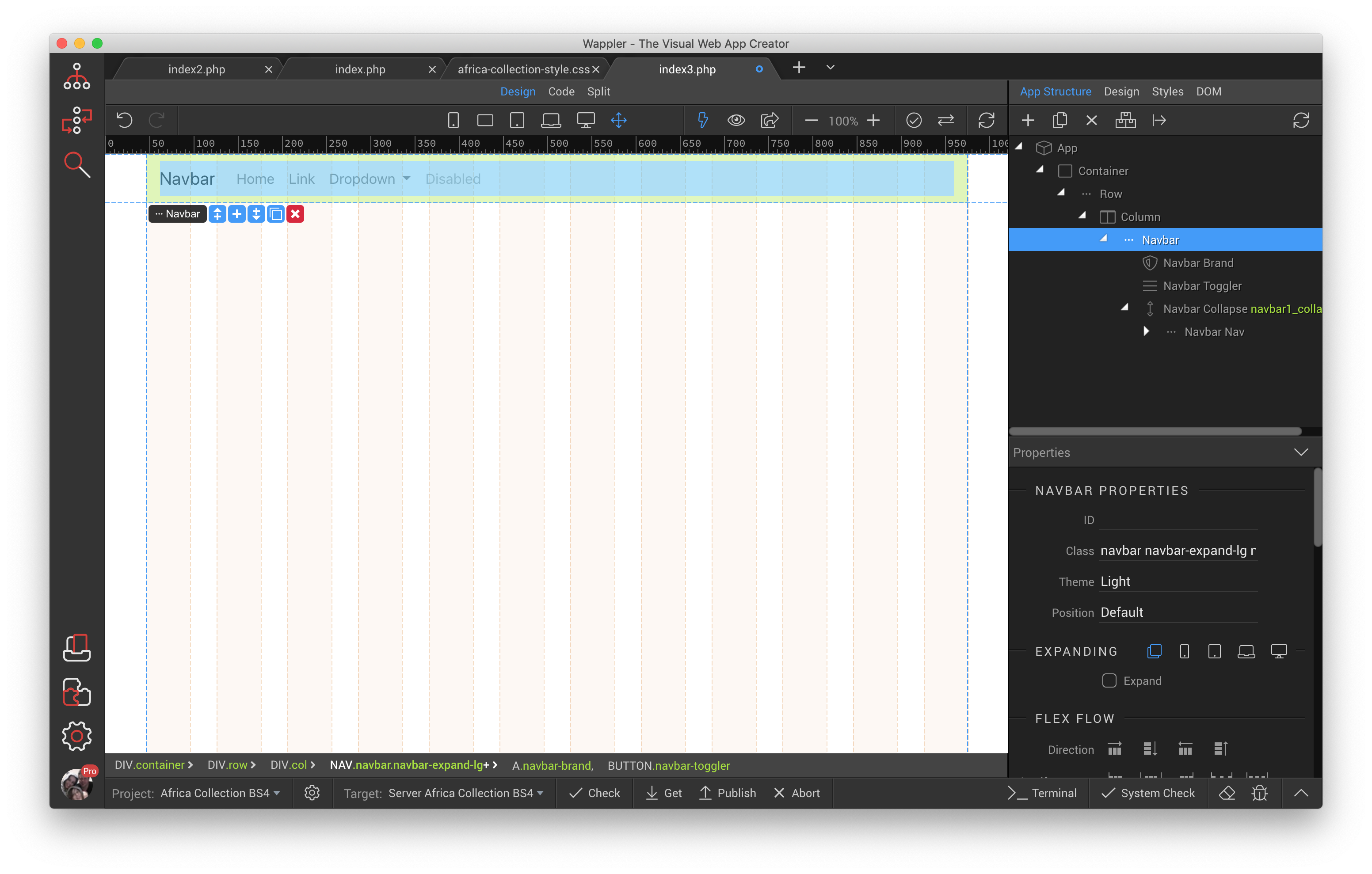
So lets start off with the standard Wappler stuff.
- Create a new page
- Add - Framework > App Connect > App Connect local
- Add - Framework > Bootstrap 4 > Bootstrap 4 cdn
- Add - Container
- Add - Row inside Container
- Add - Column inside Row
- Add - Navigation > Full Navbar
You should have something that looks like this at the moment.
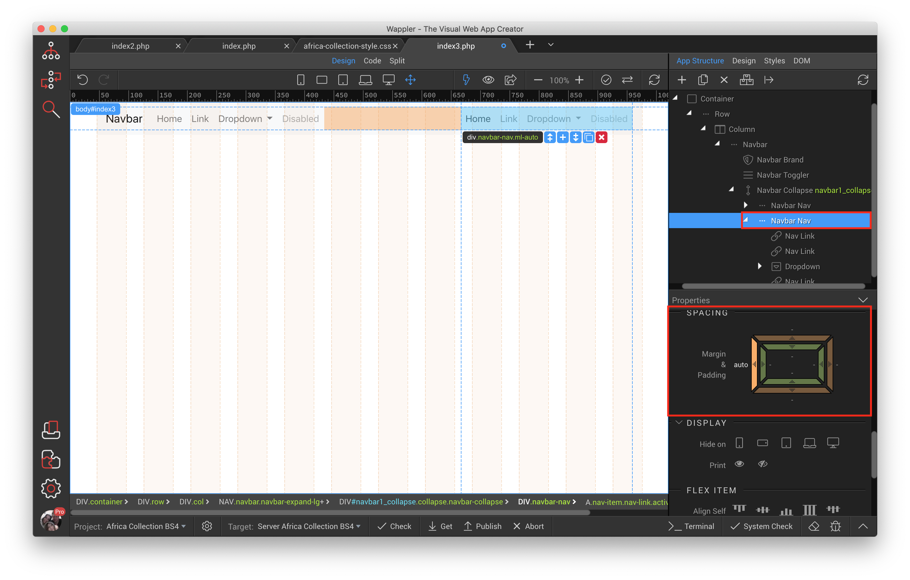
In the App Structure panel select Navbar Nav, and click the duplicate button.
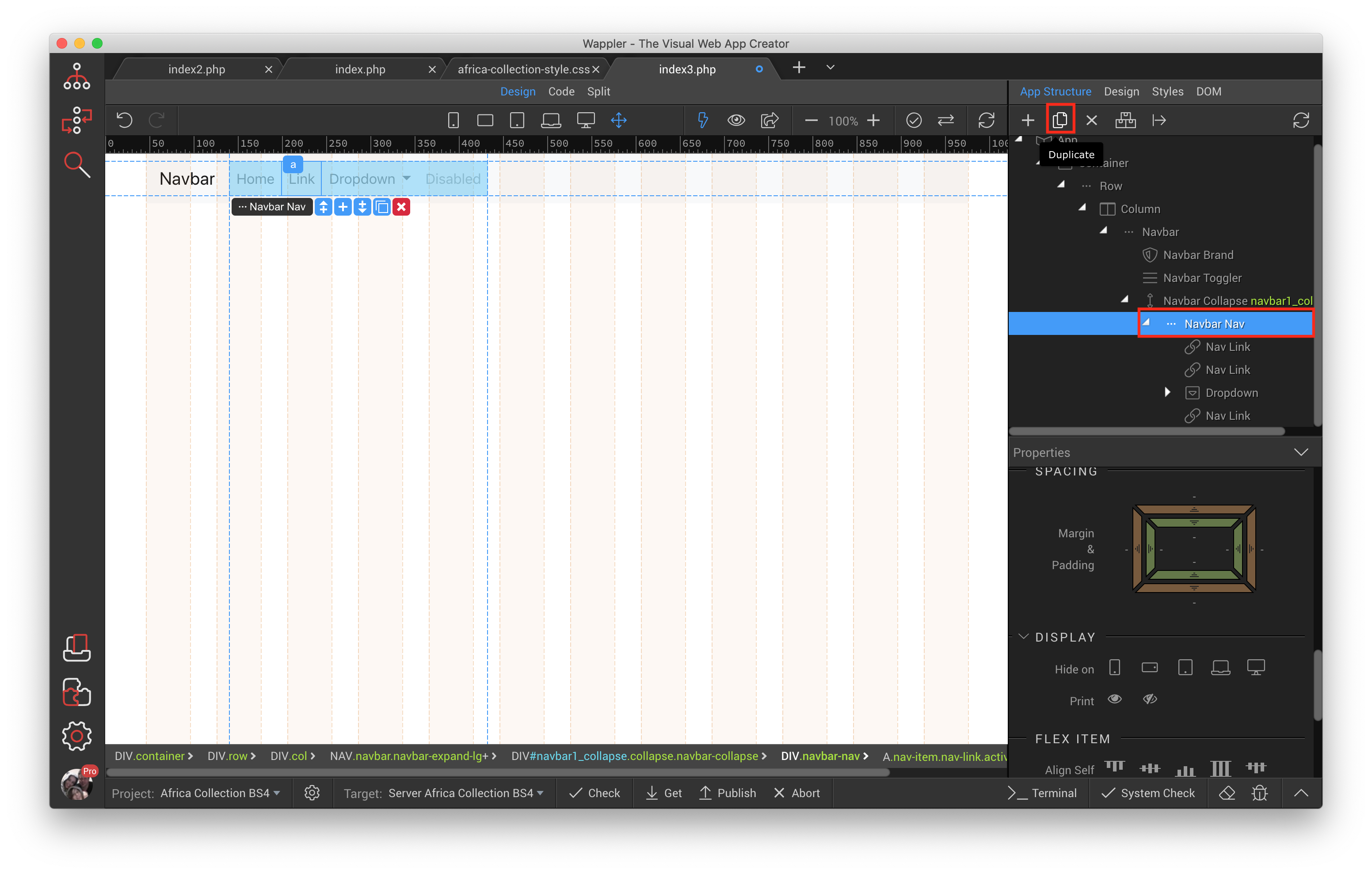
Select the second instance of Navbar Nav and scroll down the properties panel till you find the spacing area where we are going to add a margin of auto to the left only.
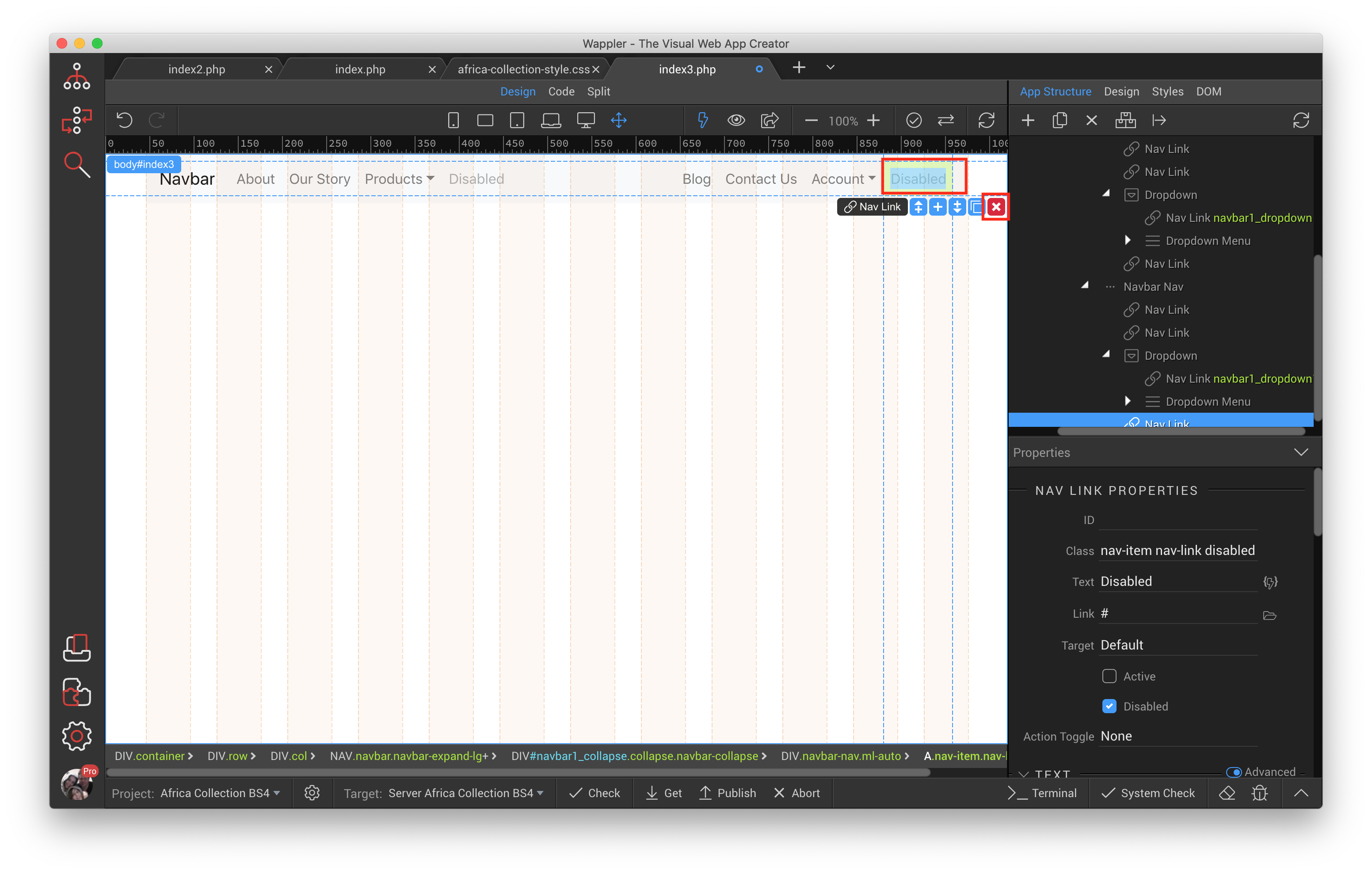
Double click on the word Home on the very left and change the wording to whatever suits your needs, then do the same to all the others until you get what you desire. I also deleted the 2 Disabled Menu items.
Now we adjust the Dropdown menu for Account, because it is on the very right hand side it needs to be aligned right, otherwise the elements inside it will run over to browser width. Click the word Account in Design View which will auto select it from the App Structure, scroll down a little and select Dropdown Menu and click Align Right.
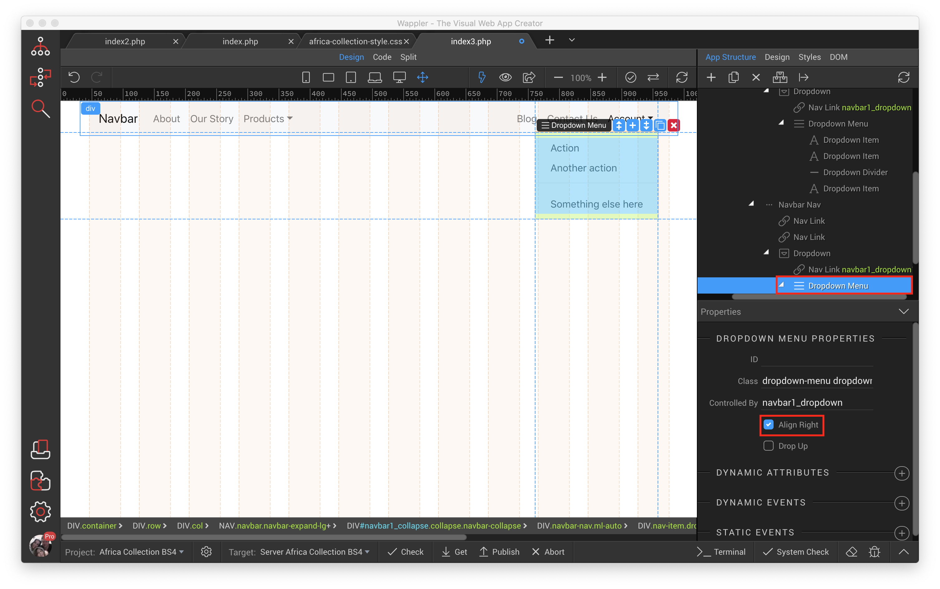
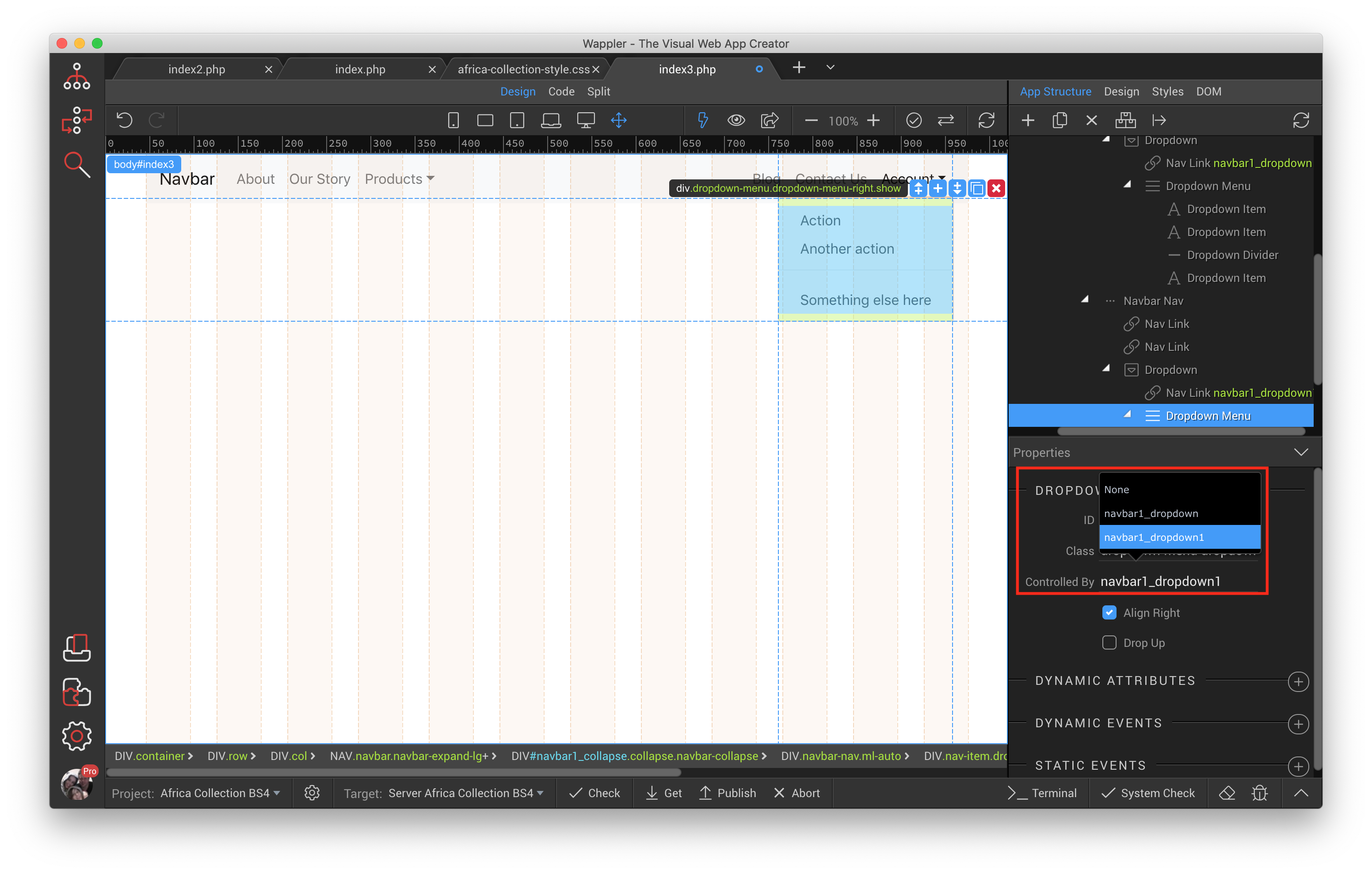
While you are still in this area click the Controlled By Menu Item and select navbar1_dropdown1
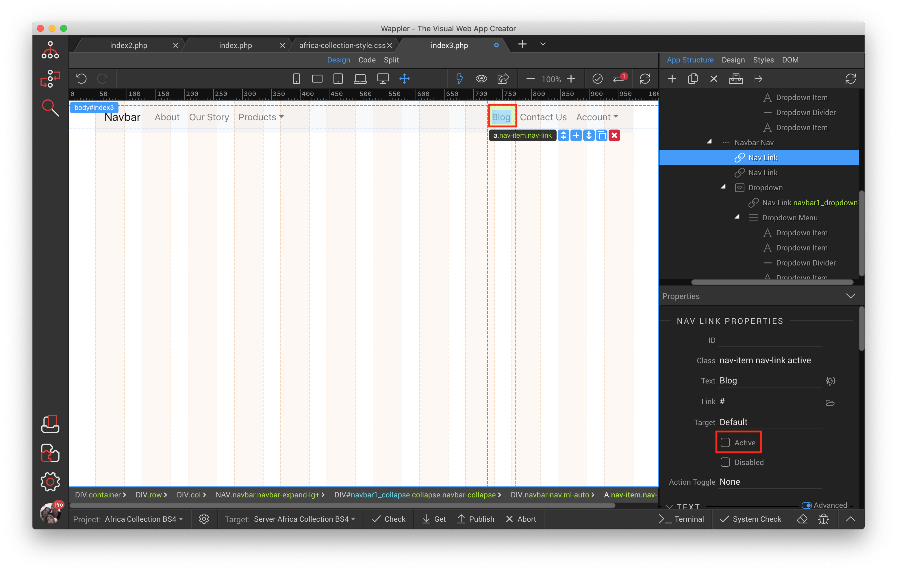
Because right in the beginning we duplicated Navbar Nav it also duplicated the “Active” state, therefore in my example About and Blog both have their state set to “Active”, click on Blog and make sure the Active checkbox is un ticked.
So far we have converted the standard Wappler Navbar component to a left and right aligned navbar that is fully responsive and works great, as long as you go and enter all your navigation links this should work well.
We are now going to turn the dropdown navigation item Products into mega menu. Warning: Although what we need to do is very simple, it totally breaks out of the conventions of Wappler and Bootstrap 4 standards, therefore it will be best to do this in code view.
Lets start, click code at the top, and you can already safely ignore everything highlighted in the head section for now.
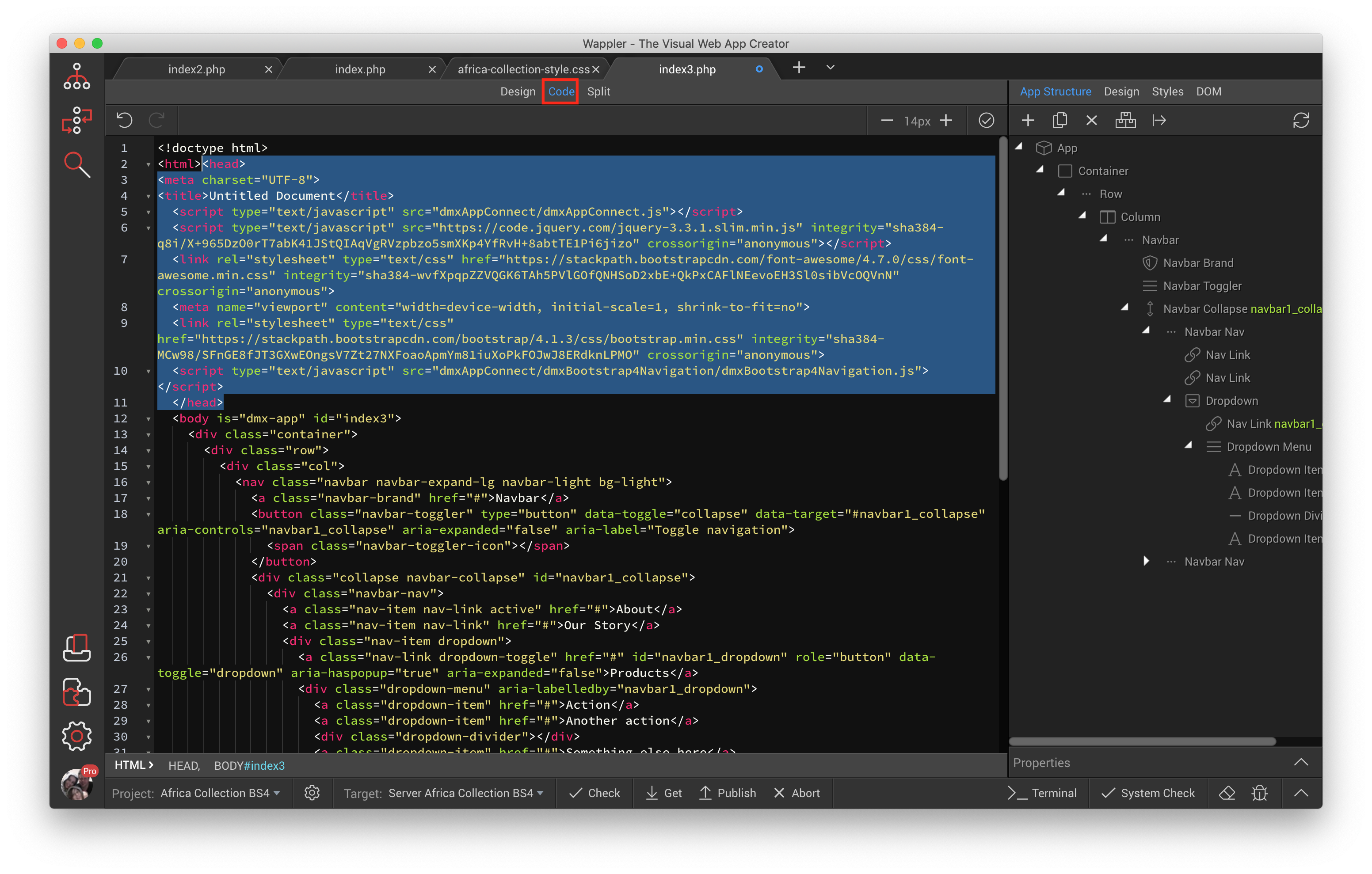
Scroll down the code a little ways and find
<div class="dropdown-menu" aria-labelledby="navbar1_dropdown">
  <a class="dropdown-item" href="#">Action</a>
  <a class="dropdown-item" href="#">Another action</a>
  <div class="dropdown-divider"></div>
  <a class="dropdown-item" href="#">Something else here</a>
</div>
Change it to
<div class="dropdown-menu" aria-labelledby="navbar1_dropdown">
  <div class="row">
    <div class="col">
      <a class="dropdown-item" href="#">Action</a>
      <a class="dropdown-item" href="#">Another action</a>
      <div class="dropdown-divider"></div>
      <a class="dropdown-item" href="#">Something else here</a>
    </div>
    <div class="col">
      <a class="dropdown-item" href="#">Action</a>
      <a class="dropdown-item" href="#">Another action</a>
      <div class="dropdown-divider"></div>
      <a class="dropdown-item" href="#">Something else here</a>
    </div>
    <div class="col">
      <a class="dropdown-item" href="#">Action</a>
      <a class="dropdown-item" href="#">Another action</a>
      <div class="dropdown-divider"></div>
      <a class="dropdown-item" href="#">Something else here</a>
    </div>
  </div>
</div>
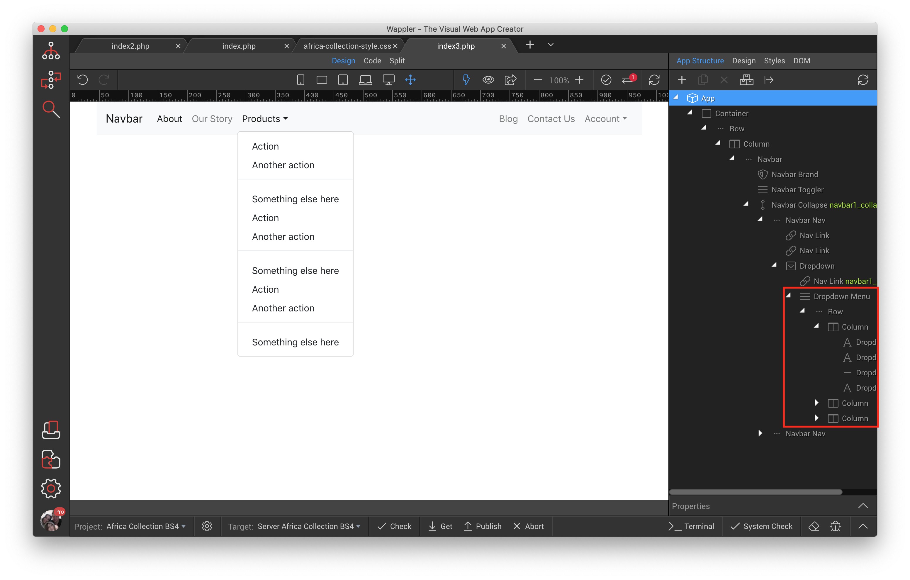
Although if you are not used to code this might seem like a big change it really is not, all we have done is taken the dropdown-menu and added a row inside it, then we duplicated the menu items two more times so we landed up with 3 sets of them and made sure each set was enclosed in a column.
Lets go back to design view and see what we have. You will notice that although Wappler would not allow us to add a row and a column inside the App Structure it has still managed to recognise what we have done.
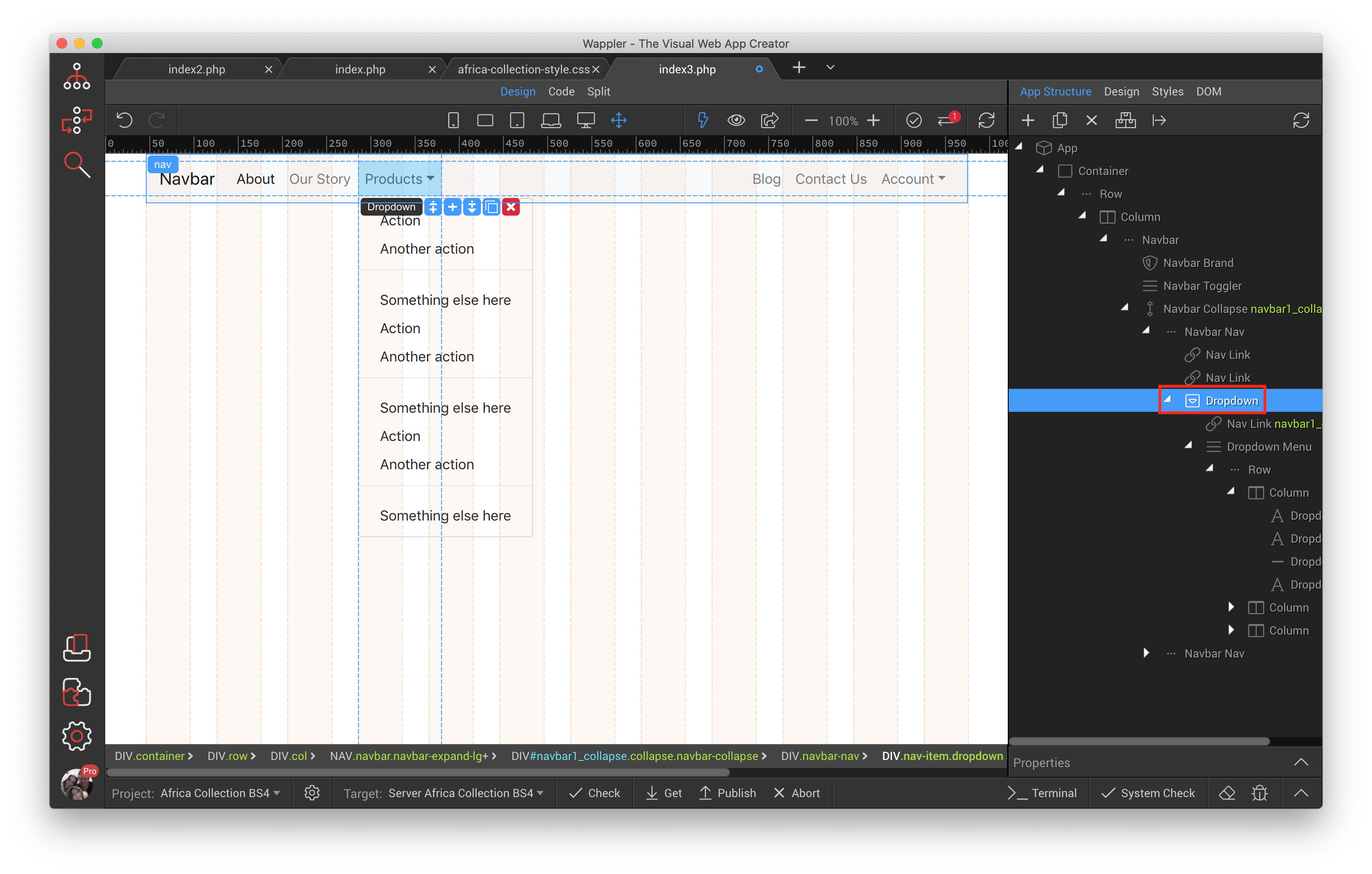
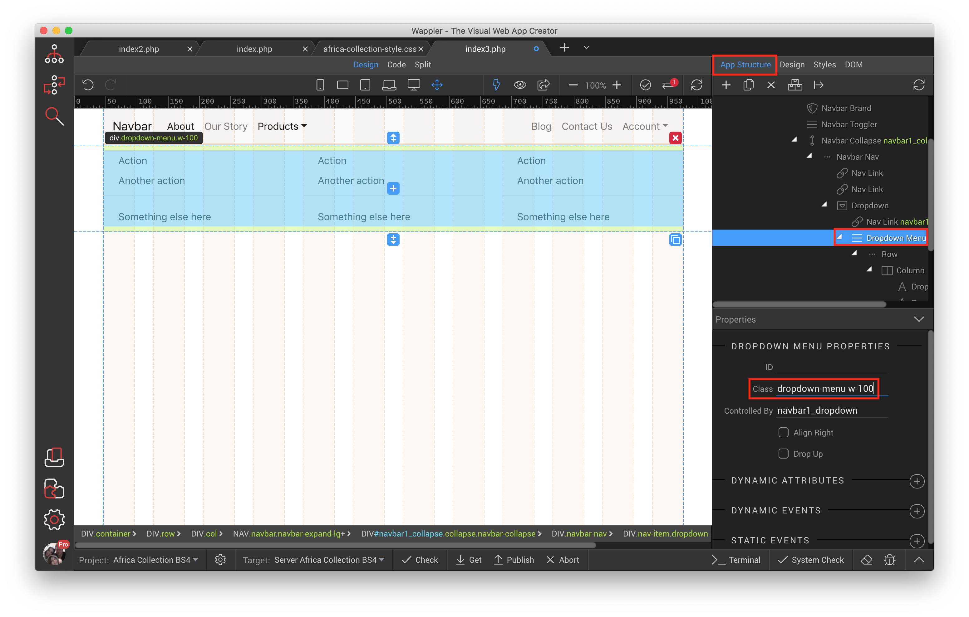
We need to add a little CSS to this so it displays correctly. From your App Structure select Dropdown
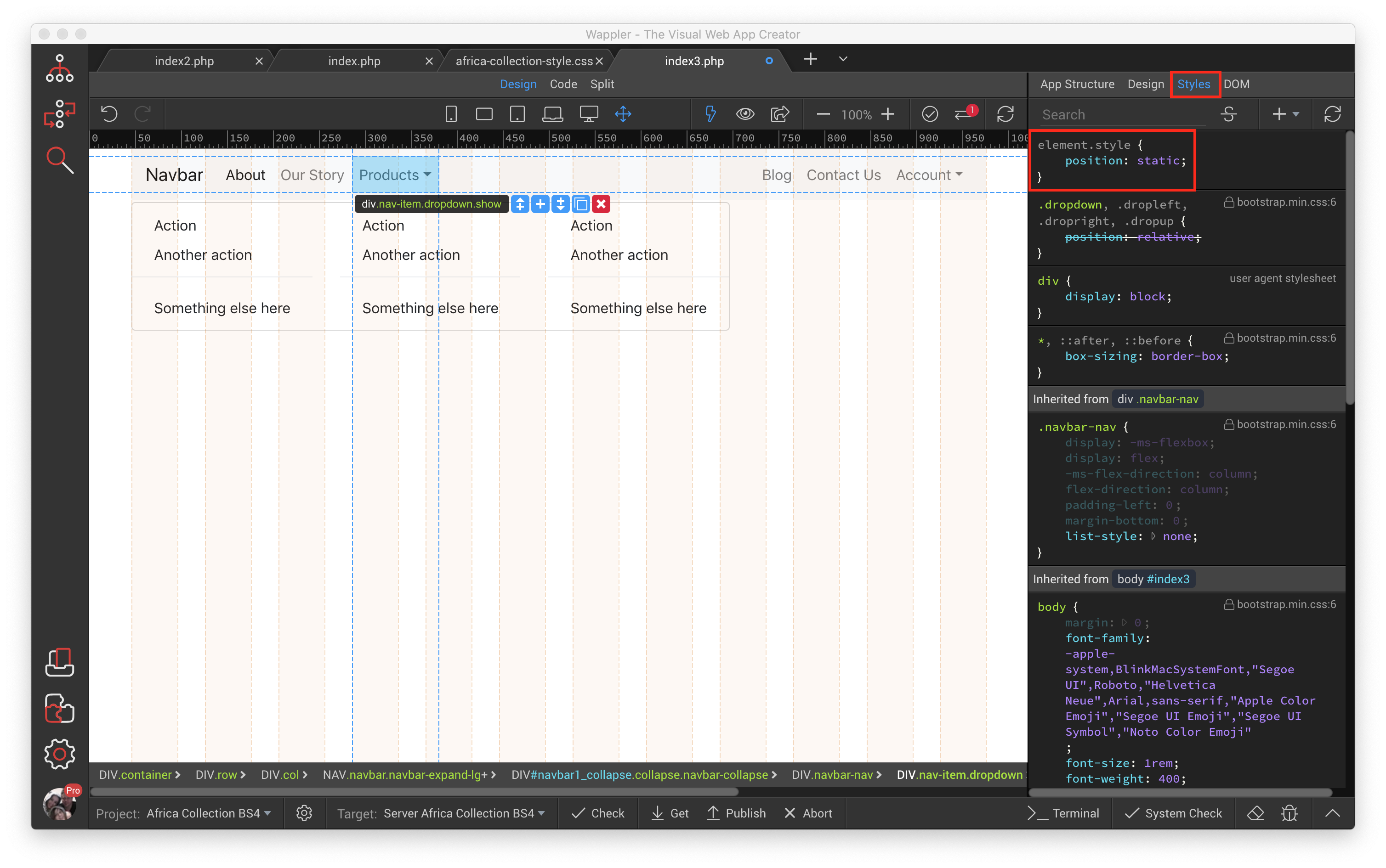
Select the Styles tab, and click after the opening { of element.style and then enter position, hit the TAB key and type static, then TAB one more time. The result should look like this.
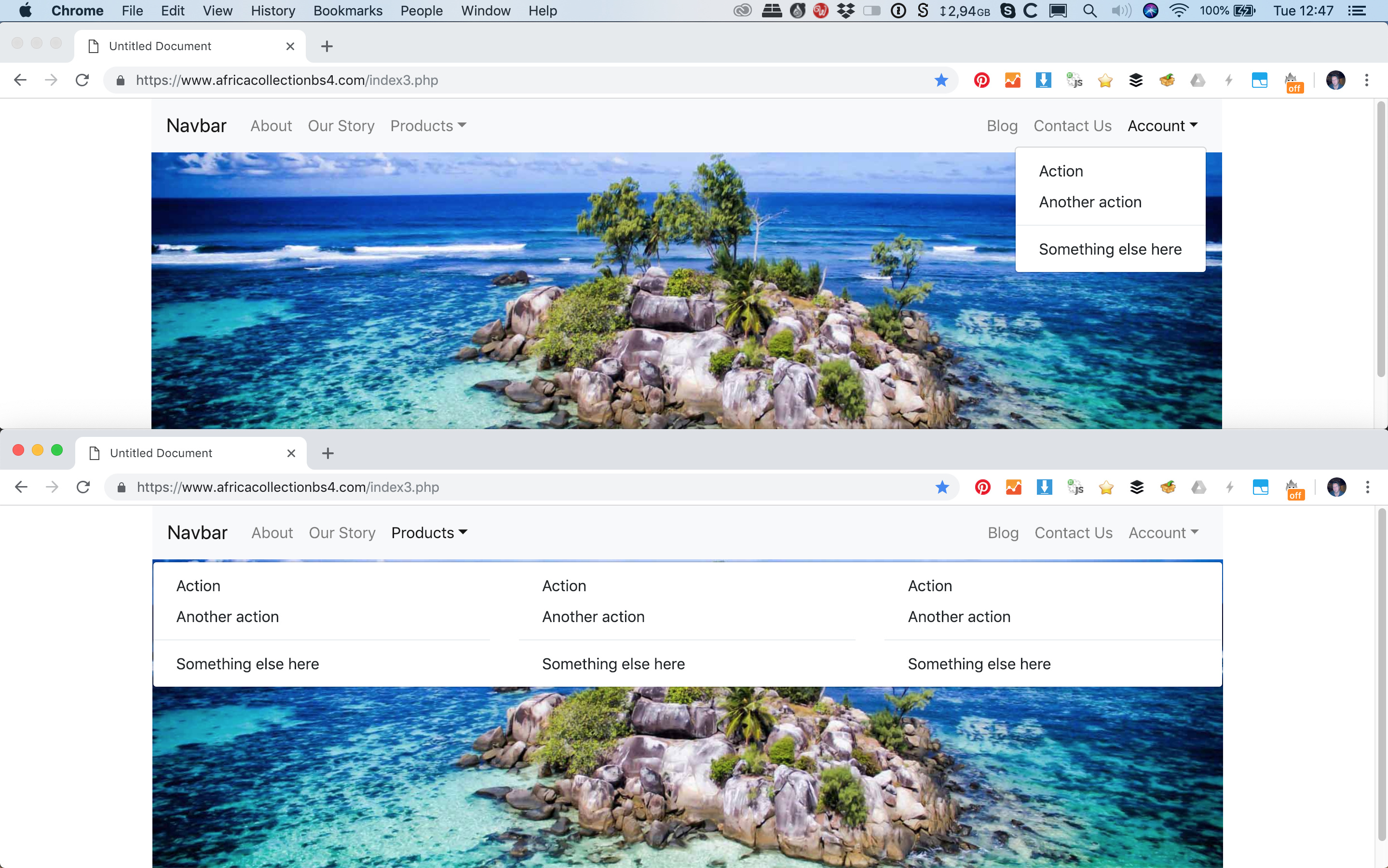
As you can see we have a mega menu, for my purposes I want it to stretch the entire width of the screen, so I go back to the App Structure tab and select Dropdown Menu, then find the Class property and add after dropdown-menu w-100TAB which produces this.
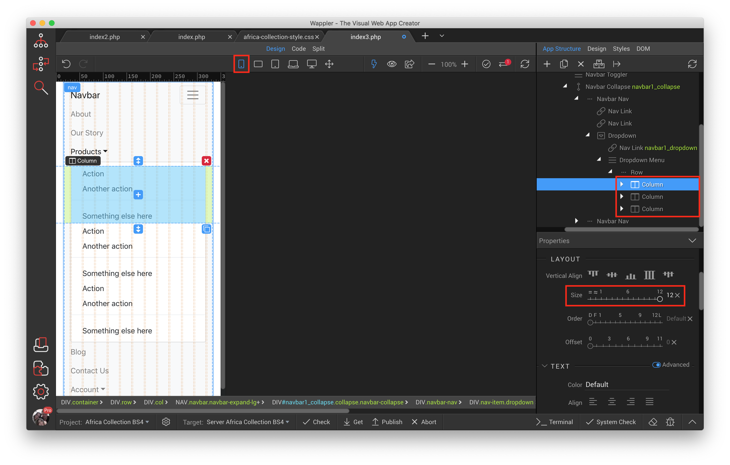
You will need to adjust accordingly for your own needs as far as its responsive nature is concerned by setting the column widths, what i did was leave it alone for Desktop and Laptop view as those views are still complete menus. I was able to also leave tablet view as it looked fine in its collapsed and uncollapsed state.
Select as per the screenshots below if you want to achieve the same results. Make sure to do the same thing to all 3 columns, one at a time.

Here is what it looked like as a final result in my browser